
There are a lot of jars in our basement.
Crock of Time is a virtual fermentation logbook, recipe collection, and guide to fermenting at home by Cory Hughart, my husband. Within its web pages are accounts of various food experiments, ranging from hot sauce to sourdough. His stated goal is “to rediscover and demystify fermentation and provide you with tools and tips to employ it successfully in your own home.”

The Journey
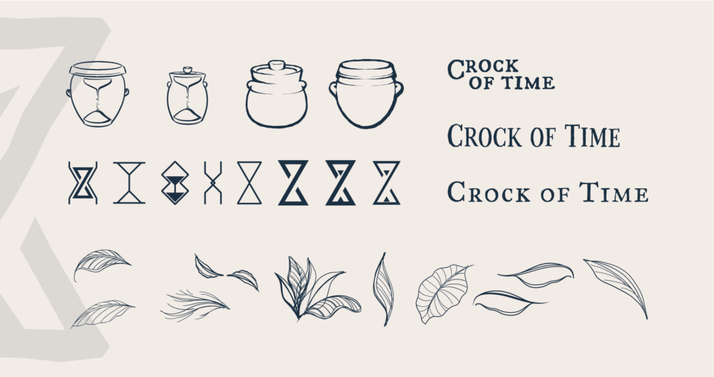
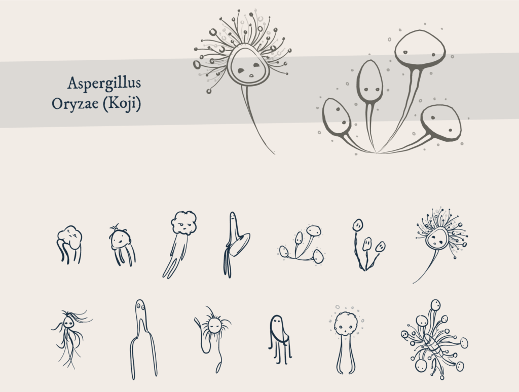
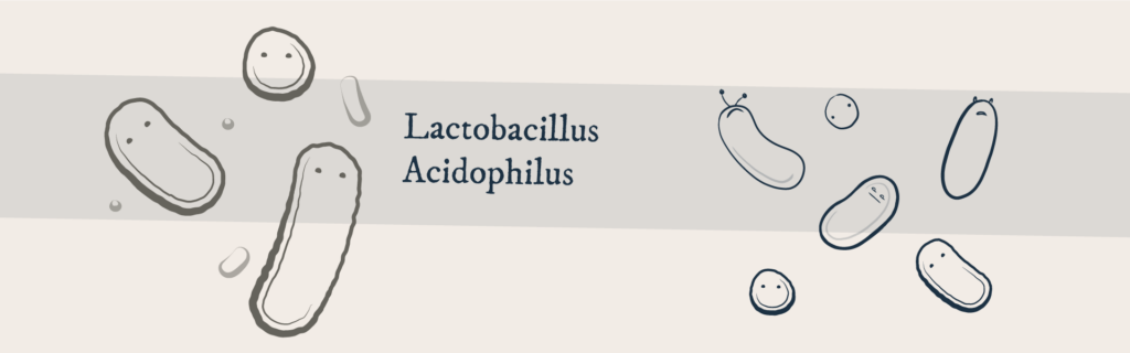
From the start, Cory laid out a very specific vision for the brand. He insisted on a very specific reference crock to be represented in the logo, and asked for a symbol to represent the passage of time. The style would ideally evoke hand-crafted woodcut prints, with an angular, thick, rough-hewn quality. He also supplied several modern revival fonts from Igino Marini called the Fell Types, with inky irregularities that compliment the linework. The brand identity would go on to include other fermentation vessels such as water-sealed crocks, open crocks, Korean onggi, and mason jars, as well as personifications of some friendly microbes like yeast, the lactic acid-producing bacteria Lactobacillus, and the koji mold, Aspergillus Oryzae.
Color Palette
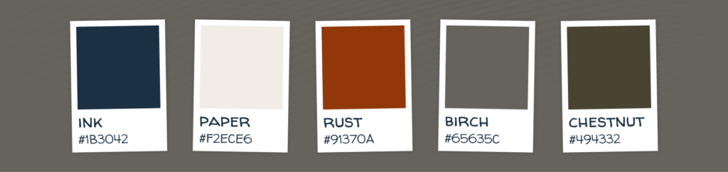
Colors were chosen that elicit nostalgia for a pre-digital era of physical things, now somewhat faded or otherwise altered by time.
Logo Sketches & Ideation
Koji Sketches
Lactobacillus Sketches
Watch the live stream replay here, and visit Crock of Time