Brightside Educational Partners is a start-up focused on providing peer mentorship and resources for teachers. They were looking for a brand to be created from the ground up. They had already gone through one round of concepts with a different agency and weren’t satisfied with the results. We took the research that was started and created something brighter and more modern, that felt more refined for their teacher focused audience instead of feeling childish and bubbly. We worked on the website alongside the branding.
Moodboard
We knew they wanted to eventually create a website and app around their concept so we took that into consideration when mood boarding for their brand, to ensure the brand would work well in those contexts.
Initial Concepts
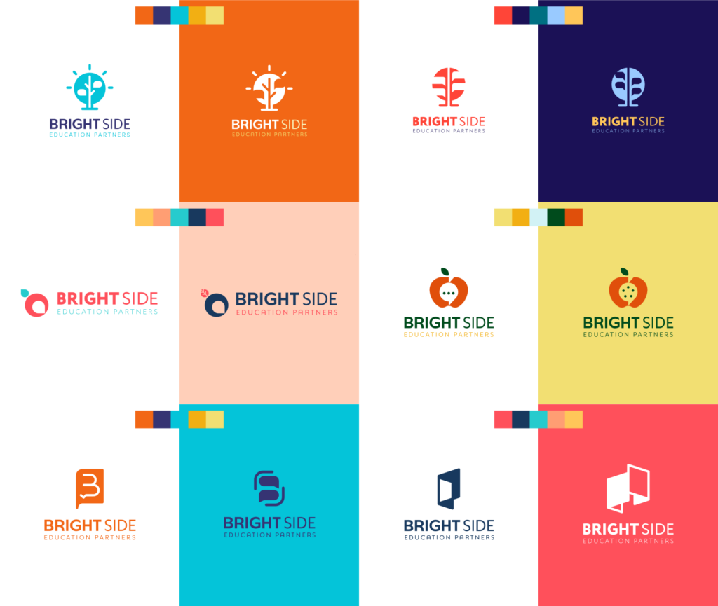
The client originally really wanted to incorporate a lightbulb and tree into the design so that’s where we started, but we also branched out (no pun intended) to include other related imagery based on what resonated with them during the research phase. They ended up really liking the negative space apple, and how it encapsulated the idea of community and conversation.
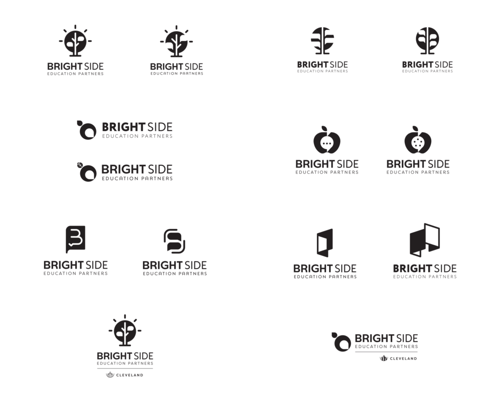
Some color exploration was also done with these concepts to give them an idea how they might read in the bright colors they were looking for.
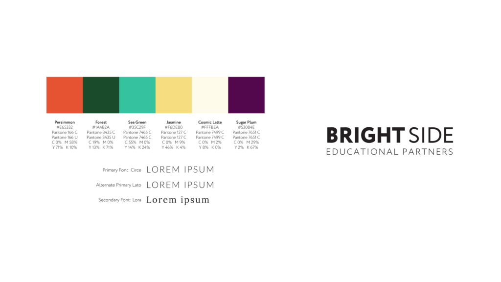
Colors & Fonts
The colors we chose again feel bright, cheerful, but also sophisticated with a wide range of contrast between them. The sans serif fonts are very modern and pair with the geometric minimalism in the logomark.
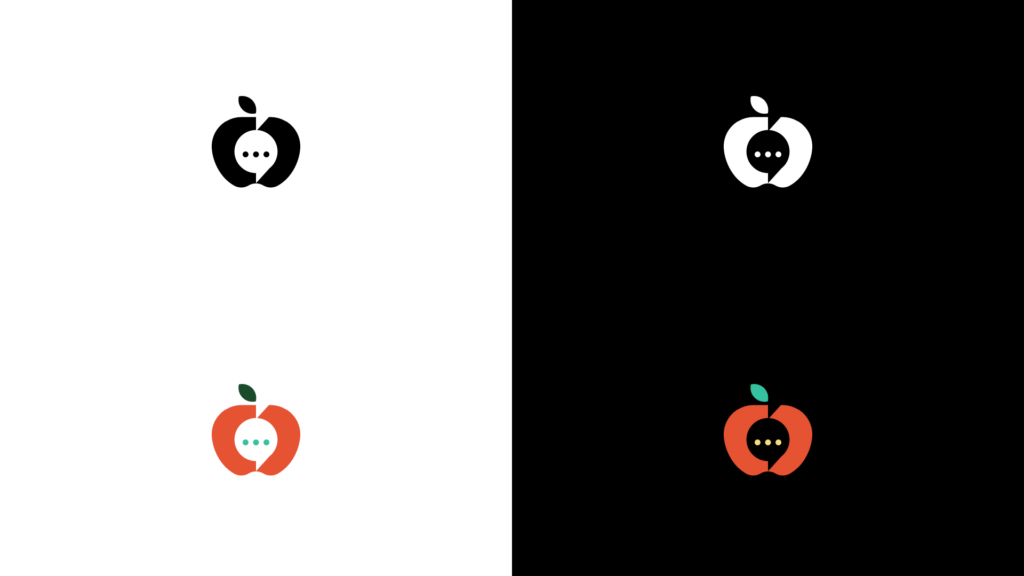
Primary Logo
We provided all of the logo variations in one color and full color, on light and dark backgrounds to ensure they had options that worked in every context. The primary logo was provided in both a vertical and horizontal arrangement.
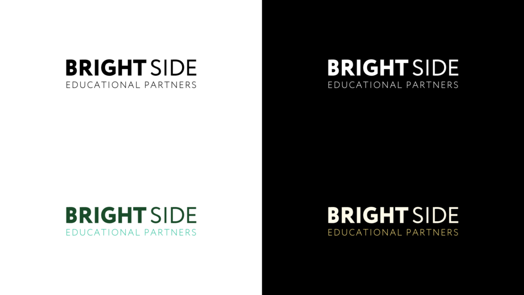
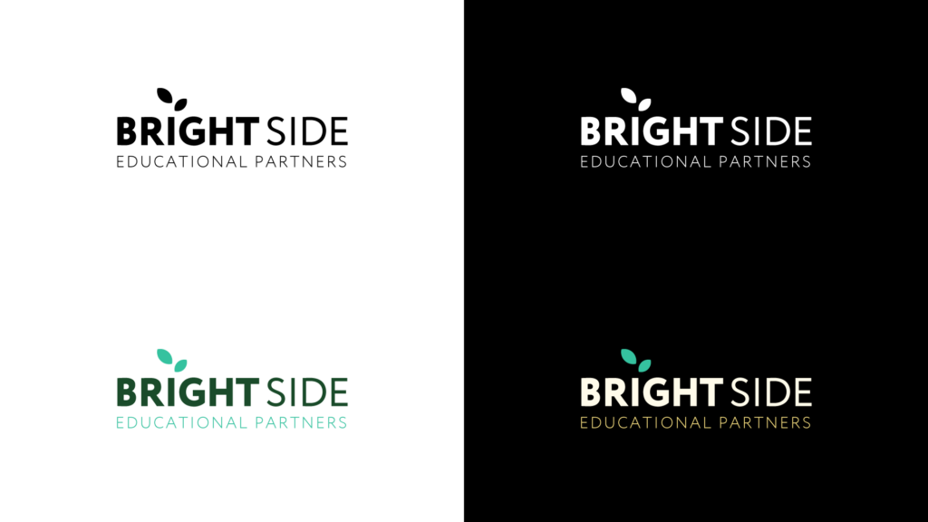
Logotype
We also provided two options for the logotype, one very classic version with only type, and another more playful version using the leaves for the “i” in “Brightside.”
Logo Badge
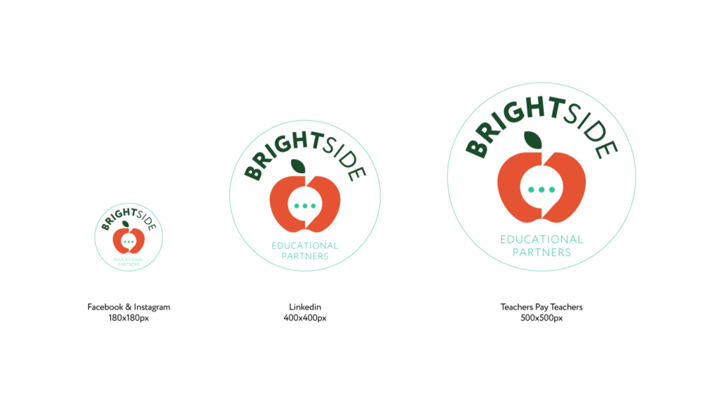
The badge was created for use on social media as well as stickers and other collateral.
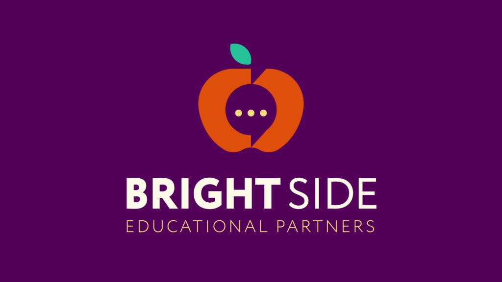
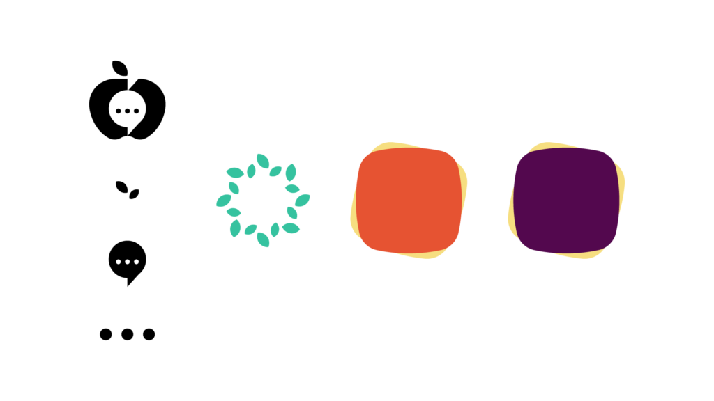
Logomark
The final logomark combines the speech bubble in the negative space of the apple, with some ellipses representing the teacher peer-to-peer conversations.
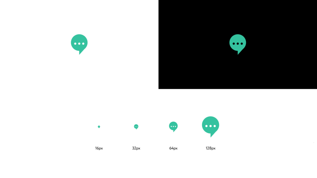
Favicon
The full logomark is too detail to hold up well for small applications like a website favicon or icon situation, so the negative space speech bubble was pulled out to create an icon that still feels consistent with the brand.
Co-branding
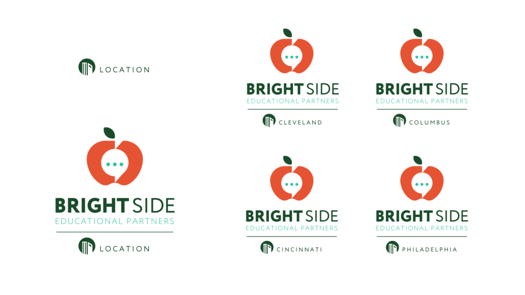
Brightside Educational Partners plans on launching programs in multiple cities so we created a co-branding lock-up with an icon system to create a cohesive look without taking away from the main brand.
Color Variations
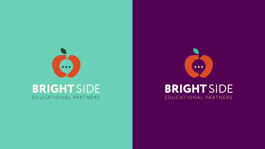
The client wanted to see two full color versions on color, so we created version of the primary logo on lighter and darker colors from the brand color palette. These colors could be extrapolated and applied to any of the lock-ups.
Design Assets
The logomark itself could be broken down to simple geometric shapes and repurposed individually larger, smaller, and repeated to build out a larger visual identity.
Social Media Assets
The badge logo as it would look for the client’s primary social media platforms. The main logotype and mark remains visible even at smaller sizes.
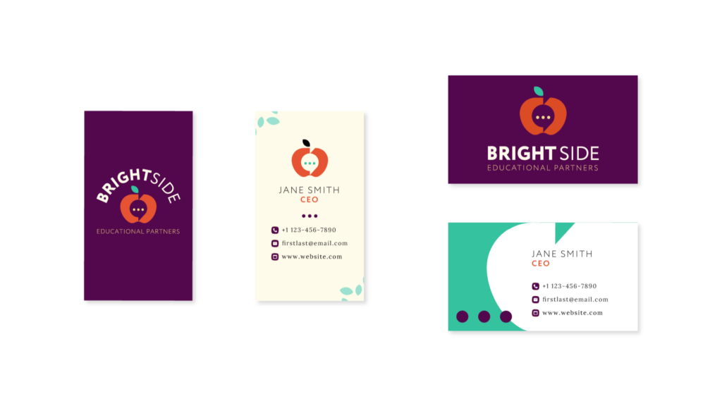
Business Cards
Vertical and horizontal business card designs. The design on the right ended up being inspiration for the client’s social media templates in Canva.