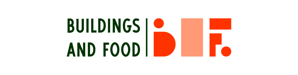
Buildings and Food is a local hospitality group. They were looking to build a brand from the ground up with it’s own style, that would still fit with the look and feel of their existing brands. The brand needed to be fresh, fun, and forward looking, yet grounded, and with a classic style to fit with their mission statement. Their origin and focus is on old-school bars and restaurants.
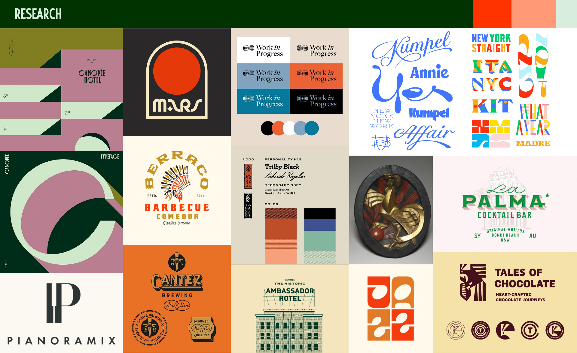
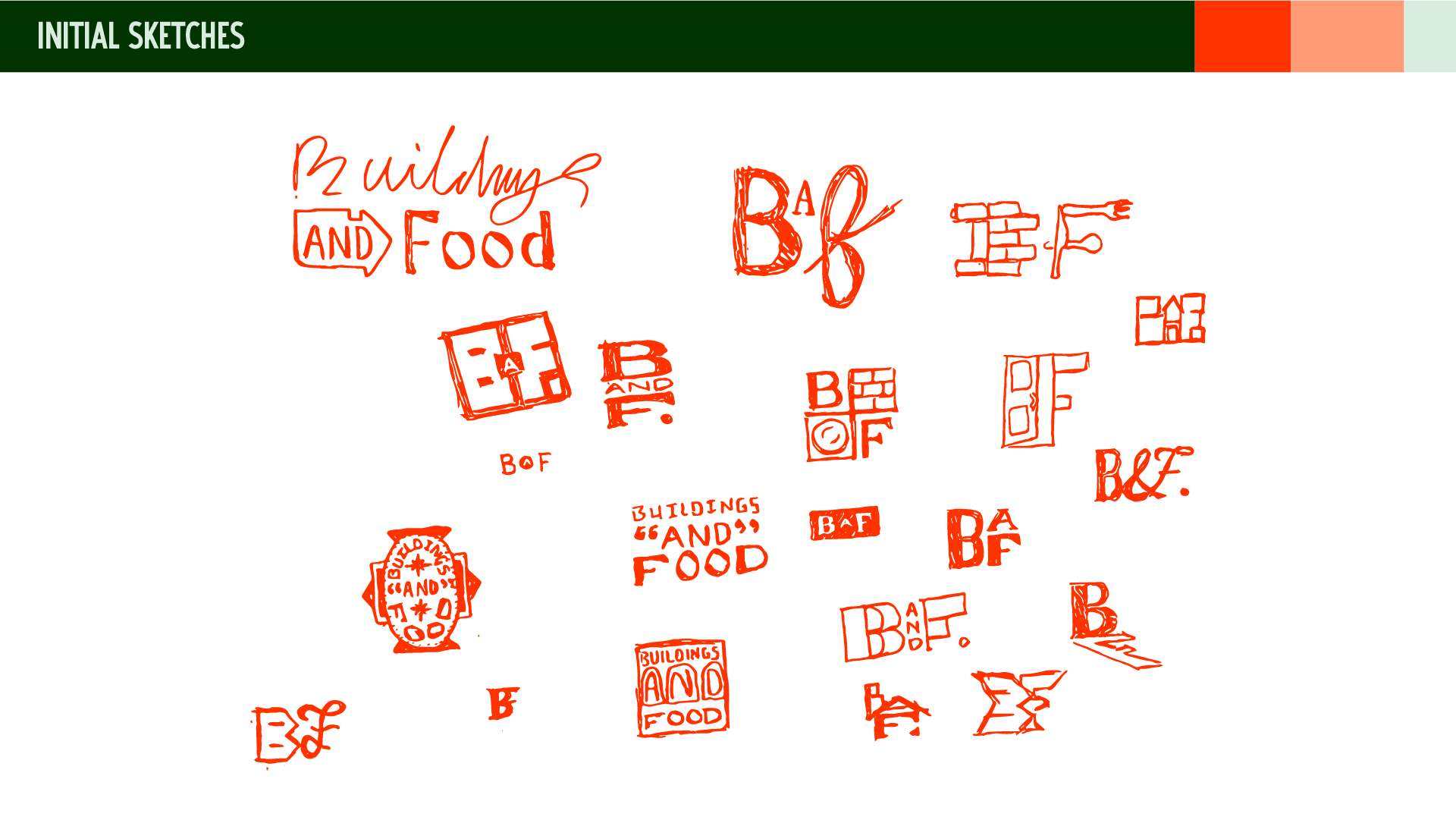
I started by gathering some imagery based around our initial conversations into a moodboard. I tried to provide a lot of different styles, type, colors, all that I thought could connect with their goals and brand traits. After a round of sketches, I livestreamed the process of creating the brand on my personal Behance, you can find the replay below.

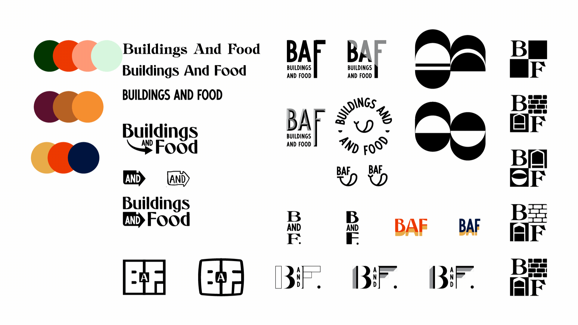
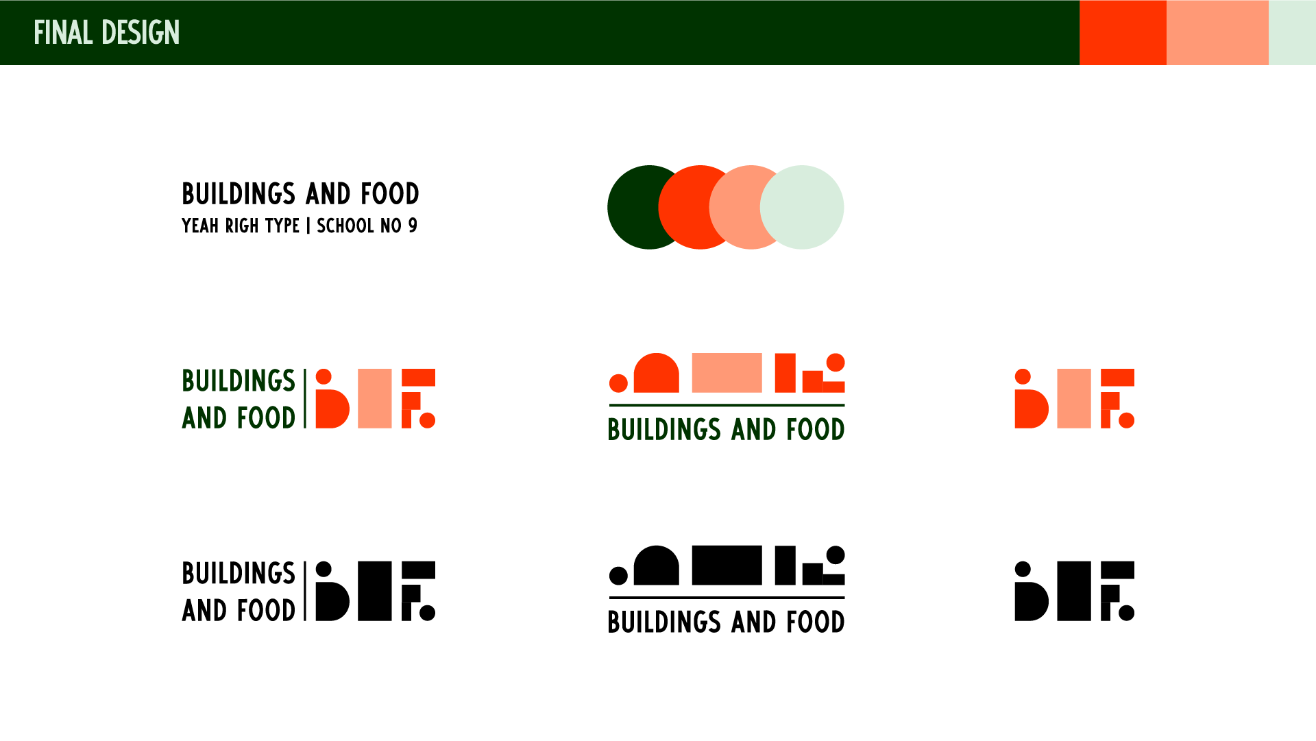
The final concept we landed on made use of geometric shapes to construct abstract forms that imply the story of the brand, buildings and food. The central focal point being the negative space for “And” acting as a sort of window, or portal. You can checkout their website made by Cory Hughart to see the brand in action with a fun loading animation, and the use of the portal concept to view their other brands inside of the main site. https://buildings-food.com/

Thanks Jack! I really love where this ended up. Thanks so much for sticking with us through such an arduous project. I’m gonna be really proud to show this off
Will Hollingsworth