Mission Statement
Frenchie’s Vanilla is an online vanilla shop focused on selling gourmet vanilla beans sourced from family farmers. The name Frenchie’s Vanilla is a play on French Vanilla. The branding should reflect a modern, feminine leaning, endearing, and delightful personality. It avoids classic style, traditional imagery with spice trade implications.
Initial Concepts
Frenchie’s Vanilla is run by long-time friends of mine, who approached me to help them with the branding and graphics for launching their Etsy shop. They had already done the work upfront to identify their audience, their ideal customer, put together some color ideas, and established a direction for the style and overall feel they wanted for their brand.
Notes from the Client
- Drawn more to the circular logo format and type on a path.
- Really like the hand drawn script fonts that are reminiscent of piped icing.
- Love simplistic line art with a lot of personality and character.
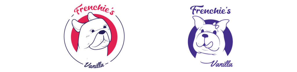
Refining Ideas
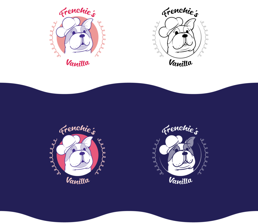
The initial two concepts that were sent to the client are above.. They preferred the dog in the right circle with it’s tongue sticking out, and they preferred the type treatment on the left using type on a path around a circle. They wanted to see additional markings on the face of the dog, and a variation with the chef’s hat added.
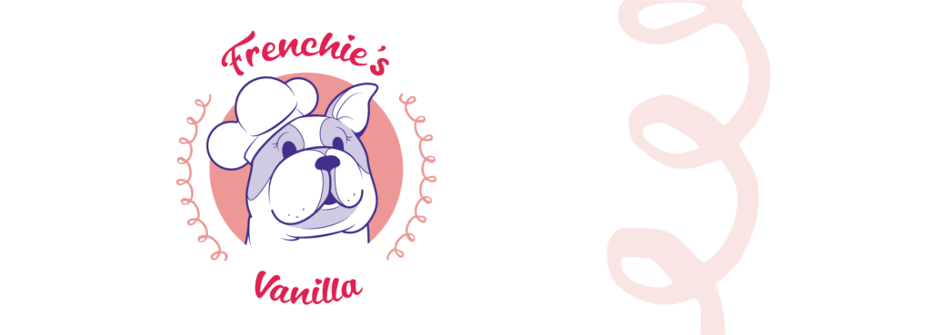
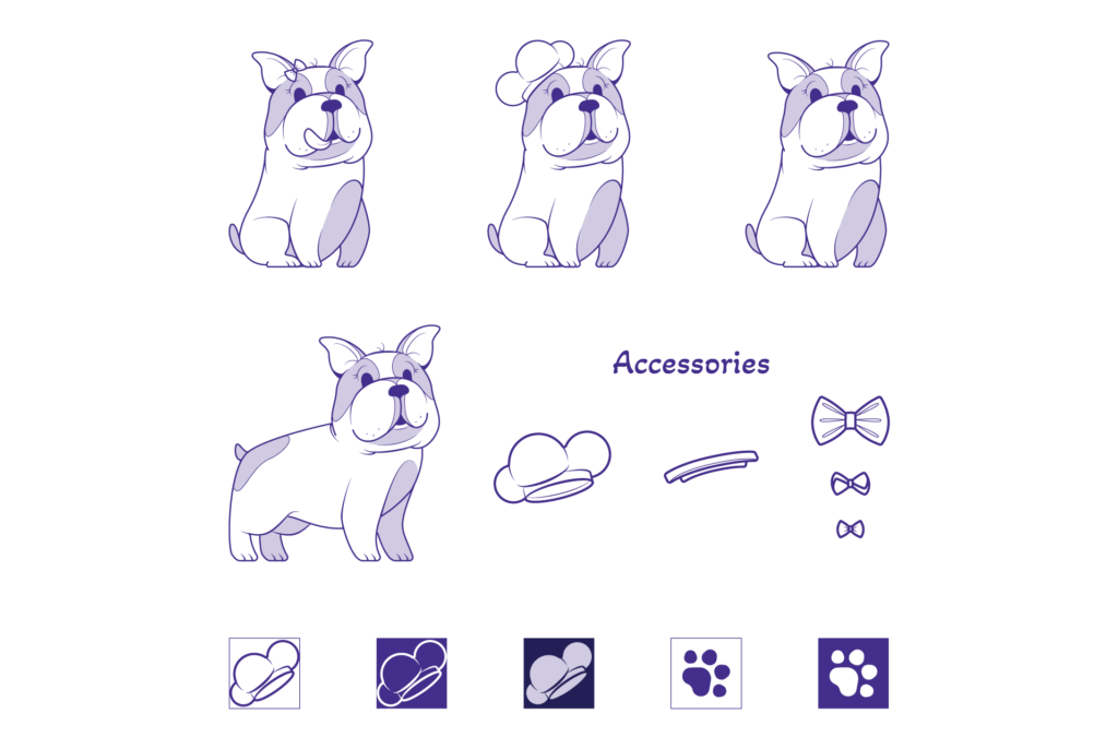
Final Logo
The final logo features a French Bulldog with lots of sass and personality, wearing a tilted chef’s hat and spotted fur pattern. The mark is accented by the text and signature loops.
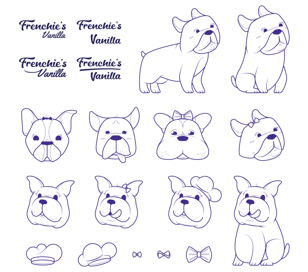
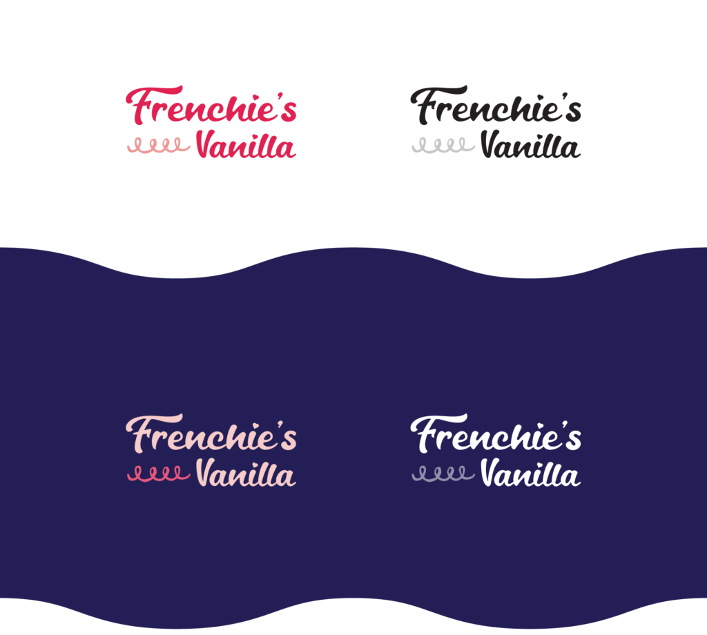
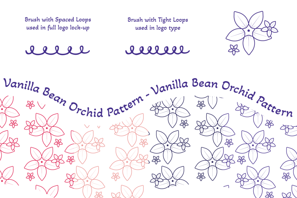
Logotype
The type is a modified script font meant to evoke the feeling of piped icing. It can be used stand-alone with the loopy line as an accent to balance out the space.
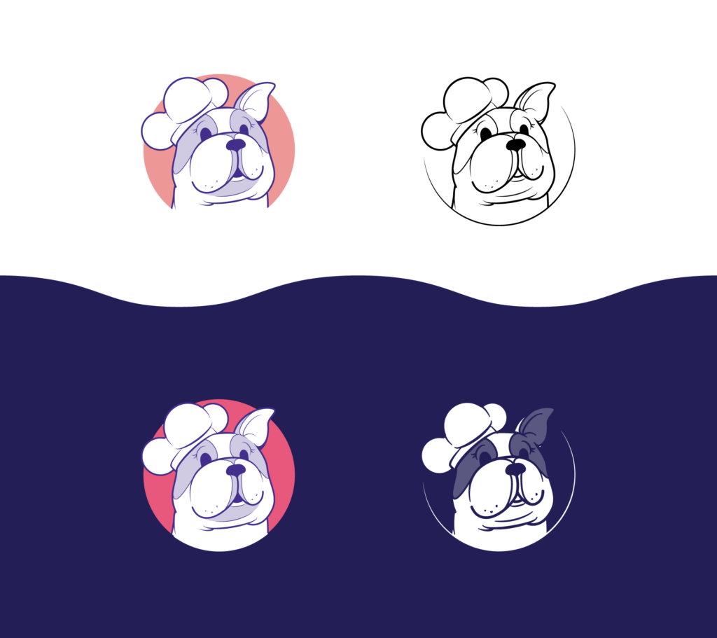
Logomark
The mark is simply the French Bulldog without any text or accenting lines. It would be used in situations where the logo type isn’t needed, because Frenchie’s Vanilla has already been established elsewhere in the design, and/or small designs where the full logo details would be lost.
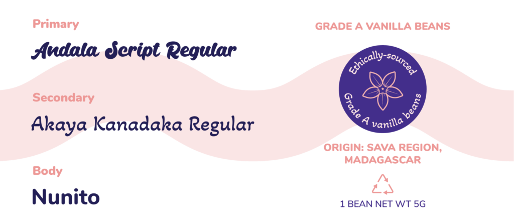
Typography
These are a selection of fonts that accent the modified script font used in the primary logo type. The primary font being the unaltered original script, with the complementary secondary and body fonts to be used in packaging and other branding assets.
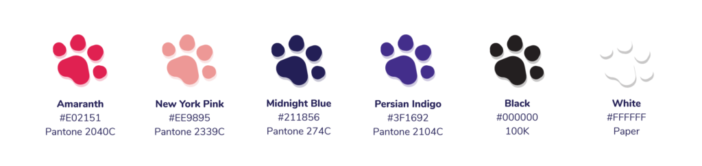
Color Palette
The colors are very bright and reminiscent of the French flag with pink and black accents. They represent the brand personality. The palette can be added to as needed in the future, but should avoid Earth tones.
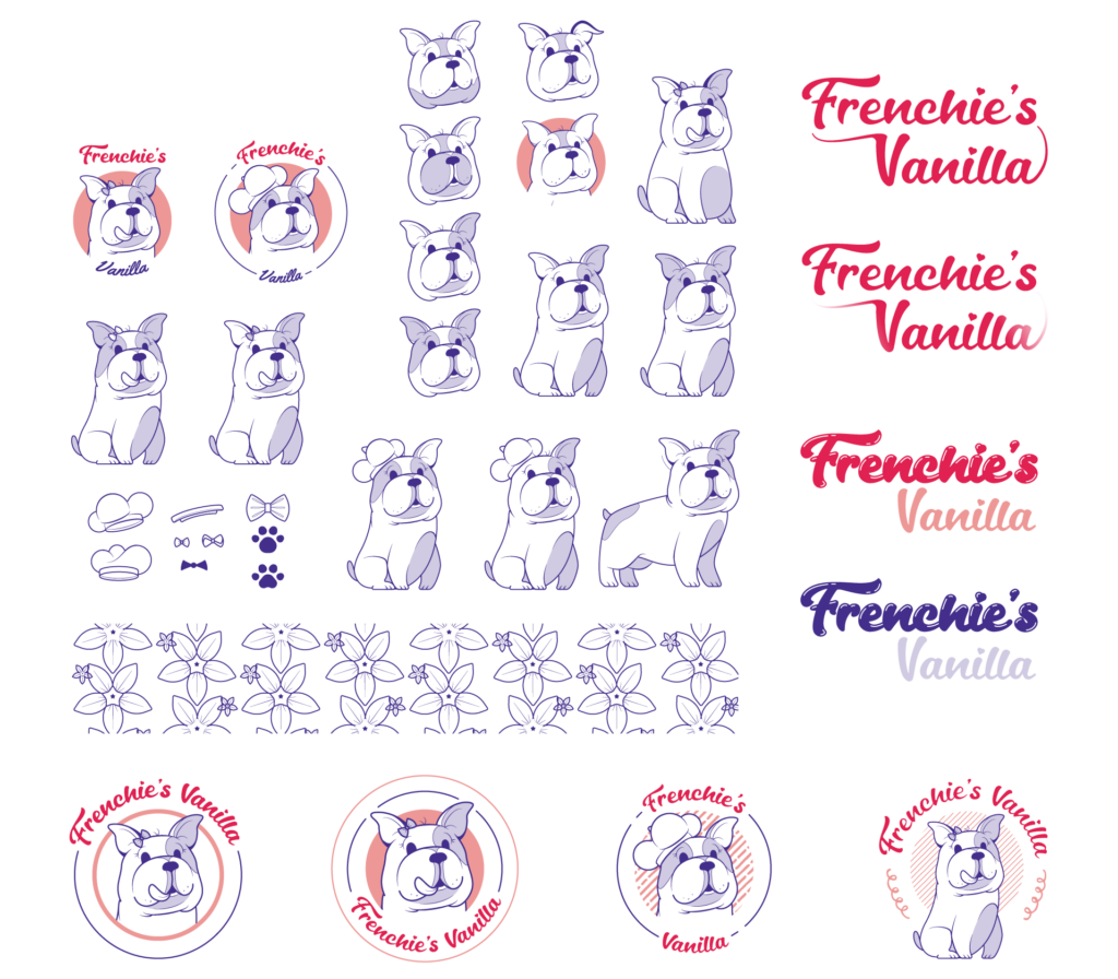
Design Elements
These patterns, accent illustrations, line styles, and miscellaneous iconography help build the visual identity of the brand. These elements combined with the logo, type, and colors, are meant to be used as needed to keep all of the brand ancillaries in a cohesive style.
Mascot
Variations on the French Bulldog that include the full body of the dog with markings, both sitting and standing, with and without the hat on, as well as accessories to add variety and customization as needed. For very small applications, such as website favicons, the chef’s hat or paw print icons can be used.
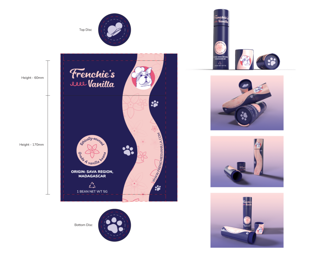
Packaging
Packaging for vanilla beans. 8.5x2in recycled paper tube (die line not to scale). All measurements are in mm and are based on 1.25mm wall thickness. Red – Wrap areas extend background bleeds to edges. Grey – Safe zones keep important design elements within. Product mock-ups created in Adobe Dimension.
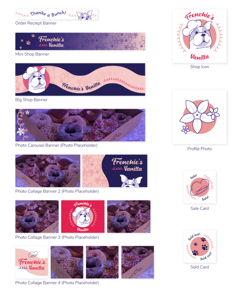
Shop Graphics
A variety of graphic options for the Etsy Shop including: profile avatar, checkout screen, and shop banner variations. The purple photo of donuts used as placeholder was taken by me (obviously).
Watch the replays: Part 1 | Part 2 | Part 3 | Part 4 | Part 5 | Part 6 | Part 7