Another client I’ve worked with in the past took ownership of Geauga Transit and needed a new logo that could also work with their existing brand. This was a quick turnaround project, and was not a full branding and identity project, basically this was a logo project only, using the already established brand elements as a starting point.
Moodboard
We didn’t have time for much research but I did want to provide some context when presenting the logo. These are some of the ideas they wanted visually represented.
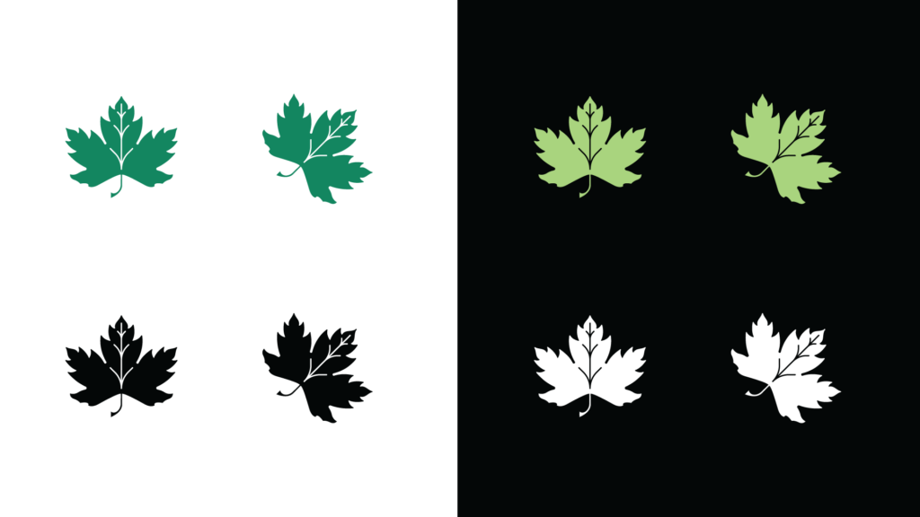
Initial Concepts
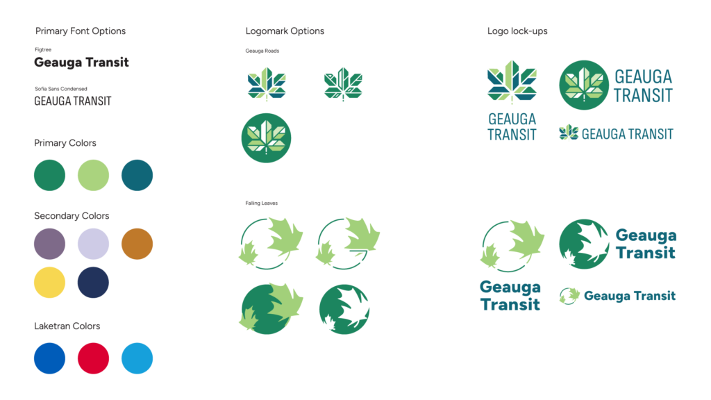
These were the initial concepts I came up with based on feedback from the client. The first concept was more traditional and in line with their existing branding, a more natural looking maple leaf with forward momentum representing progress. The second concept was more modern, I took the geography of the city center, and used the roads to create negative space veins through the maple leaf. I also created a color palette that would work well with their sister brand.
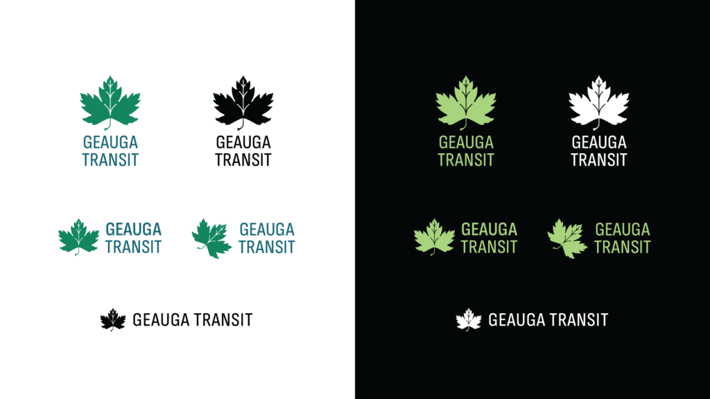
Branding Presentation
After sharing the initial logo concepts, the client asked that I put together a presentation with some changes to the version 1 and 2 logos, that they could present to the Geauga County board for feedback. Version 1 was left unchanged, while version 2 they asked for a more simplified version with a more natural and less geometric style.
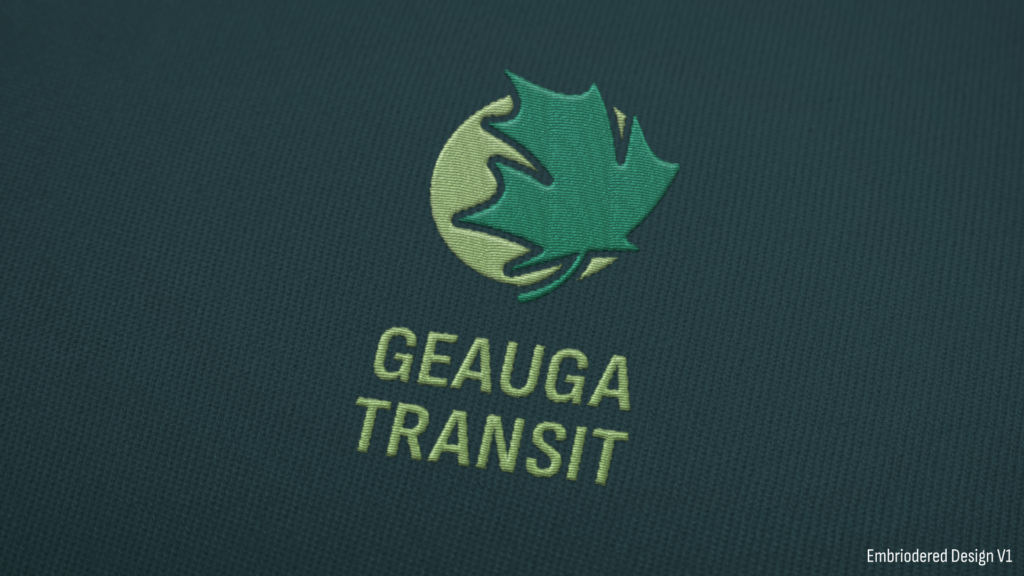
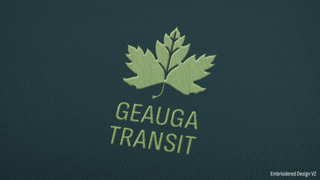
Final Logo
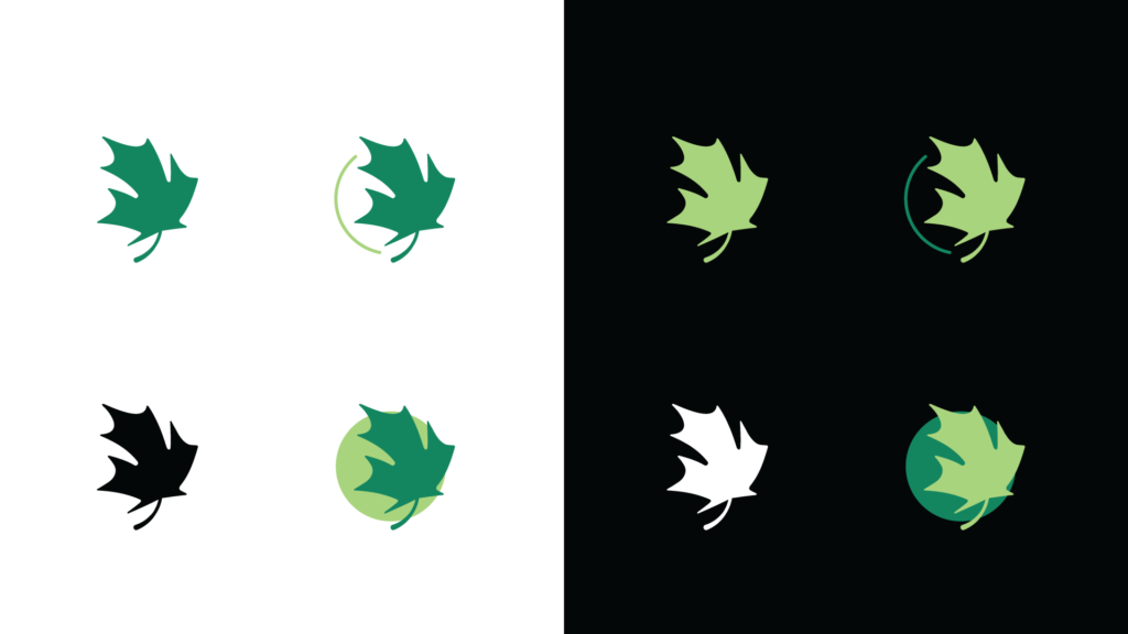
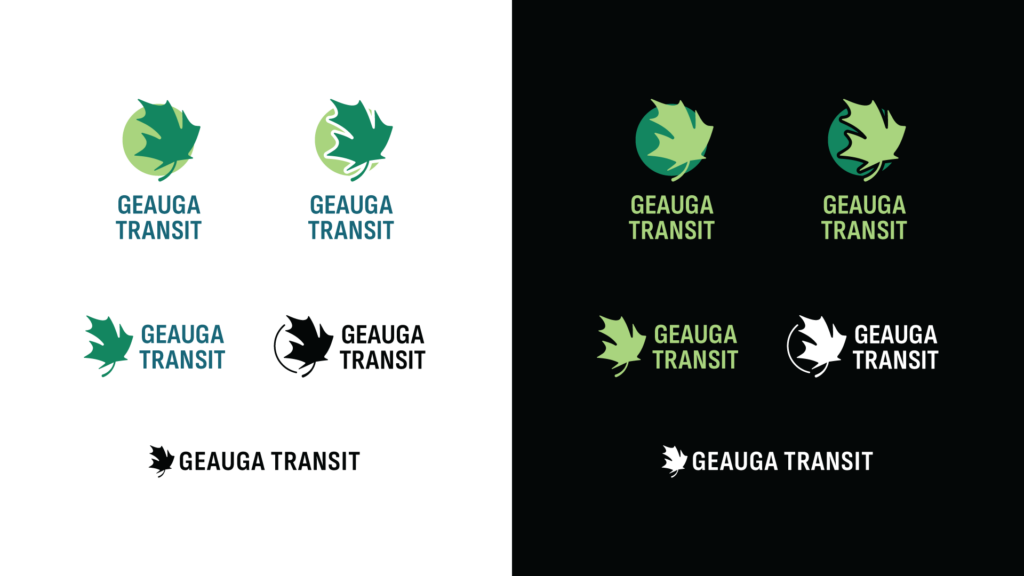
The client ultimately decided to go back to the initial concepts, and go with a modified version of the original Geauga roads concept.
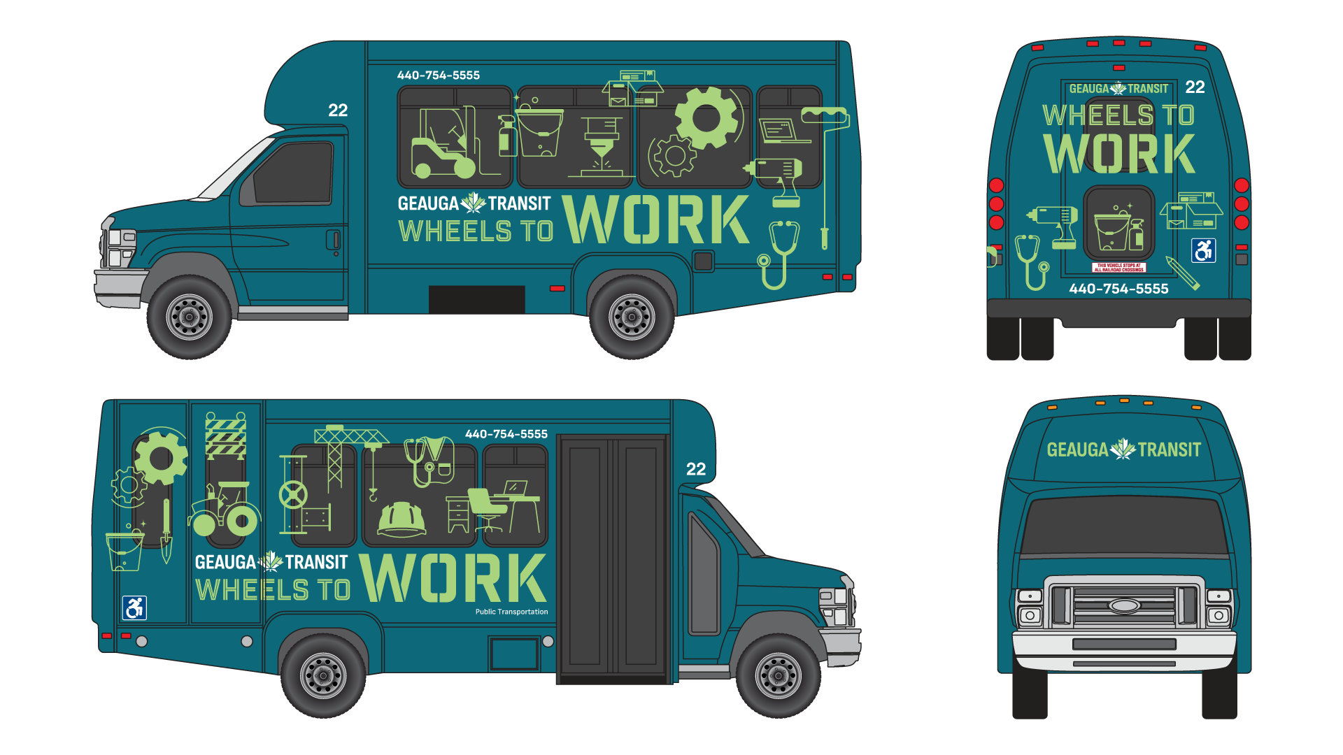
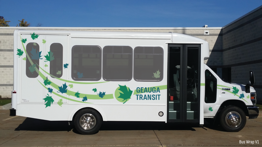
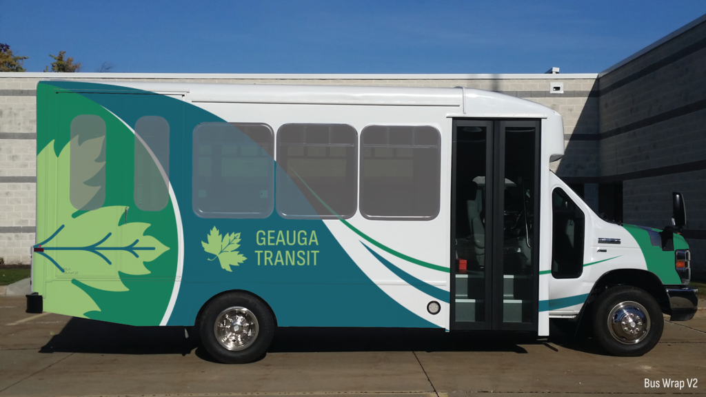
I then created a full bus wrap based on the concept, combining it with imagery that aligned with a marketing campaign targeting their audience in Geauga County.