It always feels like as a designer your brand never get the polished finish of a client project. Even though I really like my brand, I always just added on here or there when I needed another asset or a change. It sat for a long time before I decided to formalize it and share.
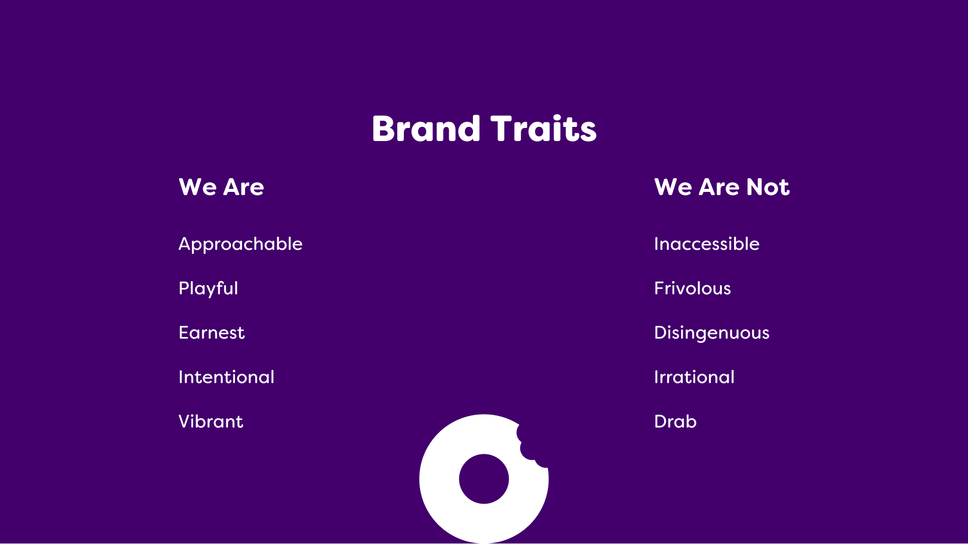
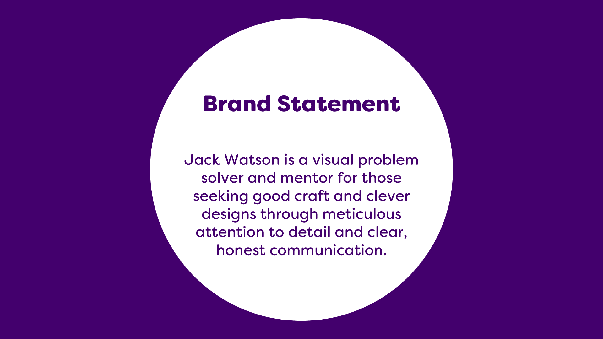
Brand Personality
I standby the importance of listing out your Brand Traits and writing a Brand Statement. With the initial chaos of creating a whole system, and the following years of add-ons and changes, these items serve as pillars to always check your work against.
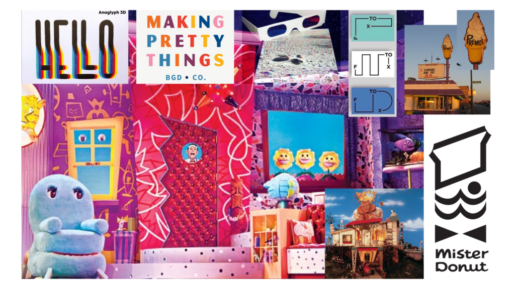
Moodboard
Since this is my personal brand a lot of this is stuff that I just really love and inspires me both visually and emotionally. One thing is for sure looking at all of this I am not afraid of a little color.
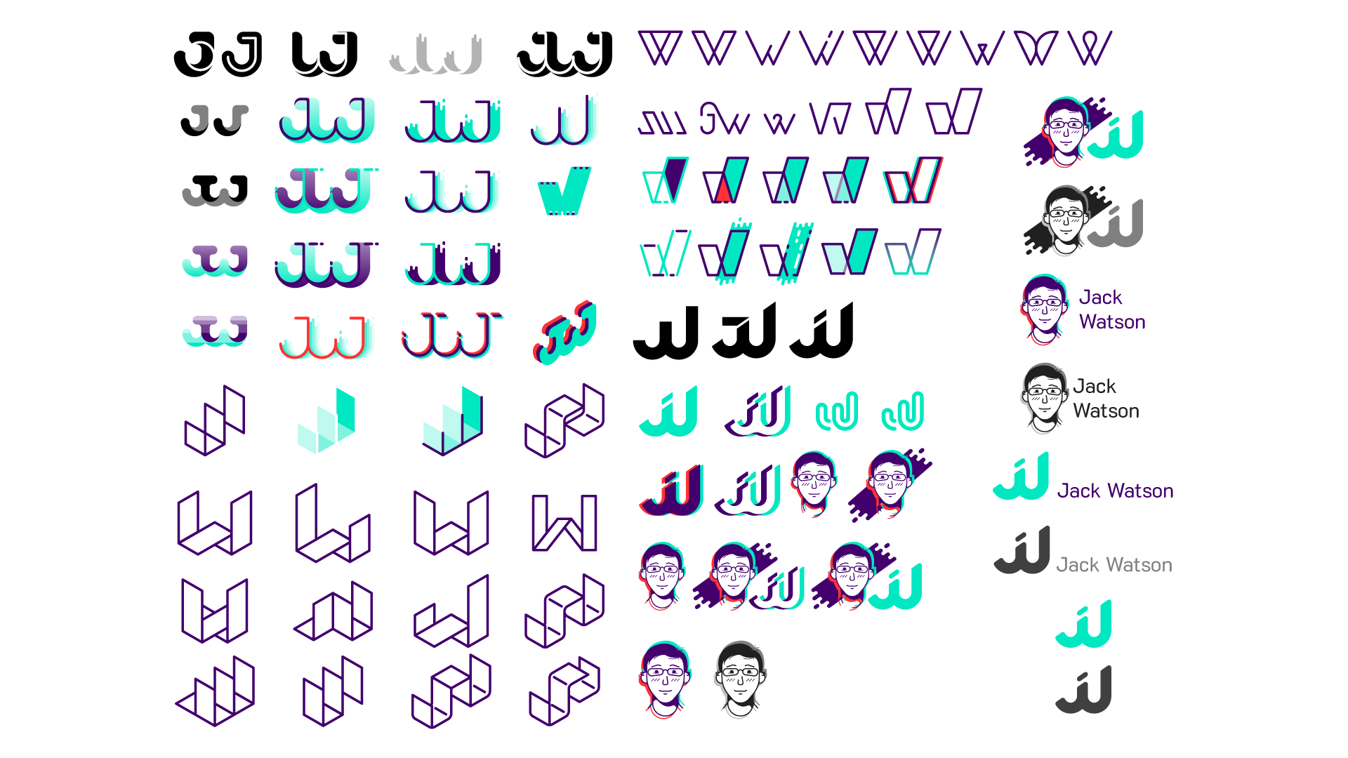
Initial Concepts
I still really like a lot of these, it was tough narrowing it down. Ultimately I decided to stick with the avatar that I had previously created, and use the type explorations as a lettermark.
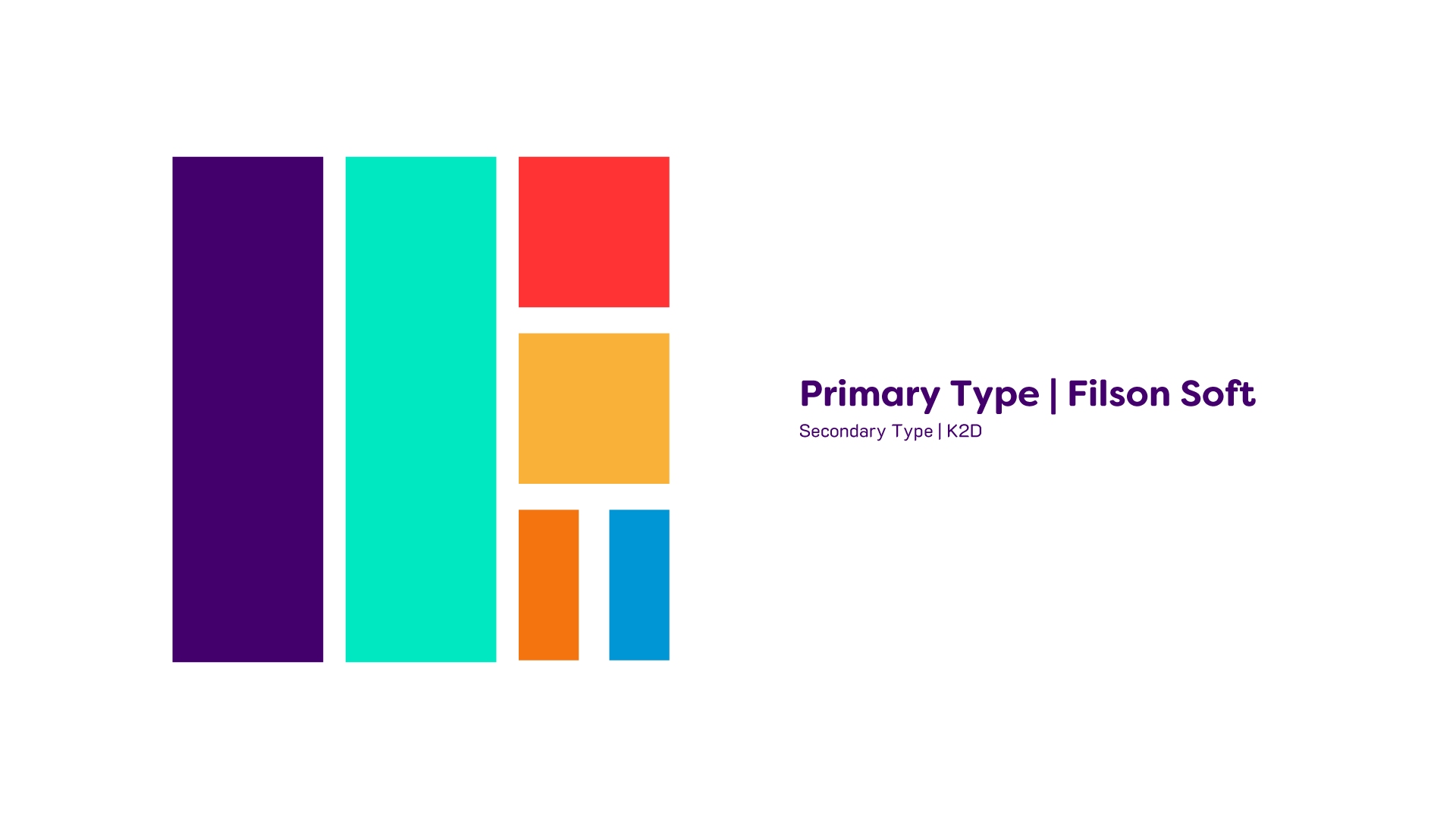
Color and Type
Again these are honestly some of my favorite colors and fonts. I really like Filson Soft as a typeface. I started with the green since I love green and balanced it with a darker contrasting purple. From there I added accent colors that worked with the look and feel I was going for.
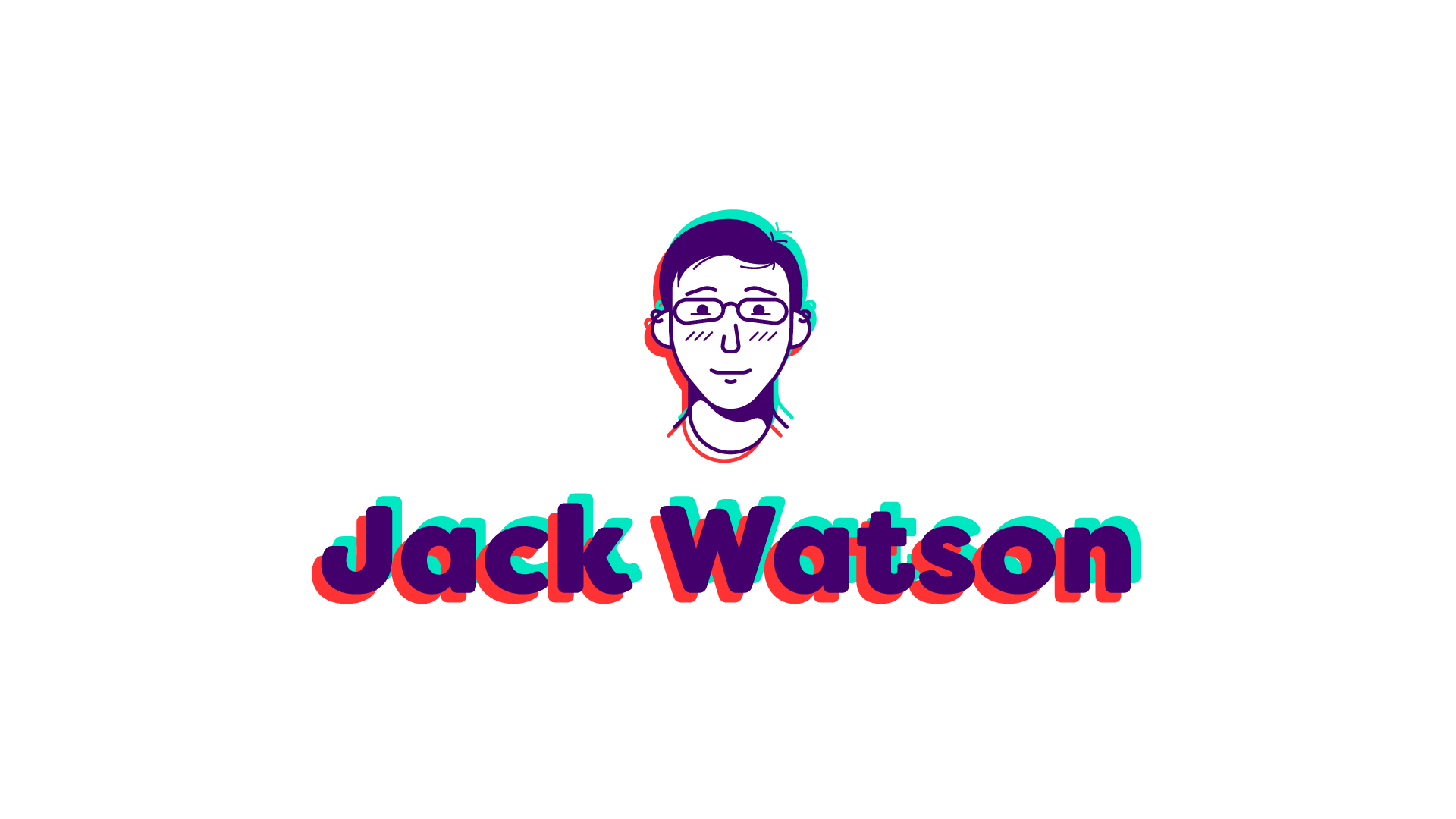
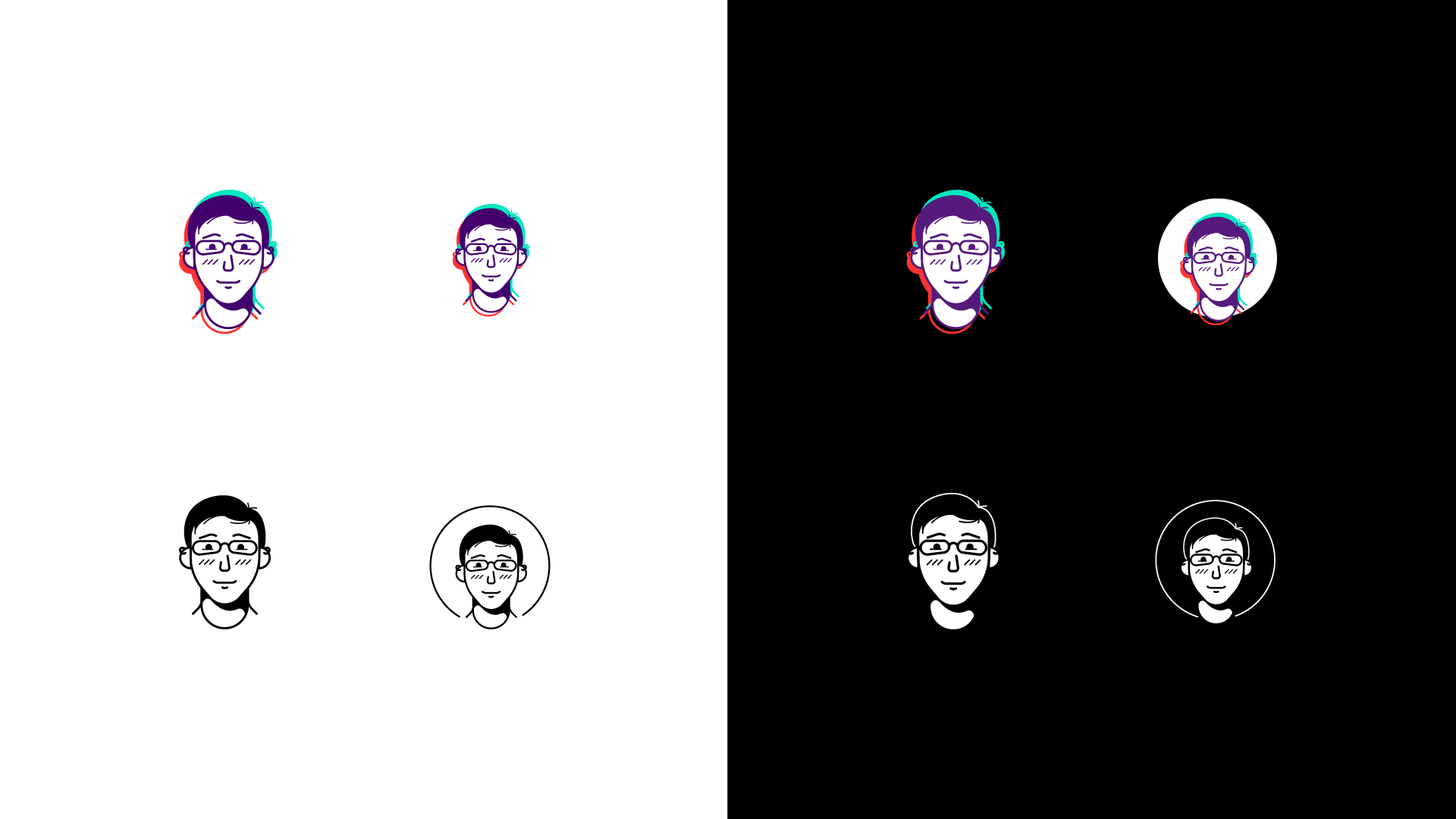
Primary Logo
Over the years I’ve had a lot of people ask how I created my avatar or the 3D anaglyph look but it wasn’t something I thought a lot about at the time. I just created something that had the look and feel I was going for. I really like how the whole thing has a bit of movement and energy.
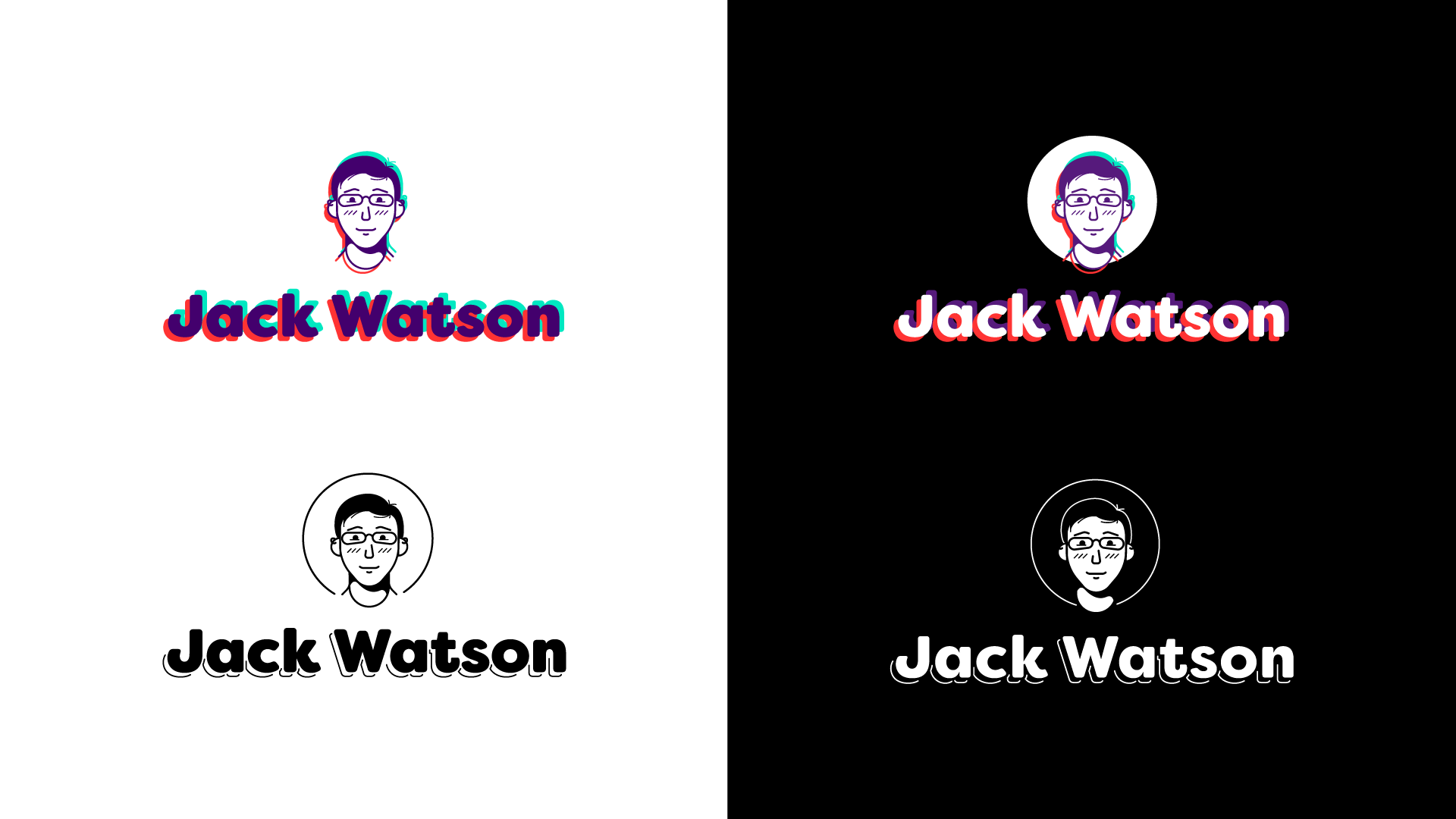
Logomark
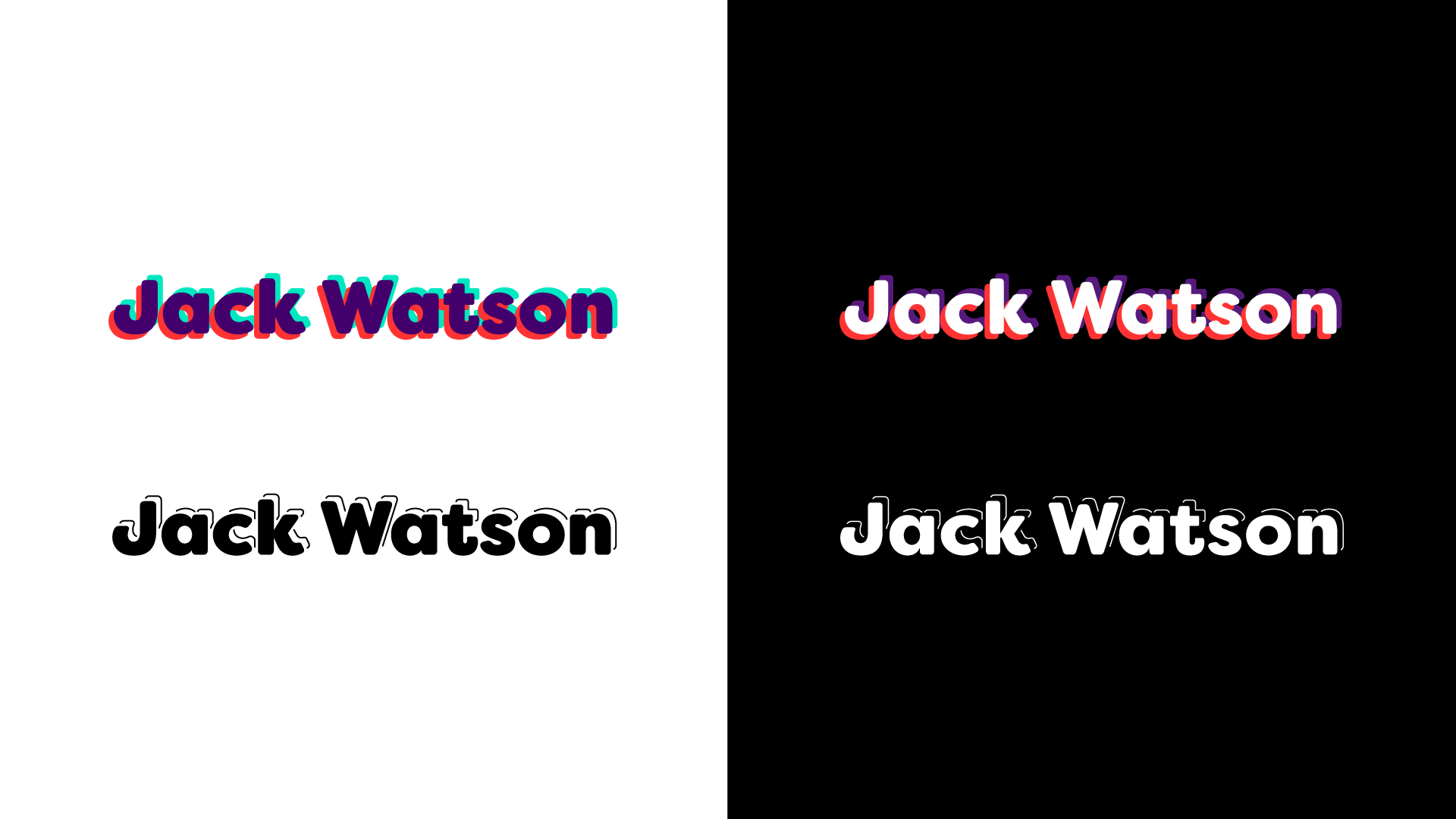
Logotype
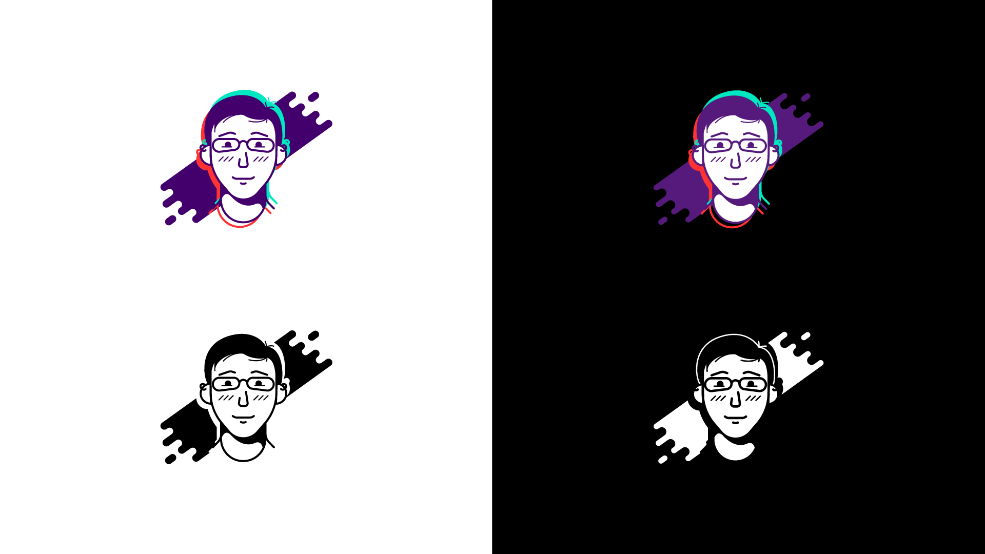
Alternative Logomark
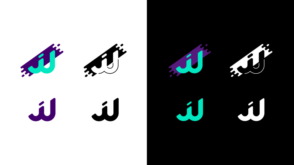
Lettermark
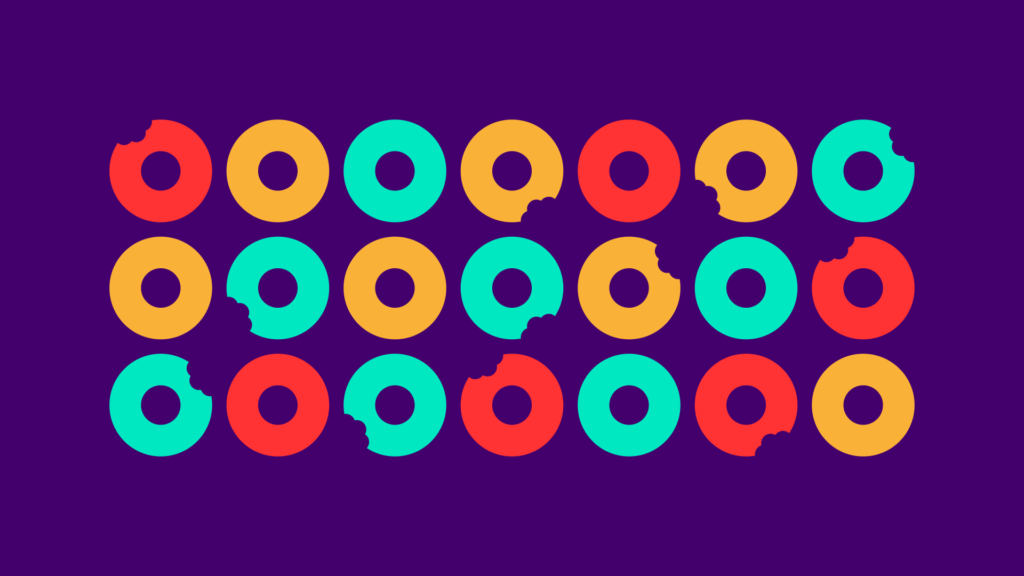
Design Elements
While donuts are a part of my brand, I try to keep a lot of that stuff for my livestreaming. I think of my livestreaming assets for Twitch and YouTube as a sub-brand of my brand. I do however think these little donut silhouettes are a good crossover between the two. They fit naturally with the circular shapes in my brand so I use them often.