Kindred is a freelance project I completed on Behance for the Adobe Firefly Boards team. They reached out looking for folks to create case studies using the app. I immediately knew I wanted to work on a branding project and sent them an overview of the project before getting to work.
Our Name
Kindred reflects our brand values. Leading with kindness. Being similar in kind to our canine companions; our family and friends.
Brand Statement
Kindred is a mobile grooming service for new dog owners providing a private at home fear-free customizable experience.
Our Goals
- Appeal to new pet owners
- Align with a younger audience lifestyle and values
- Adapt well to digital media
- Compete with larger pet brands in a new and niche space
Why Mobile Grooming?
- Mobile grooming popularity on the rise
- No big players dominating this space
- Looking expand beyond brick-and-mortar clientele
- Flexible scheduling
Brand Traits
- Clean and simple
- Playful but not overly cute
- Clever
- Modern
- Calm
- Natural
- High quality
Brand Values
- Kindness
- Trust
- Family
Audience
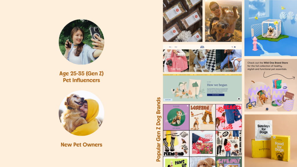
- Largest percentage of new dog owners
- Prefer experiences when shopping
- Wants custom/personal options
- Use social media to find new products
- Prefer TikTok, YouTube, Instagram
- Prefer to shop online
Audience Considerations
- Offer a lifestyle brand that aligns with their values
- Offer sustainable and ethical products
Competitive Analysis
- Earth tones and pastels
- Sans serif display fonts
- Indirect characterization
- Wordmarks
Brand Inspiration
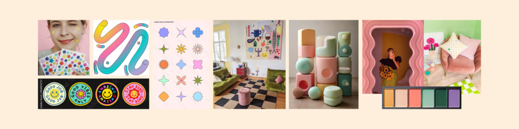
- Fresh, light, fun, should be inviting to the humans
- Geometric patterns and organic shapes
- Maximalist decor
Things to Avoid
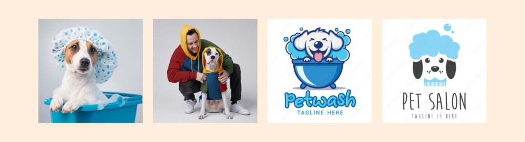
- Overly cute or sweet bath imagery
- Scissors, soap, and blues, feels cold and medical
- Primary colors, used in larger dog brands
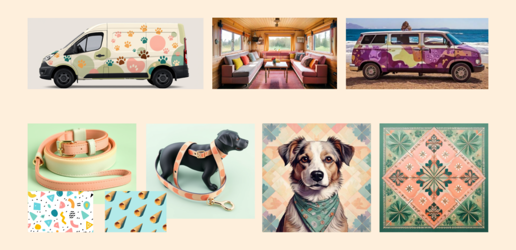
Marketing Content Inspiration
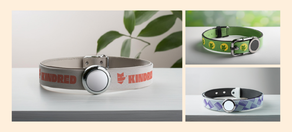
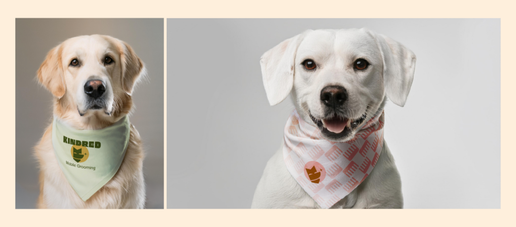
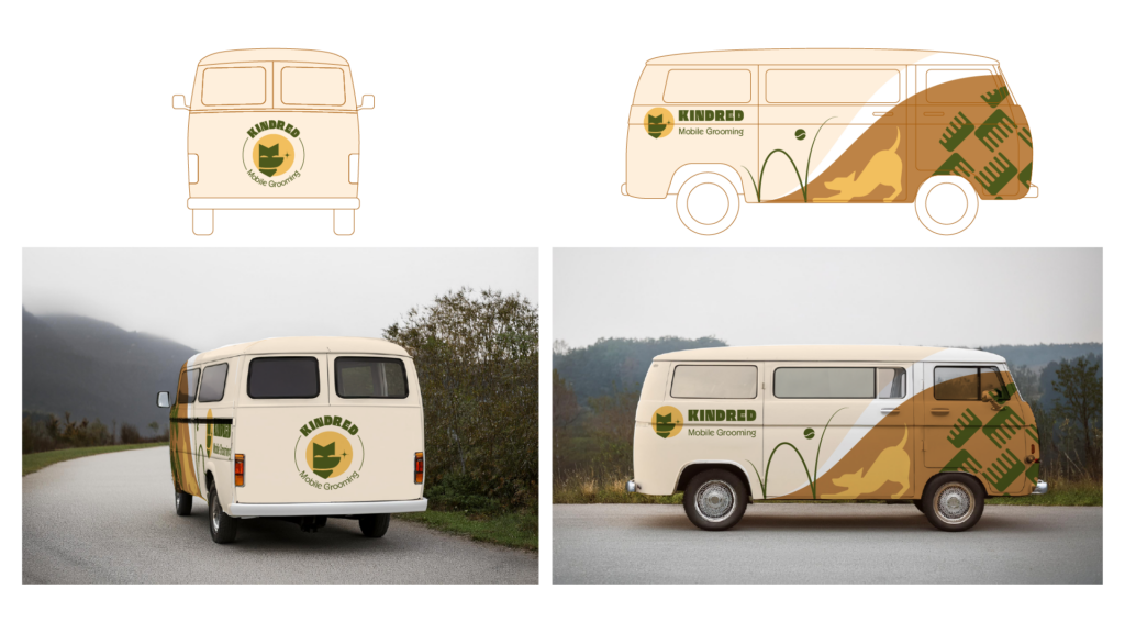
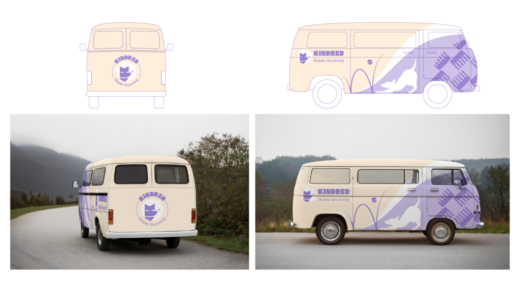
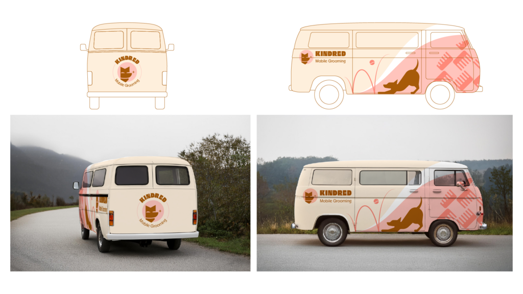
RV/Van life inspired vehicle designs with branded wrap. Marketing products such as bandanas, toys, leash and color, to sent clients home with.
Sketches
After completing the brand research, we felt confident moving into concepts starting with font and color exploration. We knew our audience resonated with wordmarks so that was a logical first step. Originally we though that the comb as the “E” would create a strong word mark but in exploring some of the letter shapes, we found the “K” for one of the fonts made a perfect foundation for the shape of a dog’s face.
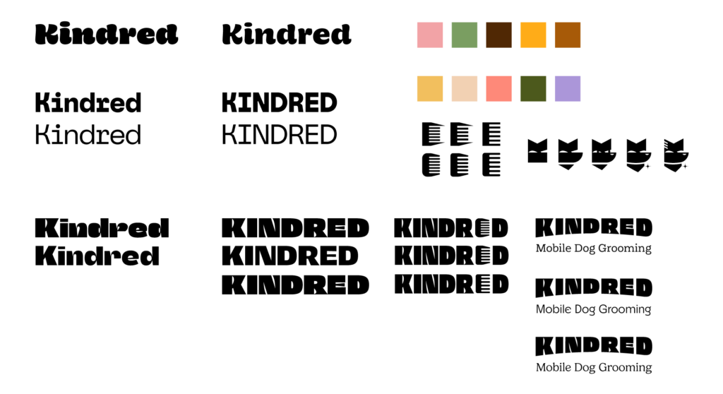
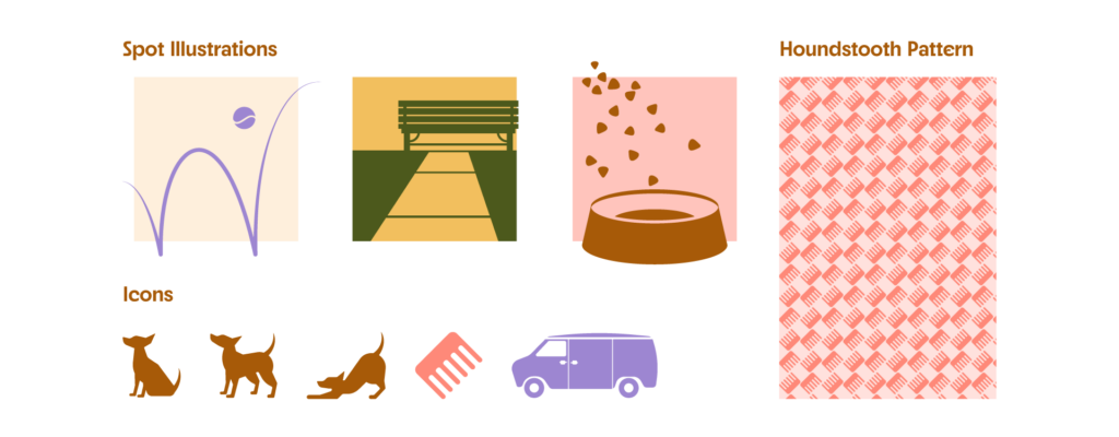
We continued to explore the mark and fonts from the initial round, testing the idea and refining the color palette. At the same time we started taking a look at supporting art and came up with some “day in the life of a dog” spot illustrations that could complement the brand, as well as iconography.
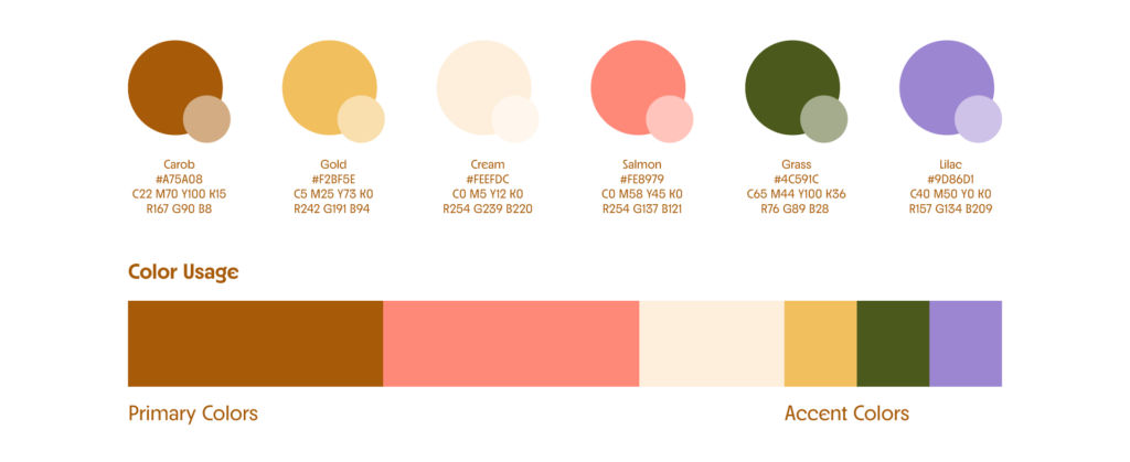
Color
Color palette and fonts friendly and approachable.
Type
Large, bold, quirky display fonts
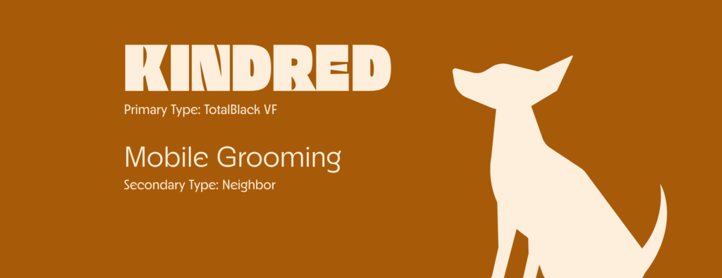
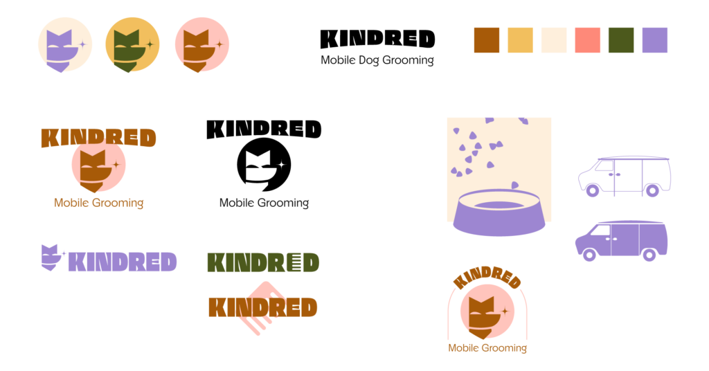
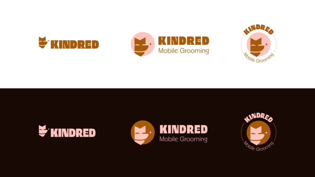
Primary Logo
Logomark
Logotype
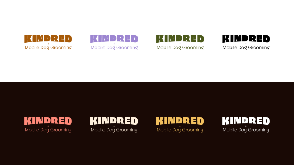
Alternative Logos
Logo Clear Space
Primary logo and variations should have spacing equal to “x” height on all sides.

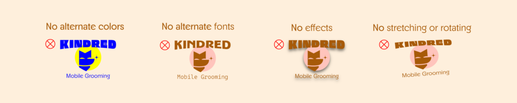
Logo Usage
To keep the branding consistent across all applications, use this guide for what to avoid.
Icon and Art Style
Art to support the brand and build a consistent visual language.
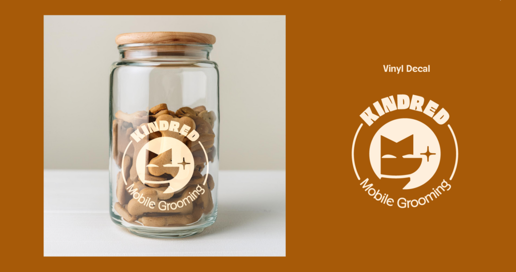
Dog Product Mock-ups
Mobile Grooming Van Mock-ups
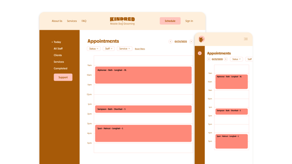
Scheduling App Mock-up