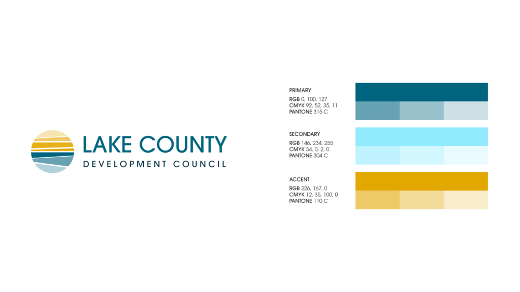
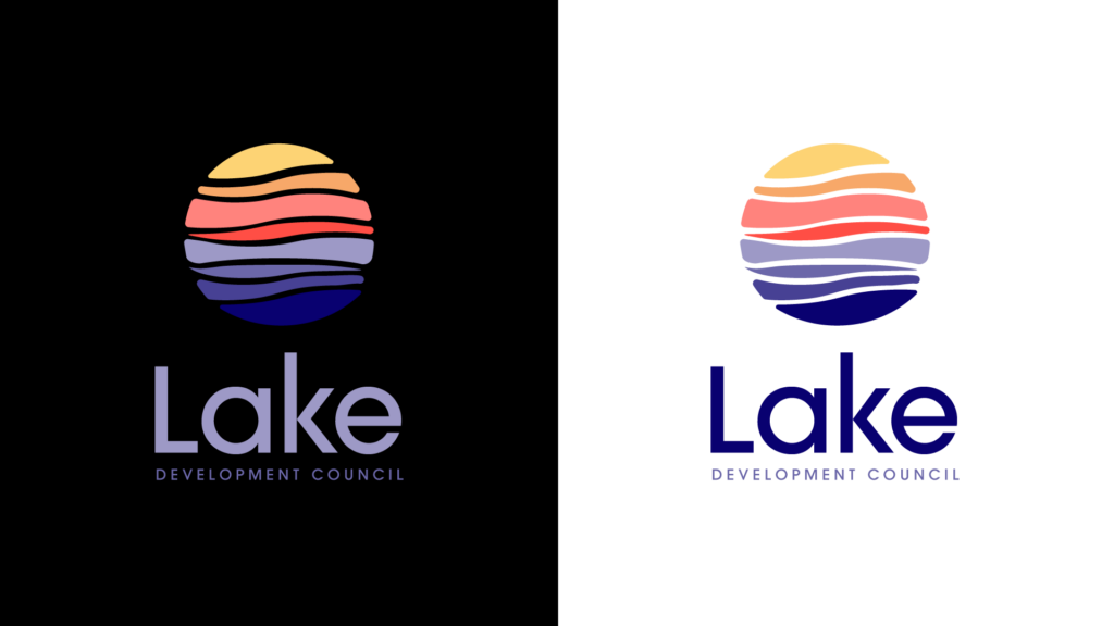
This was a quick turnaround project I did at Blackbird, and basically a logo project, without a full rebrand. This was challenging in the sense that there are so many lake and Lake County brands locally that you really have to think outside of the box to come up with something visually unique to the client. For this one we really leaned into the beach glass concept, that also captures the Ohio flat midwestern landscape.
Initial Concepts
I started with more traditional, obvious imagery and shapes and landed on the sea glass look pretty early on. The client was going back and forth on using the full name or using a shortened version.
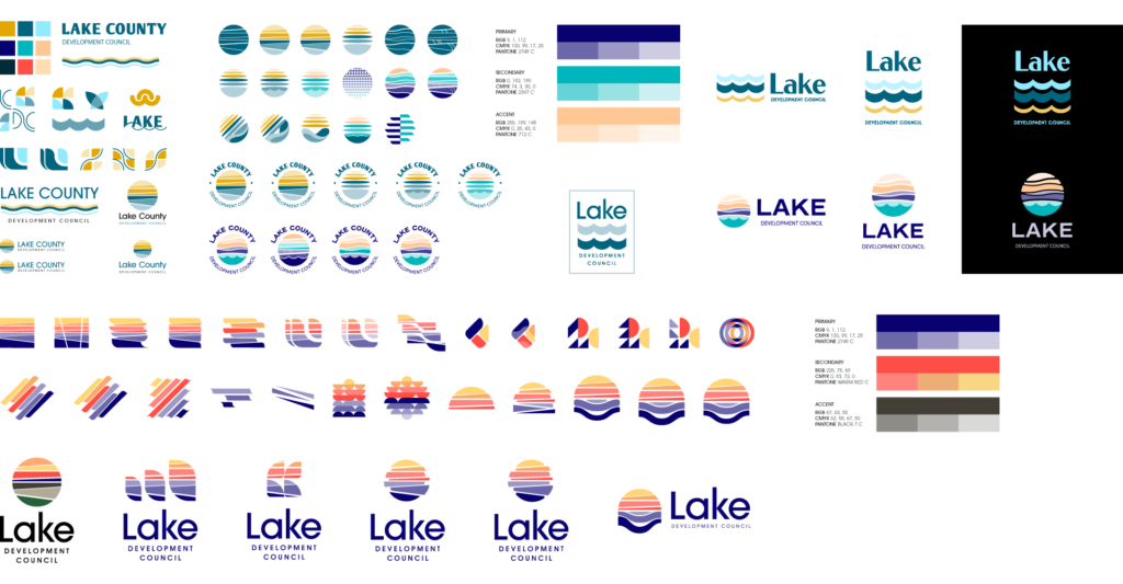
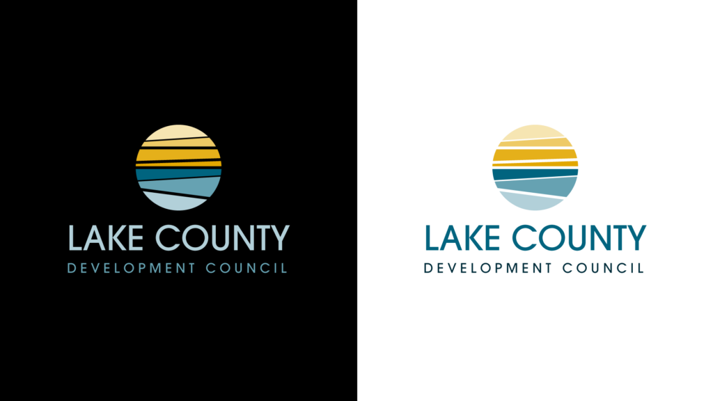
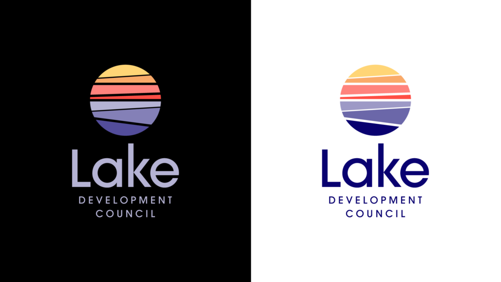
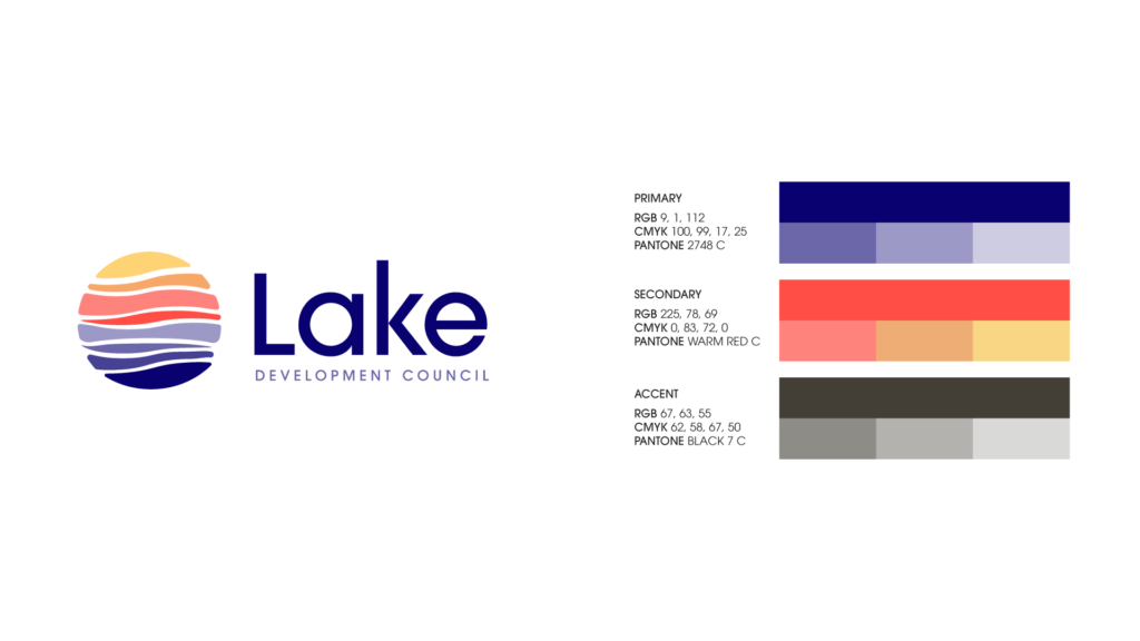
Final Concepts
We shared 3 versions of the logo with the client. They ended up choosing the more geometric look with the purple, orange, and gold color palette.