Opportunity Lake County is a community organization focused on developing the future workforce in Lake County through education, training, and career advancement. They are a sub-brand of Jobs Ohio. This was a new brand that needed to be created from scratch, alongside a brand new website, which was being worked on at the same time. The goal being to grow the workforce in Lake County with young professionals potentially looking to move to the region, to see what features and amenities are available.
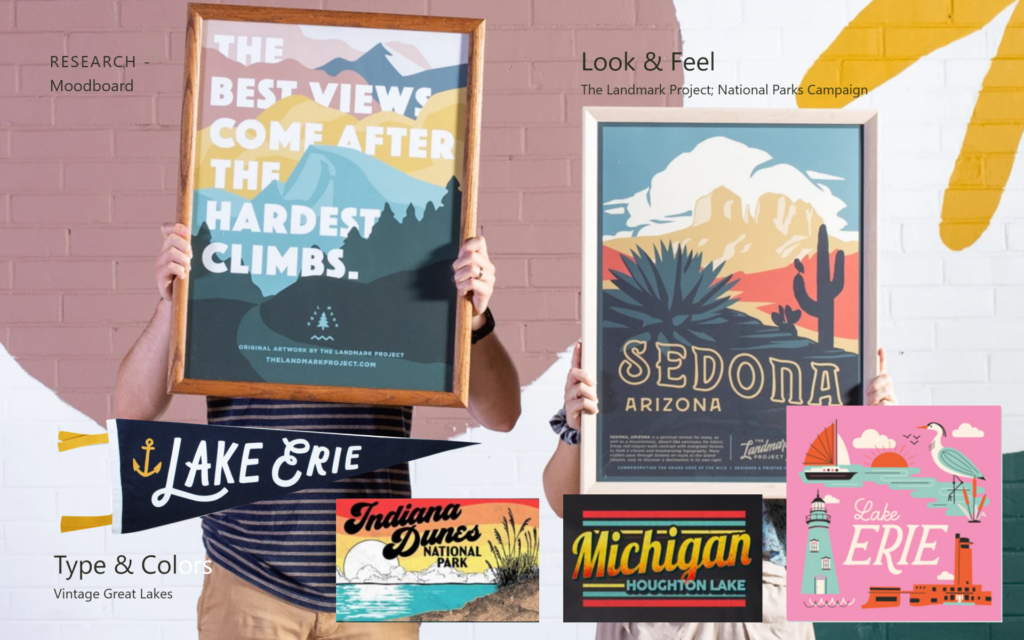
Moodboard
The moodboard for this project was a bit different, it’s paired back and specific to what the client was looking for based on market research of other cities with similar programs. We went with a hyper local vintage Great Lakes feel partially inspired by the Landmark Project National Parks Campaign. The outdoors and the lake were a big focus of the brand.
Research
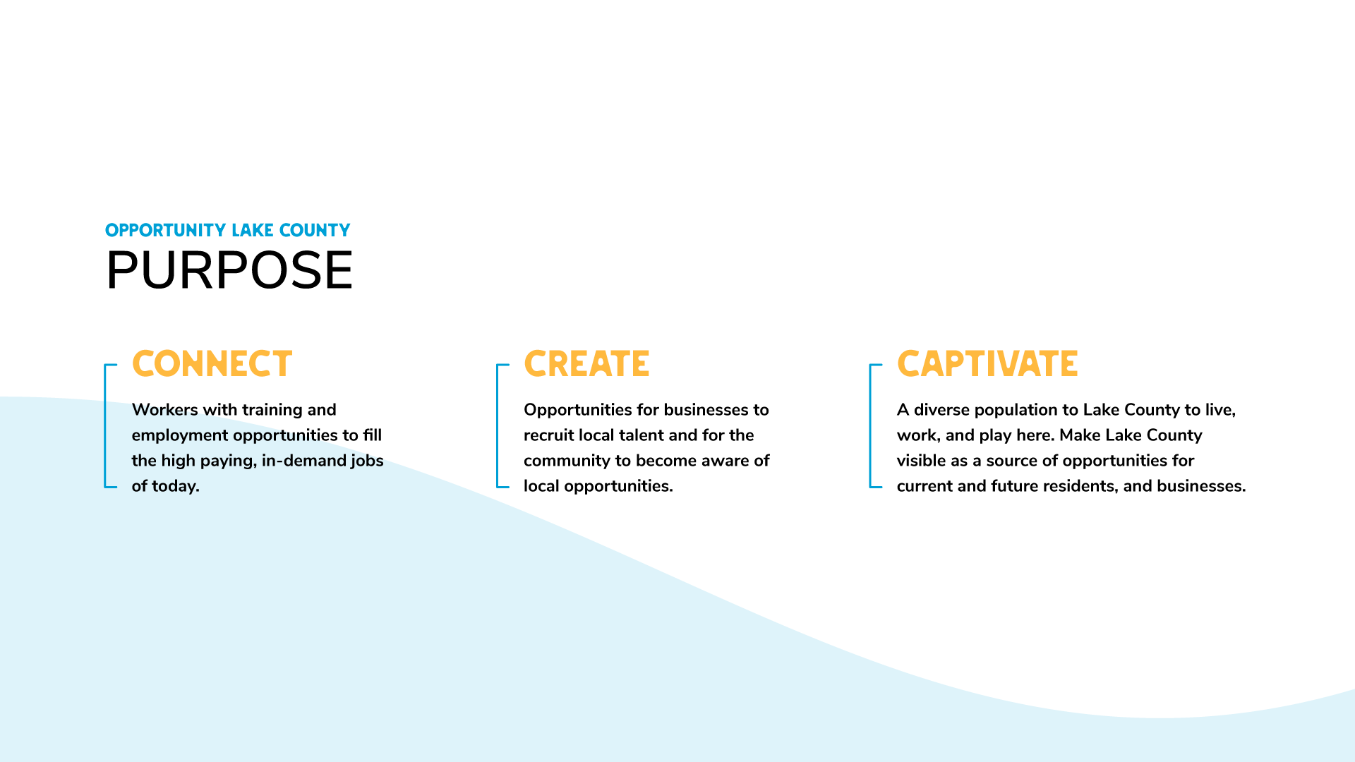
The brand statement was written as the brand’s purpose with three main pillars, connect, create, and captivate, all relating back to the target audience and the goals for the project in some way.
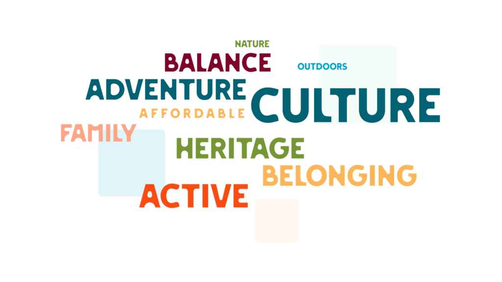
The word cloud encapsulates all of the themes the client wanted to represent with the larger items taking precedence over smaller words. It creates a very visual way to look at the hierarchy to pull imagery and concepts.
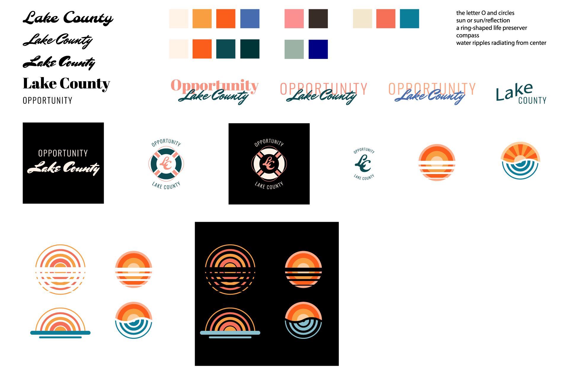
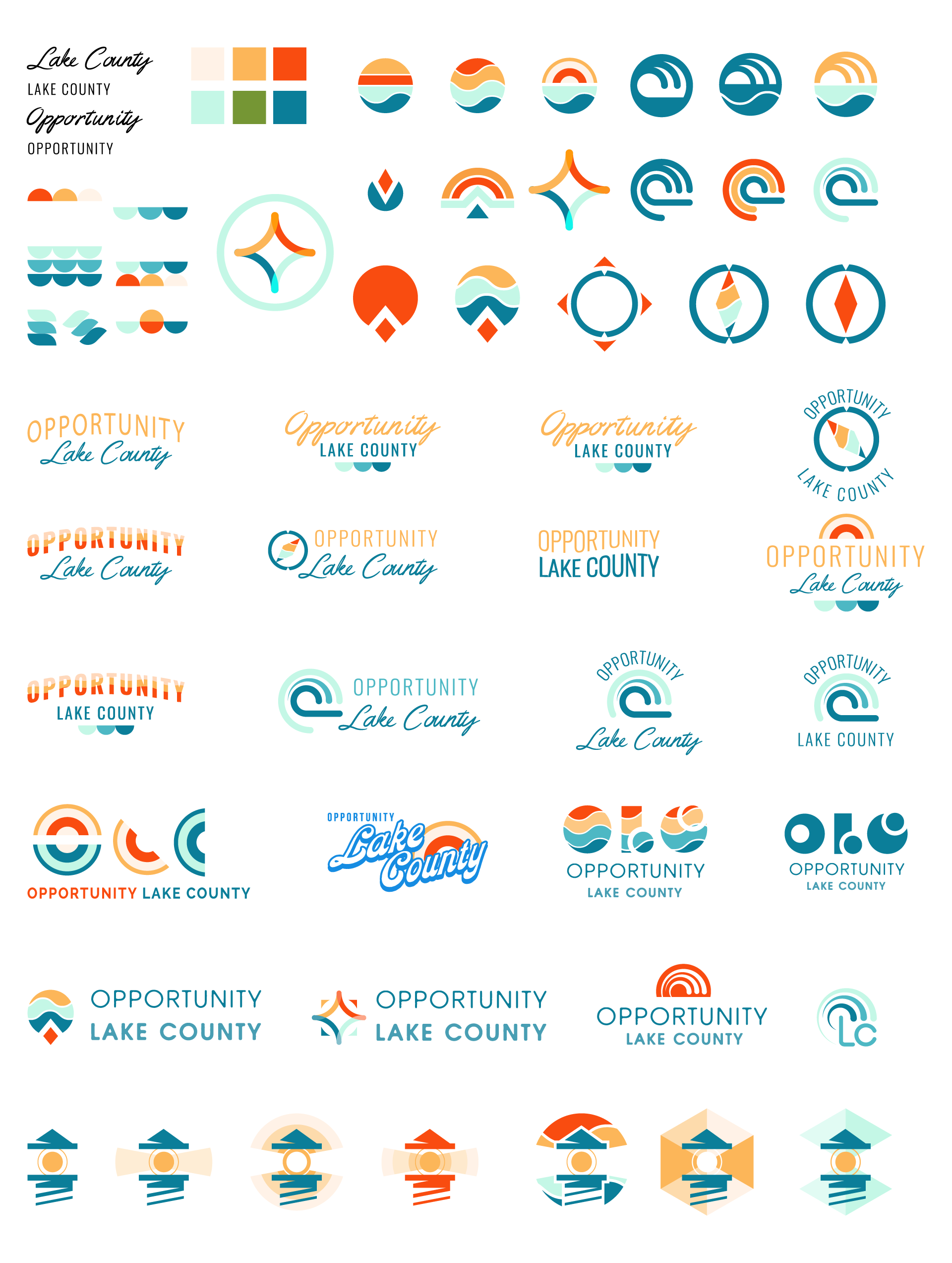
Initial Concepts
There were a ton of concepts explored for this project. The upfront research made it easy to iterate on the specific themes so all of the concepts felt like they could fit for the brand. The saturated earth tone color palette starts to emerge early on.
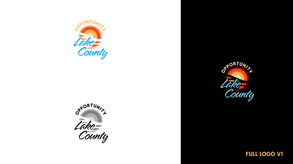
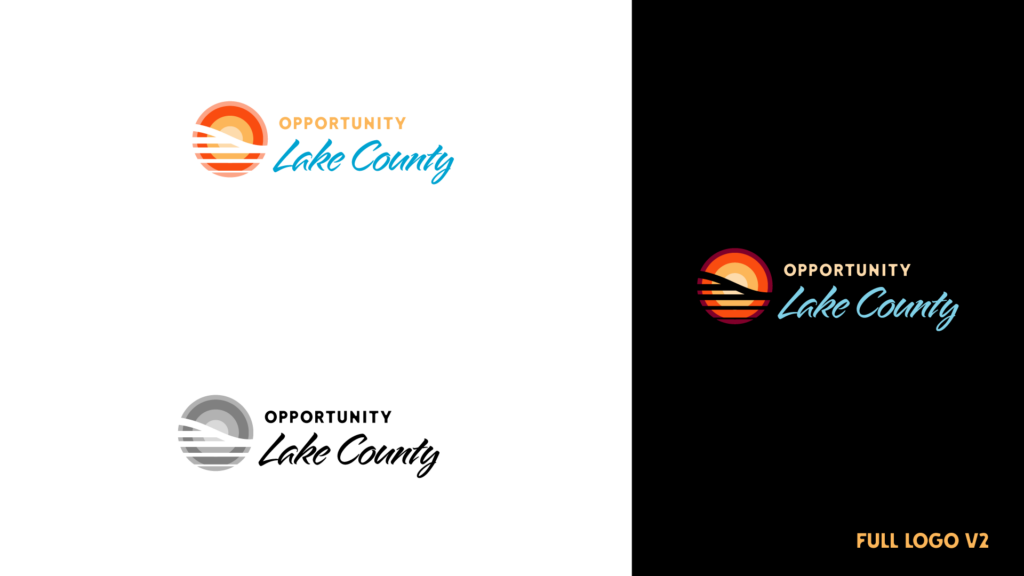
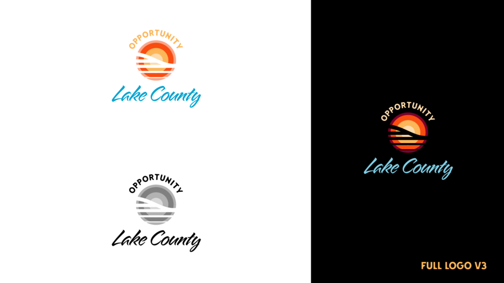
Final Logo
The final logo feels very fresh, but also classic Lake County. The vibrant colors and sans serif type give the brand an optimistic and approachable feel, while the script blue type not only taps into the vintage Great Lakes imagery from the moodboard, but also matches the existing Lake County brand.
Primary Logo Variations
The primary logo being a badge format, we created 3 variations to ensure they had options for different contexts, in one-color, and full color on dark and light backgrounds, with and without the type overlapping the mark.
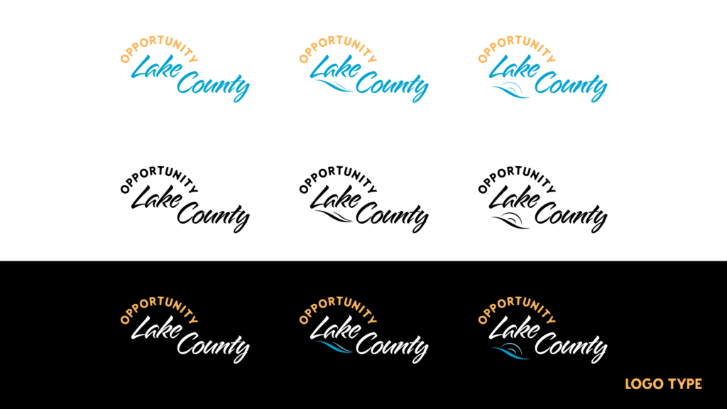
Logotype
The logotype is a bit non-traditional with the addition of the smaller blue waves, this was at the request of the client. It’s a subtle addition that doesn’t take away from the type in this version.
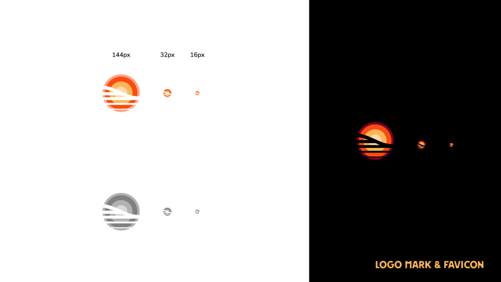
Logomark
The mark was design to read clearly on it’s own at large and small sizes for a website favicon. It works in one-color as a sunset and wave due to the use of the negative space to define the forms. Even at the smallest scale the wave still reads well.
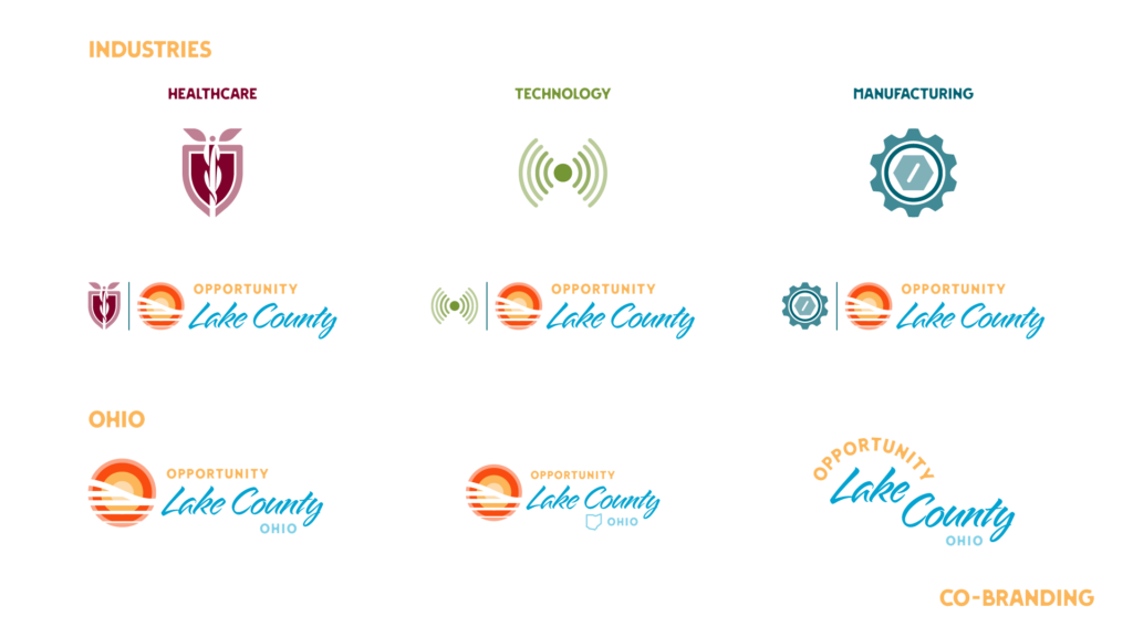
Co-branding
The client requested co-branding for the different industries they were targeting, as well an option to include the location alongside the brand for use outside of Ohio.
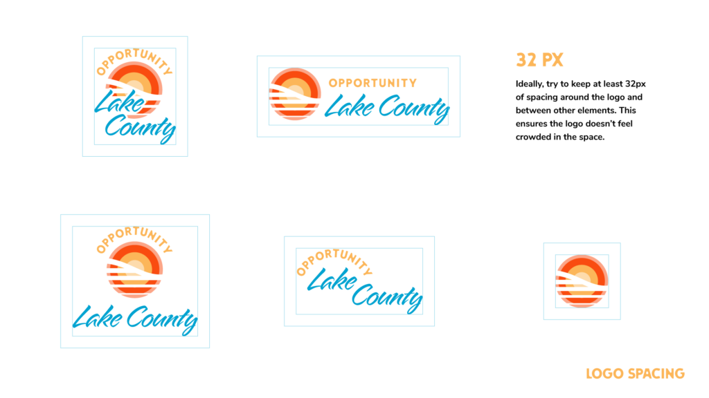
Clear Space
Due to the unique formats of the logo, it was important to provide clear space guidelines for the client for use in brand collateral. These guides ensure good legibility and balance with other elements.
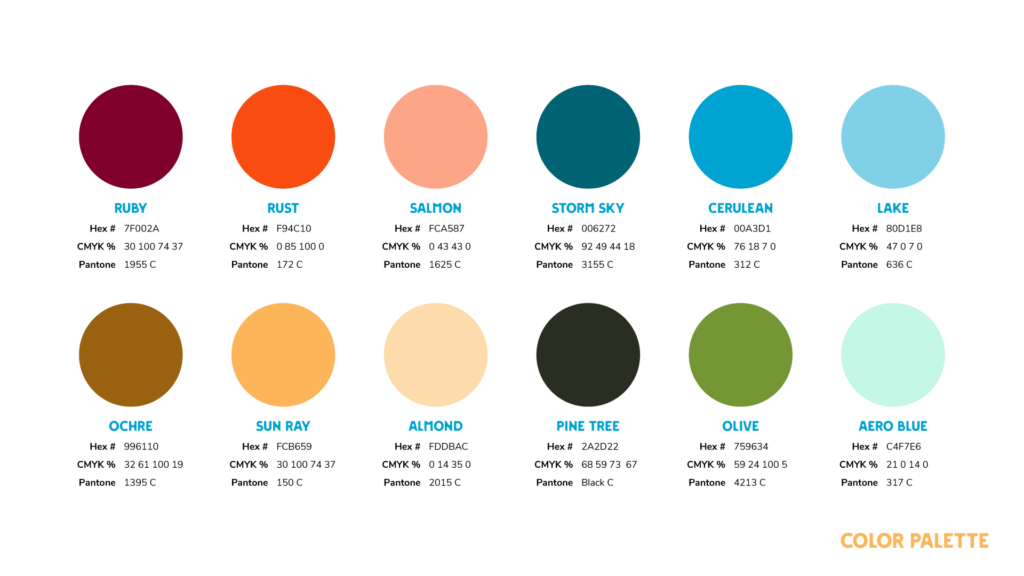
Color Palette
This project has an extensive color palette. We knew we were creating not only the brand but the website as well, so we included colors that would be used to identify sections of the website to create a visual language. Overall I’d call this palette vibrant earth tones.
Typeography
Again because we knew we’d be creating the website as well, the fonts took into consideration the needs there as well. It was a really bold choice to go with a script font for the primary type, but I think it works really well and creates a unique look for the website headers. The sans serif we chose also has a unique look to it with the mix of hard and soft edges, it reminds me of water worn stone.
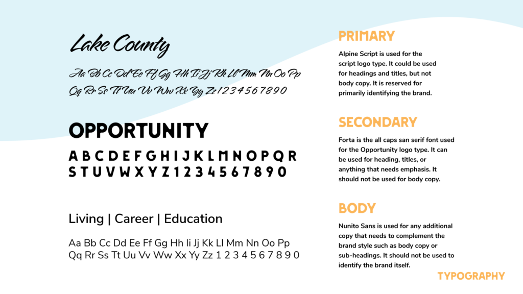
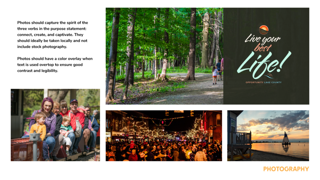
Photo Styles
The client was leaning on us to develop a style for their photography as well. This came into play again when designing the website. You get a taste of what the website would look like with the top right text treatment.
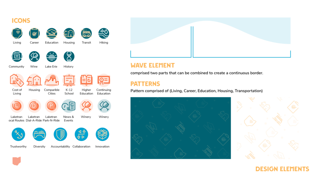
Design Assets
Different sections of the website are color code and have icons in the header as well as patterns made of those icons over blocks of color for body copy. The iconography matches the style of the logomark and co-branding. The wave element was pulled directly from the brand as a background element.