Tanuki Sushi is a personal branding project just for fun, my original inspiration for this was the name. It popped into my head one day and had nice alliteration so I wrote it down for a possible future project, so when I had a chance to live stream on Adobe Live it seemed like a natural fit. There’s crossover in meaning/history between the two words. Together they tell the story of the brand even without visuals.
Moodboard
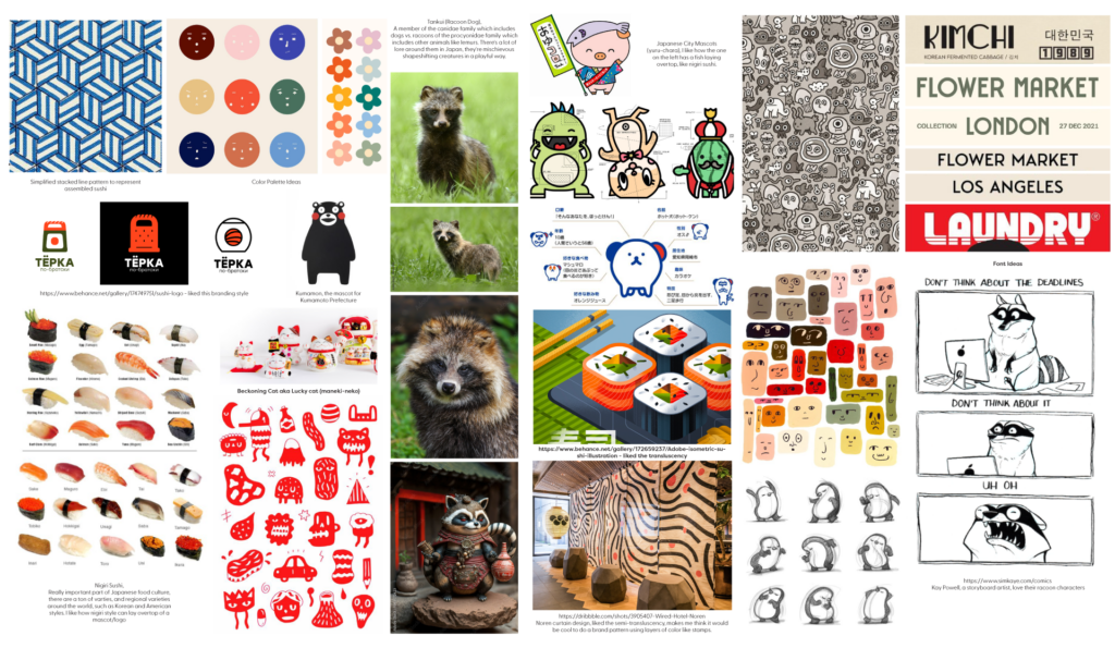
Inspiration
Tanuki, AKA racoon dogs, look similar to racoons, but are actually a member of the canidae family which includes dogs, while American racoons are a member of the procyonidae family which includes other animals like lemurs. They sort of look like little bears. There’s a lot of mythology and lore around them in Japan, they’re mischievous shapeshifting creatures although in a playful way, not mean-spirited.
Sushi, a really important part of Japanese food culture, has a ton of varieties, and regional varieties around the world including Korean and American styles. Similar to Tanuki there’s a lot of tradition and lore, but it’s also a bit playful with elements of surprise, the menu changes depending on what’s available. The mix and match of the textures and colors can be seen in the brand’s elements.
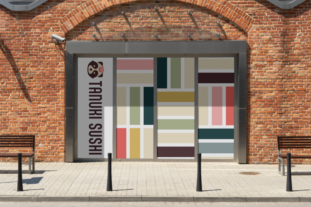
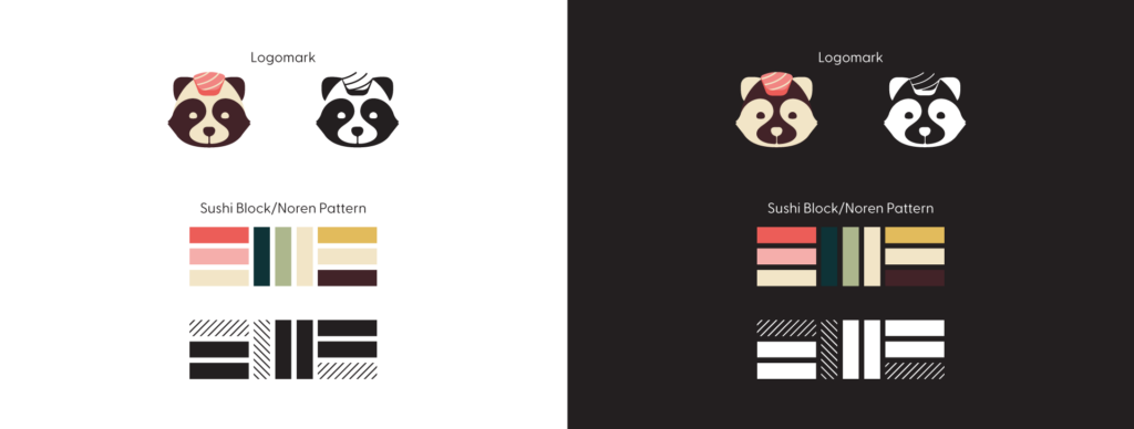
Noren, a fabric banner that hangs at the entrance of sushi establishments, was historically used to wipe hands before personal napkins, usually with the brand displayed. These inspired the block patterns that frame the brand.
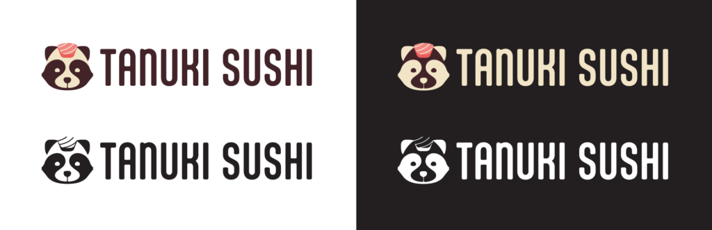
Japanese City Mascots (yuru-chara) and the Beckoning Cat aka Lucky cat (maneki-neko) were inspiration for the characterization and style of the tanuki.
Brand Statement
Tanuki Sushi is a casual restaurant with a foundation in traditional Japanese sushi, that uses fresh local ingredients. The menu is designed seasonally to surprise and delight patrons, depicting the passage of time. Our goal is to provide a high quality sushi experience in an approachable atmosphere.
Brand Characteristics
Playful yet respectful | Mischievous in a friendly way | Surprising and delightful
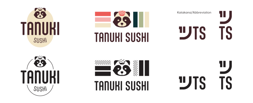
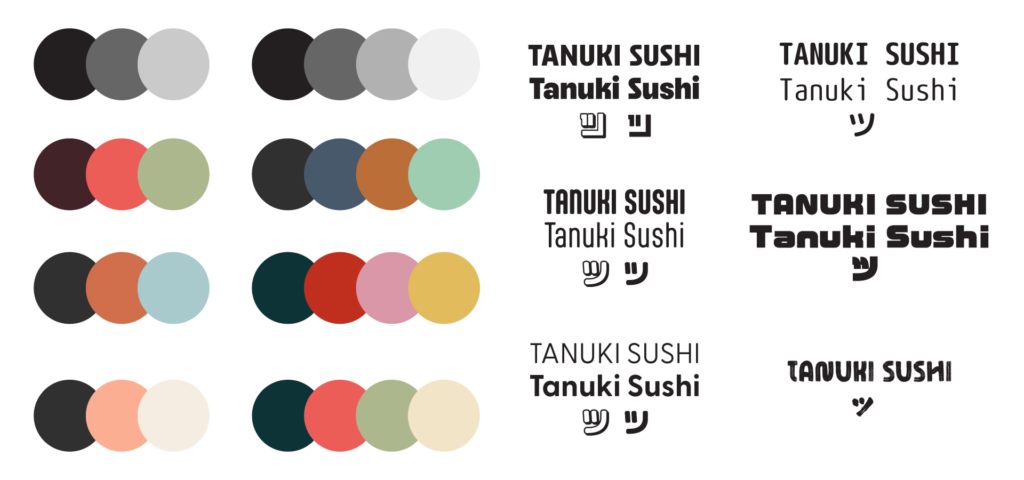
TS ツ
Katakana are phonetic characters used generally to spell foreign words. ツ is pronounced “tsu” which is similar to the abbreviation of the brand name. It’s a little tongue-in-cheek or ironic play on words, mirroring the use since this is an American sushi brand.
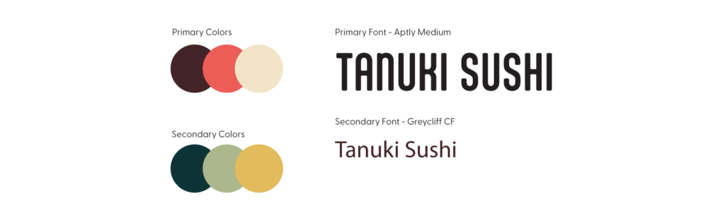
Color Palette & Fonts
Restaurant Mock-up