While at Blackbird I worked on a number of government projects, one of which was a website redesign for Lake County, Ohio. This was another massive website with a ton of information managed by individuals from every single department. There several big challenges with this project, the first being creating department page structure to accommodate a huge variety of department’s needs. We also needed to create a website that felt fresh and modern without altering the existing branding at all. Finally the information needed to be structured in a way that made it easy for a wide range of users to find what they needed.
Research
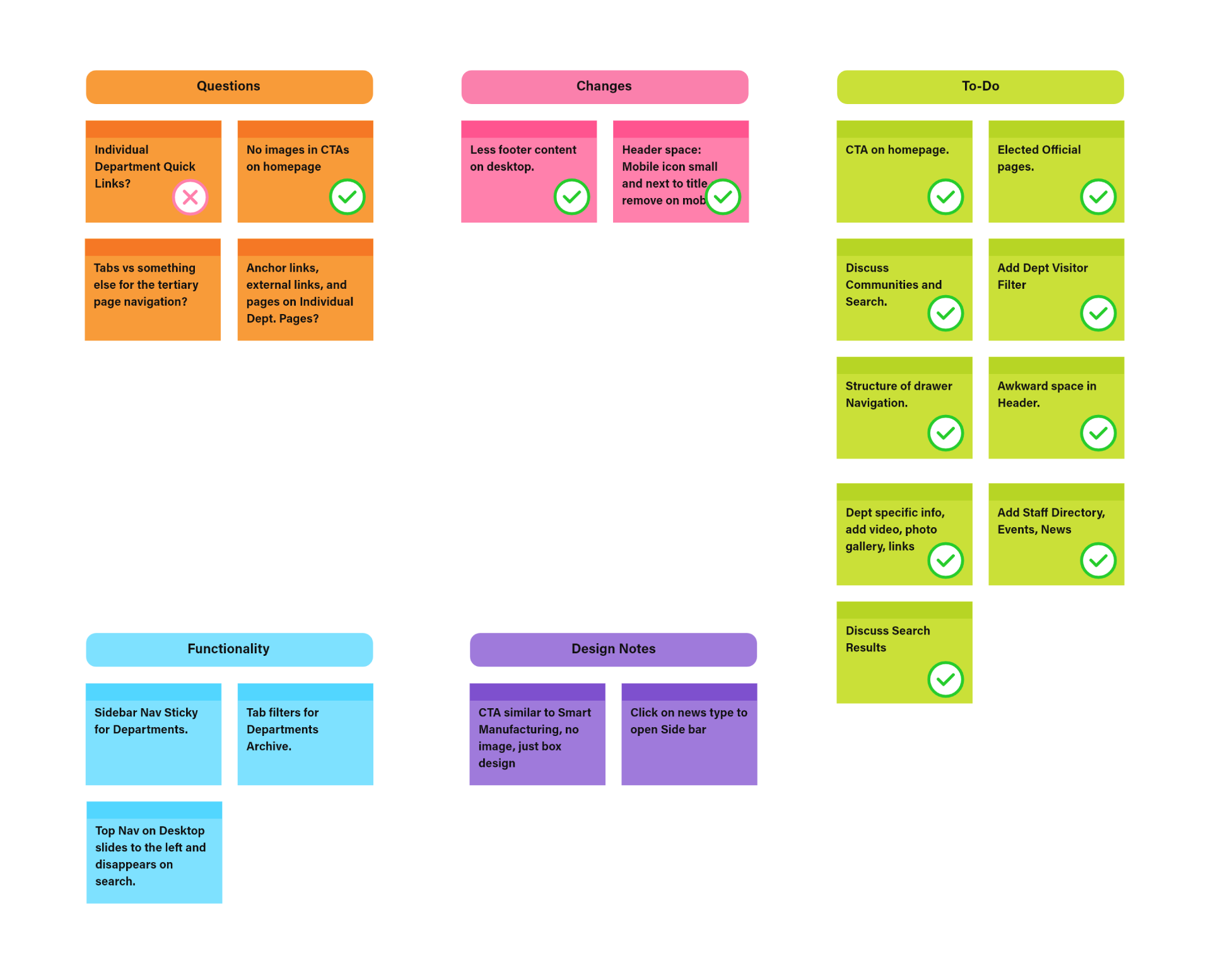
I always like to put together notes based on meetings with the client directly into Adobe XD. Since all team members and the client have access to the file it’s easy to track any design specific notes in a single source. Below is one iteration of the notes.
Wireframes
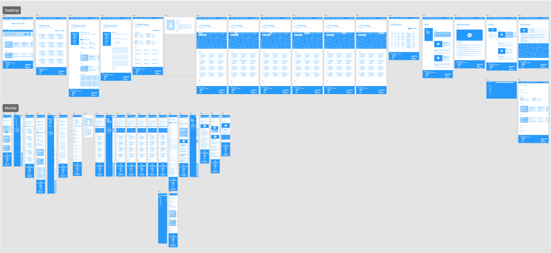
We put together wireframes based on meetings with the clients to determine their various needs. The pages themselves are more generic, and contain a wide variety of blocks that could potentially be used by each department but not necessarily. This was a difficult project to anticipate the needs for current and future individuals who need to maintain the site, update, and change content.
Branding
Heading into design, we knew the client was not updating their branding, however they did not have a vector version of their logo. So we did have to make some changes to create a useable version of their logo that looks identical to their hand drawn one.

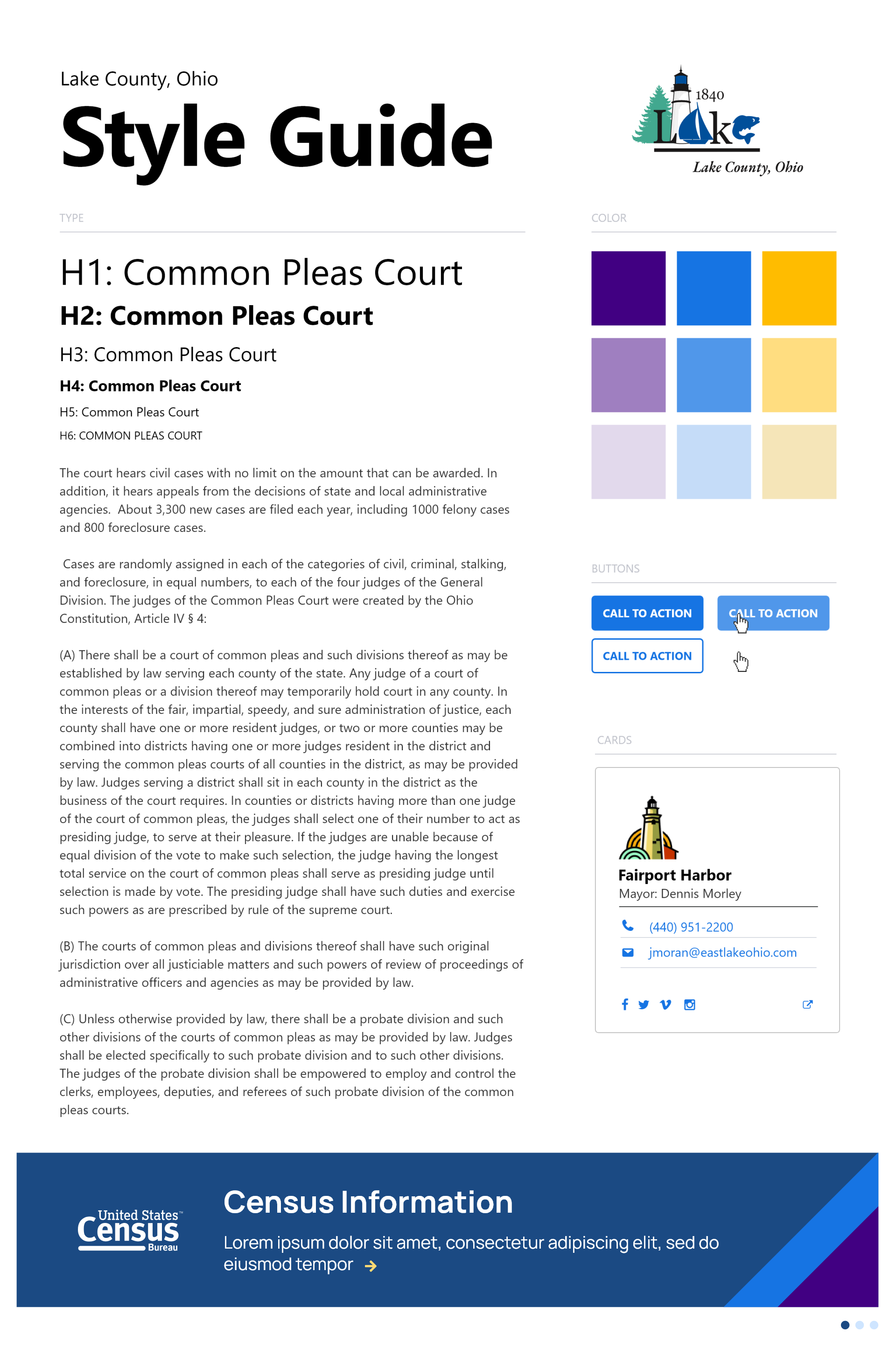
Style Guide
The style guide for the site is pretty straightforward. That being said, this was quite the balancing act. The fonts are all sans serif, and the color palette was expanded from the original branding to create a modern and clean look that still pairs nicely with the brand. We also wanted good contrast and legibility.
Iconography
The iconography is something we did to give the website some personality. They originally did not want any photography in the header images, so we thought this would be a good way to add visual interest and a cohesive look to all of the pages. The icons were created in a grid system to work for each department, as well as altogether as seen on the home page design.
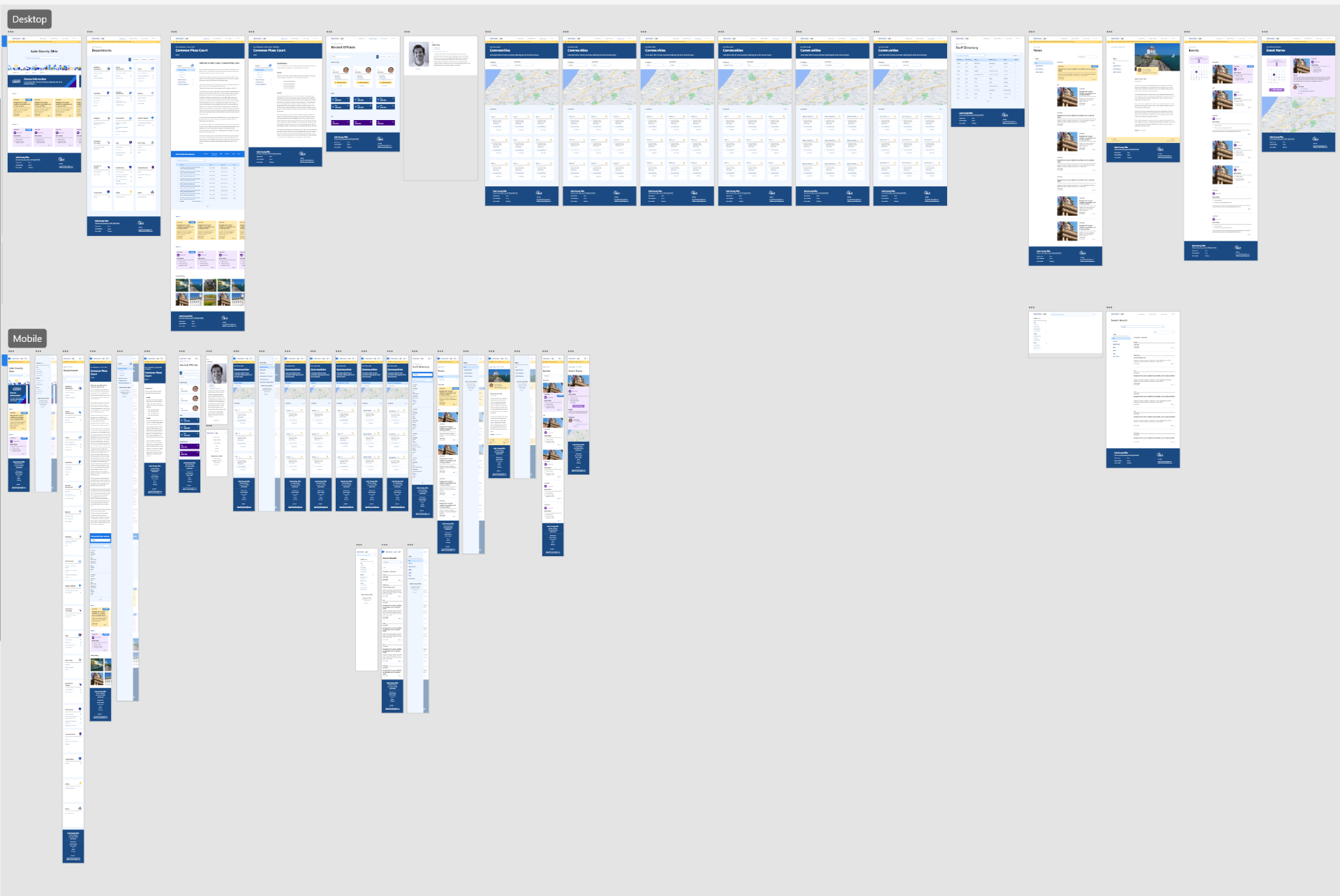
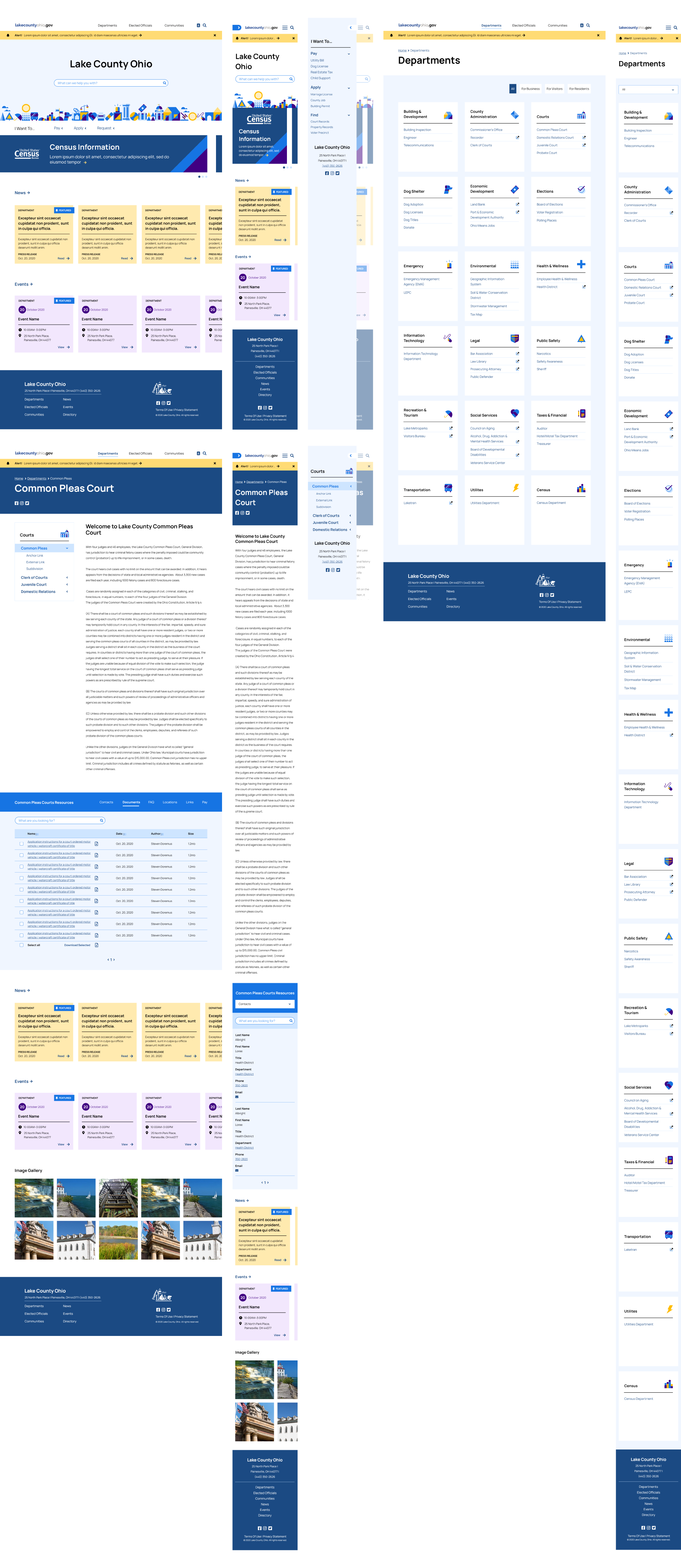
Final Design
The final design came together really nicely, not only visually but with the structure of the new site. The department pages have their own menu to accommodate more or less sub-pages depending on individual needs. We also added a home page call to action directing users to choose the action they’re looking to complete.