Positive Peers is an app created and maintained by MetroHealth for HIV positive youth to connect with resources, healthcare providers, and young people with similar experiences to ideally improve health outcomes for those individuals. Between 2021-2022 while working at Blackbird, I embarked on a redesign for the app, a version 2.0. We evaluated what was working, what wasn’t working, what was needed, and how to implement these features in a way that respected the framework that was already built. One big goal of the redesign was to allow more flexibility as the app grows.
Health Score Redesign 2021
The initial step of the project was redesigning the health score system. This was an important element from the initial project that was never fully realized due to other features needing to take priority to create a fully functioning app. The health score redesign was one factor that sparked the decision to redesign the app, along with the app itself reaching its current end of life state from the existing code.
Audit of Existing App
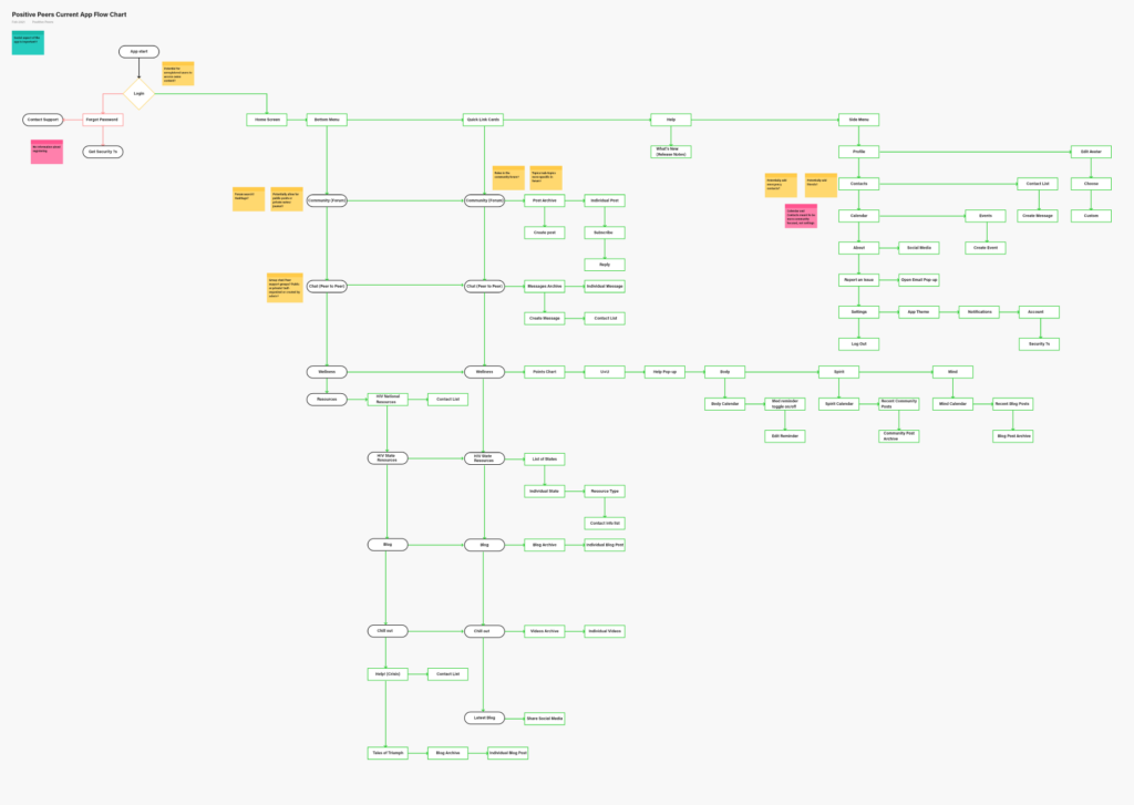
The first step in the process was to audit the existing app structure and user flow, and create an updated flow for the client and their stakeholders to review and compare.
Card Sort
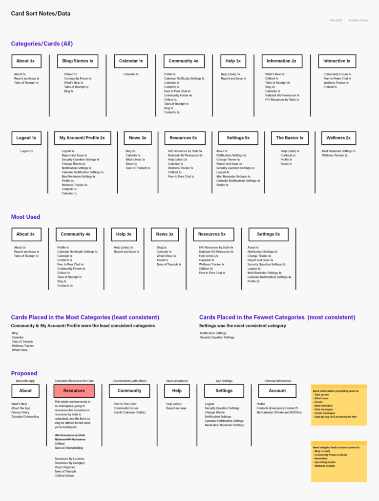
We used a card sort with the team and stakeholders in conjunction with the original site map, and compiled the results into a document for the team to review. We based the updated site map on the information gathered during the card sort.
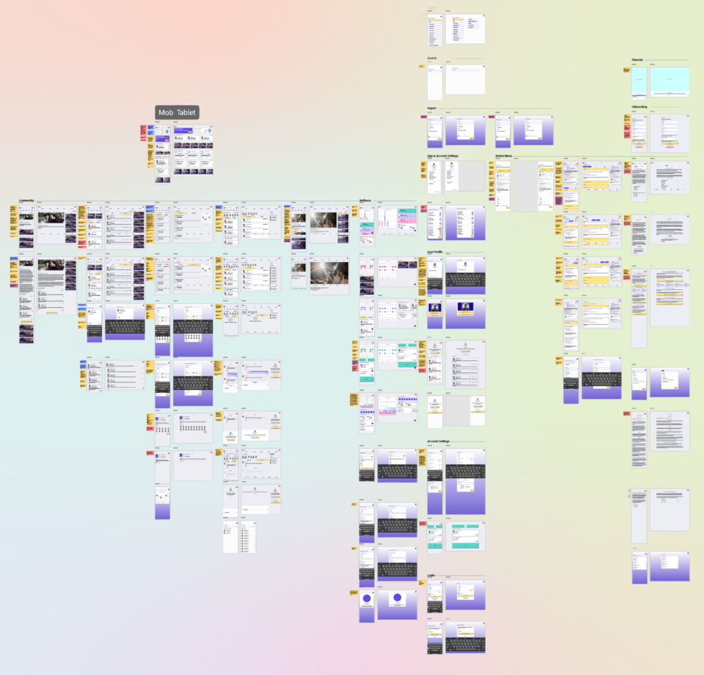
Updated App Information Architecture
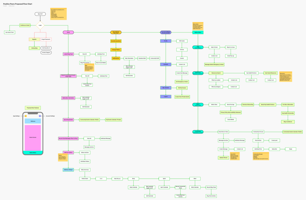
This made it clear what would be moving, changing, or be removed from the app moving forward. We needed to keep some elements consistent for health research purposes so we were very cognizant of how we redesigned the app to not only appeal to user needs, but also research needs.
Wireframes
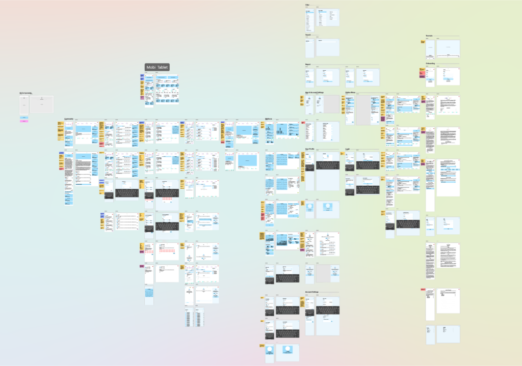
Once this blueprint was approved, we moved onto creating a feature list for the developer to get started building the foundation, while I worked on the wireframe designs. The goal being to work in tandem with the developer and keep everyone on the same page about any potential roadblocks or changes early on in the process. The wireframes created a series of reusable ui elements to not only make the app consistent, but to create a design system for adding features in the future build off. This design system was considered even in the wireframe stage.
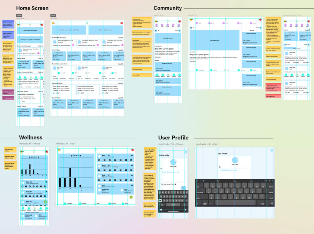
During wireframes, I color coded notes with questions for design, dev., and the client, as well as any clarification that might be needed about the specific screen in question. This prevented certain details from falling through the cracks.
Design
When we felt confident in our wireframes, and after reviews with the client, we added some style to these wireframes building off of the existing brand and expanding the color and fonts where needed. This phase created a low fidelity design, that I then wired up as a working prototype we could test on their users and stakeholders to get feedback on our hypothesis userflow, this allowed us to again troubleshoot and make changes before committing to final design and development. Overall the results were positive with a few changes to the organizing and naming of items.
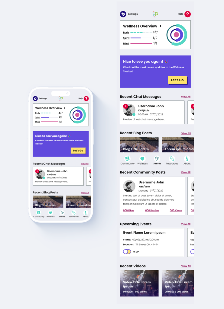
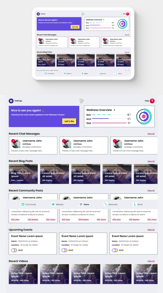
Finally we applied the design fully to the project, making sure colors, icons, and overall navigation through the app was accessible while still on brand. The colors did prove a bit of a challenge as the neon color palette did not have strong contrast between individual colors and required some adjustments. We went with a neo-brutalist style to make it feel modern and audience appropriate.
Prototype
Overall I’m really proud of the final outcome of the project, it was a large UX challenge that required careful consideration at all stages through to design. It’s still an evolving app although I am no longer personally involved so the designs here likely differ from the current app.