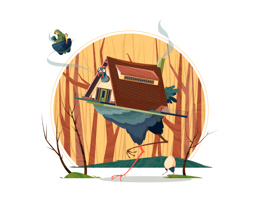
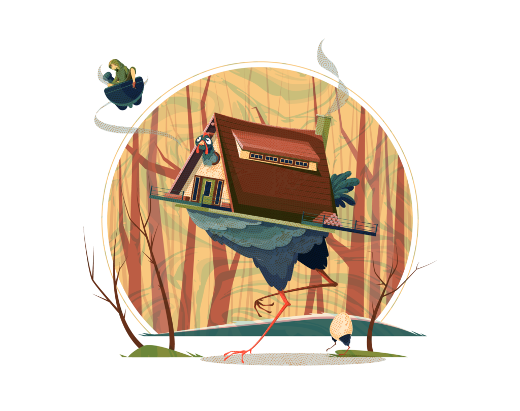
Our yearly October project is back again! I really wanted to work on a chicken house after seeing the trailer for the game REKA on steam, so we decided to create a Baba Yaga inspired piece. After I had finished the initial art with flat fills and shading, Adobe Live reached out about doing a Pro Tips and I thought it would combine the flat art with textures to take it from being a sort of silly and fun piece to something a bit more spooky.
Final Art
I really like how the silhouette from the sun or moon frames the art with Baba Yaga breaking the frame. It took a few tries to get the pose and position of Baba Yaga in the scene in a way that felt natural. She actually has quite a bit of detail in her face and shading. Normally I wouldn’t go that detailed on a small element, but it fits the details on the house and the face for the chicken so I think it works.
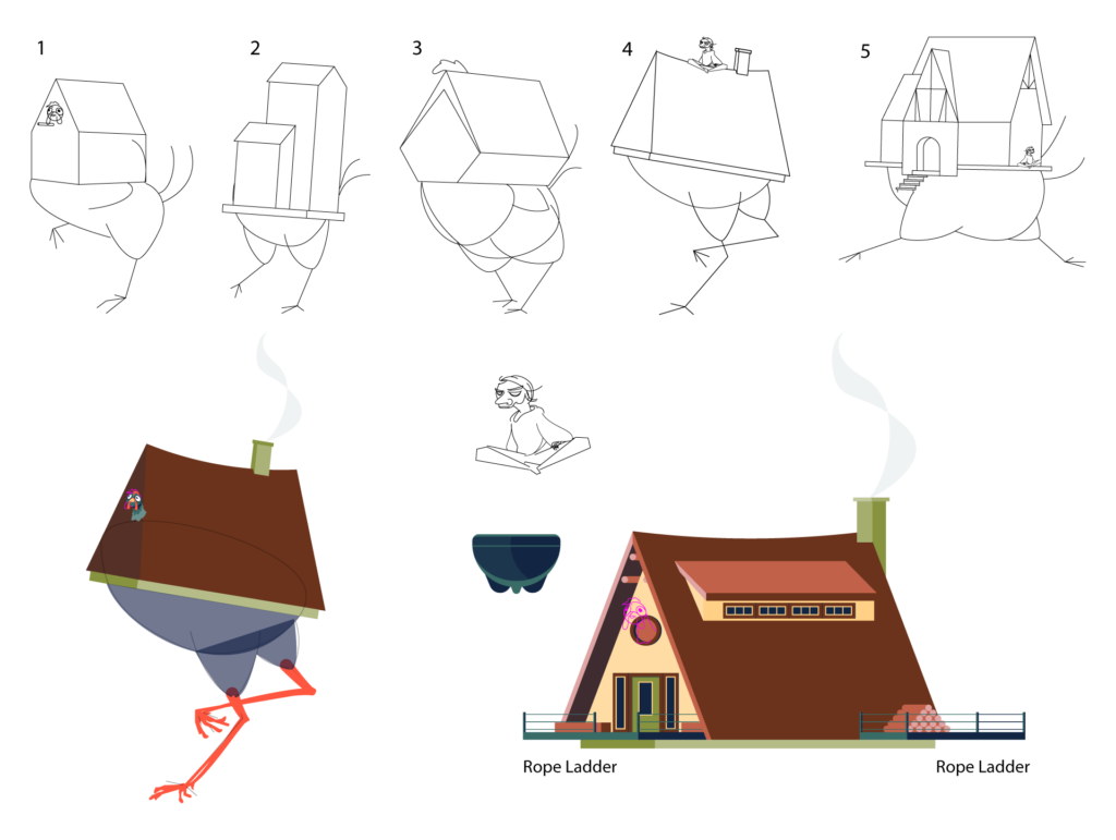
Sketches & Notes
I started out with some sketches to get the personality and style for the chicken. I really liked how the house came together separate art rotated into position once a lot of the details were in place. Honestly I feel like any of the sketches could have worked out for the chicken, they’re all pretty silly poses. The chat provided some notes during the live stream and I pulled from those ideas for the final composition
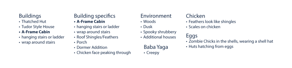
Color Palette
This ended up being a massive color palette compared to what I normally use. I started out with basically blues and browns but kept adding on as needed. The colors still all work together, overall they’re a pretty warm color palette, even the blues on the chicken lean warmer into the teals which I think helps keep it consistent.

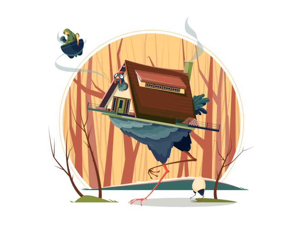
Textured Art
During the Pro Tips stream I explored different ways you can go about adding texture to your art. The first one below I used a single texture with opacity masks to create highlights and shadows on the overall art giving it a sort of vintage look.
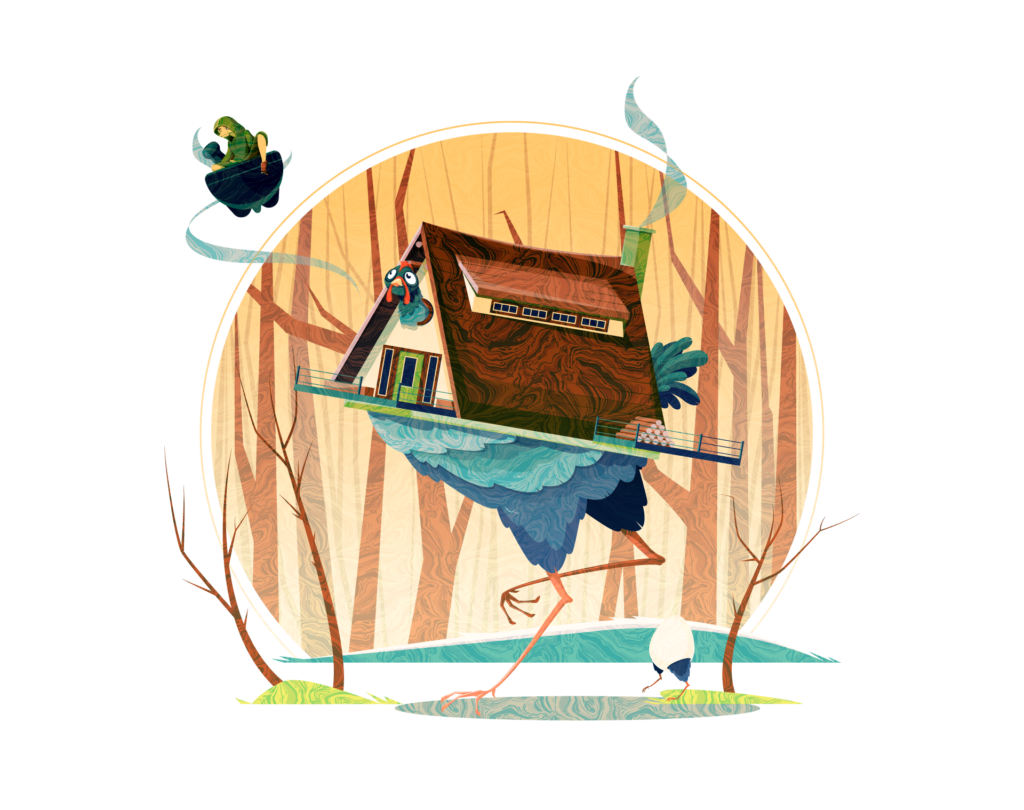
This next one I combined the first marble texture with an orange dot texture. I used the marble on the background and the dots on the foreground to visually separate them adding some subtle depth to the illustration.
The final version is the route I would normally take when working with textures. In this one I selectively applied the texture to the background trees and the ground, and selectively added the foreground dot texture to the shadows on the art. I also added a roof shingle texture to give the roof a different style. It sort of has a collage look to it that I like.