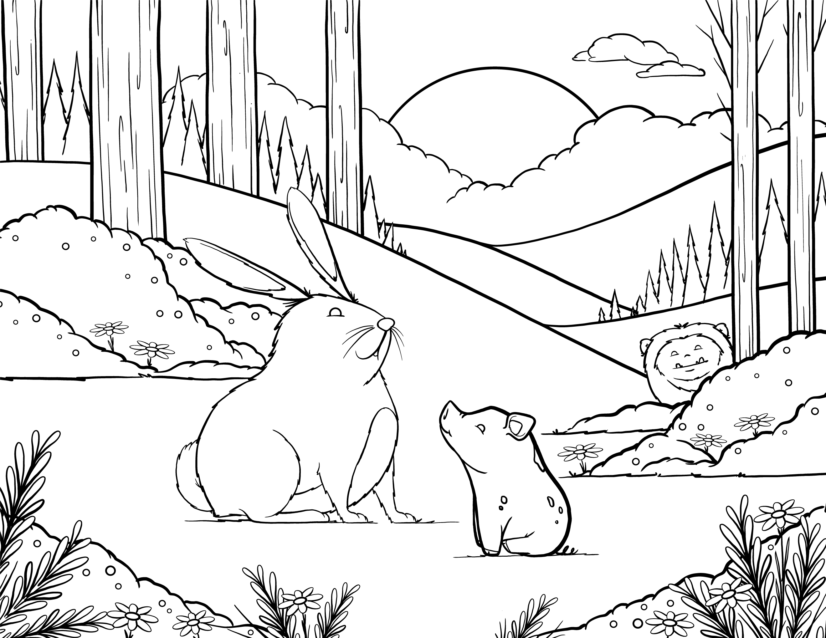
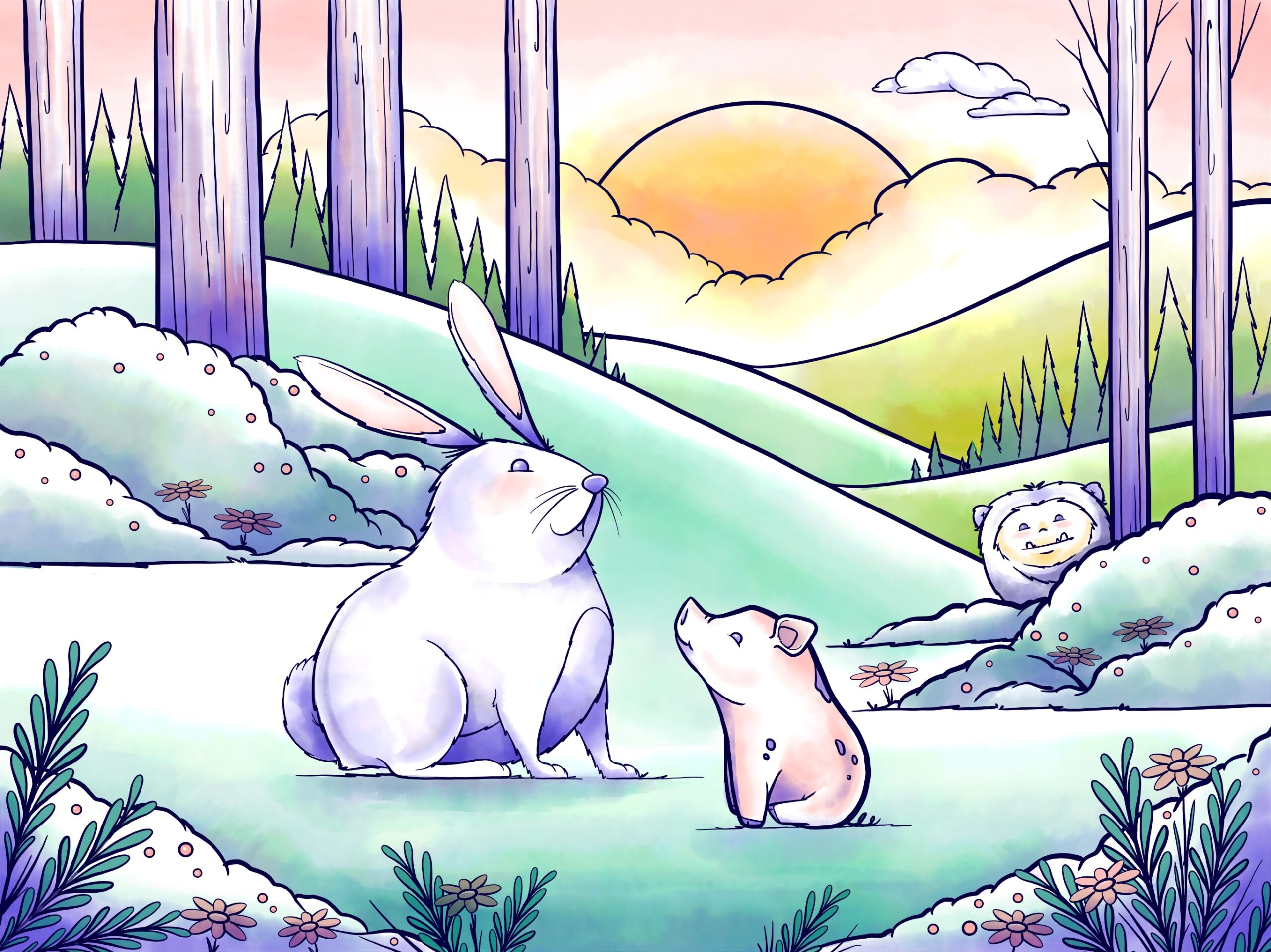
I worked on a coloring page during a two part live stream on Facebook in Adobe Fresco. For part one, I took the sketch into Fresco and used the vector brushes to create the line work. We talked about how line work is the blueprint for your art. I took requests and added the pig and big foot peeking in the background. At the end, I exported a PDF and shared the file for others to print out and color, or color in digitally.
Facebook Livestream: https://www.facebook.com/1149630026/videos/10219044813288477/
![Black & white line art of a forest scene with a rabbit and small pig in the center. A strange furry creature peaks out from the bushes in the background.](https://jackwatson.design/wp-content/uploads/2023/07/Spring2020-white.png)
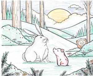
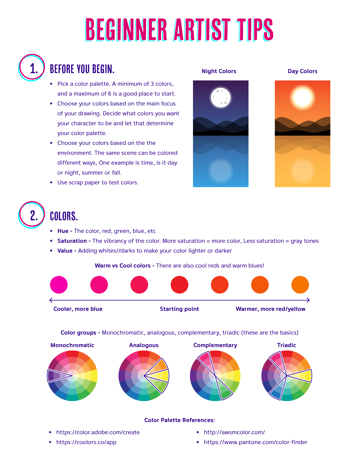
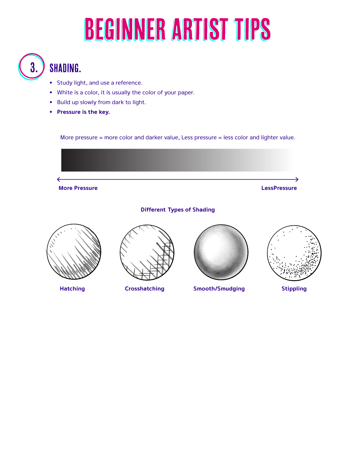
For part two I showed how you could color your page in if you printed it out, with colored pencils. I also showed coloring it digitally using the watercolor live brushes in Adobe Fresco. We went over a bunch of art basics such as color and shading. I created a pdf with some of the information we went over, including examples.
![The coloring page digitally colored in a watercolor style.](https://jackwatson.design/wp-content/uploads/2023/07/Spring2020-final-scaled.jpg)
![Beginner Artist Tips
1. Before you begin.
- Pick a color palette. A minimum of 3 colors, and a maximum of 6 is a good place to start.
- Choose your colors based on the main focus of your drawing. Decide what colors you want your character to be and let that determine your color palette.
- Choose your colors based on the environment. The same scene can be colored different ways, one example is time, is it day or night, summer or fall.
- Use scrap paper to test colors.
2. Colors.
- Hue - The color, red green, blue, etc.
- Saturation - The vibrancy of the color. More saturation = more color, Less saturation = gray tones
- Value - Adding whites/darks to make your color lighter or darker
Warm vs Cool colors - There are also cool reds and warm blues!
Cooler, more blue - Warmer, more red/yellow
Color groups - Monochromatic, analogous, complementary, triadic (these are the basics)
Color palette references:
https://color.adobe.com/create
https://coolors.co/app
http://awsmcolor.com/
https://www.pantone.com/color-finder](https://jackwatson.design/wp-content/uploads/2023/07/Beginner-notes1.png)
![3. Shading.
- Study light, and use a reference.
- White is a color, it is usually the color of your paper.
- Build up slowly from dark to light.
- Pressure is the key.
More pressure = more color and darker value, Less pressure = less color and lighter value
Different Types of Shading
- Hatching
- Crosshatching
- Smooth/Smudging
- Stippling](https://jackwatson.design/wp-content/uploads/2023/07/Beginner-notes2.png)
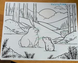
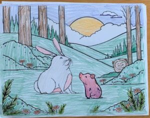
Some of the lovely art I was sent!
![](https://jackwatson.design/wp-content/uploads/2020/04/Spring2020-colored1-300x243.jpg)
![](https://jackwatson.design/wp-content/uploads/2020/04/Spring2020-colored2-300x236.jpg)
![](https://jackwatson.design/wp-content/uploads/2020/04/Spring2020-colored3-300x248.jpg)