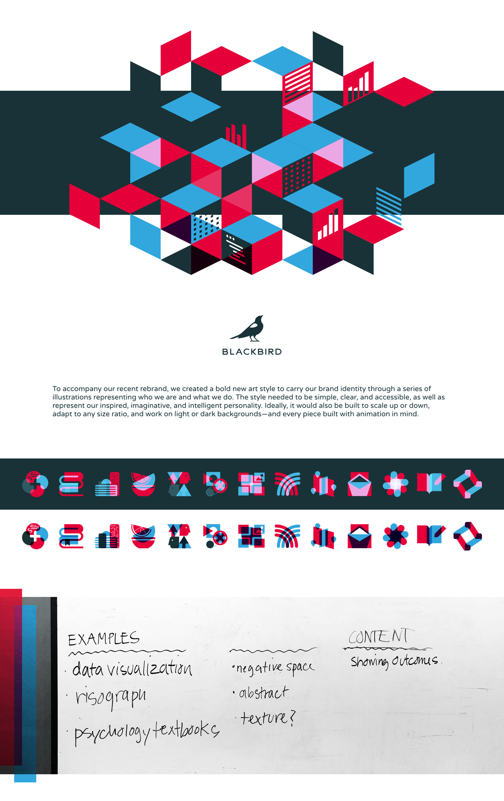
To accompany our recent rebrand, we created a bold new art style to carry our brand identity through a series of illustrations representing who we are and what we do. The style needed to be simple, clear, and accessible, as well as represent our inspired, imaginative, and intelligent personality. Ideally, it would also be built to scale up or down, adapt to any size ratio, and work on light or dark backgrounds—and every piece built with animation in mind.