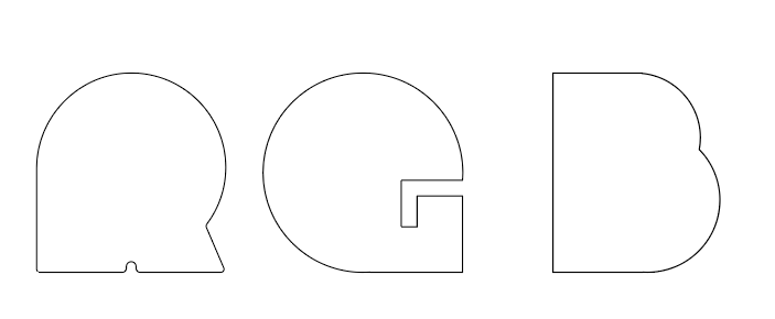
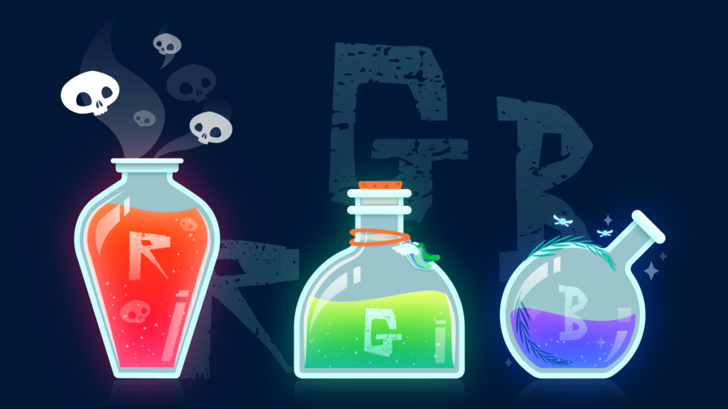
This was a part of a weekly series during the pandemic on Behance to create work around a specific theme. RGB seemed like a cool way to explore type and imagery together. I started in a very different direction with the shapes I wanted to use for the bottles, but decided to layer the text behind instead.
Watch the replay here