This was one of the first professional branding projects I did from start to finish working at Blackbird. This was a local client looking for a Shopify website and a brand. She had a logotype previously but was looking for something with a bit more personality. We went through a lot of rounds of revisions, she was particular, but also wanted to see a lot of changes at each round. We even put together mock-ups to try and help her better visualize the brand. In the end she went with something that felt very personal using a handwritten “G.”
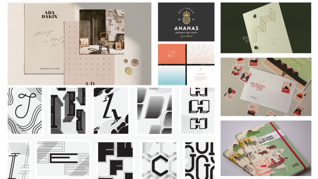
Moodboard
I think the moodboard was helpful on narrowing in on the clients ideas, she had a lot of thoughts around the brand so we presented narrow range of ideas from those conversations including, organic, geometric, travel, and type imagery.
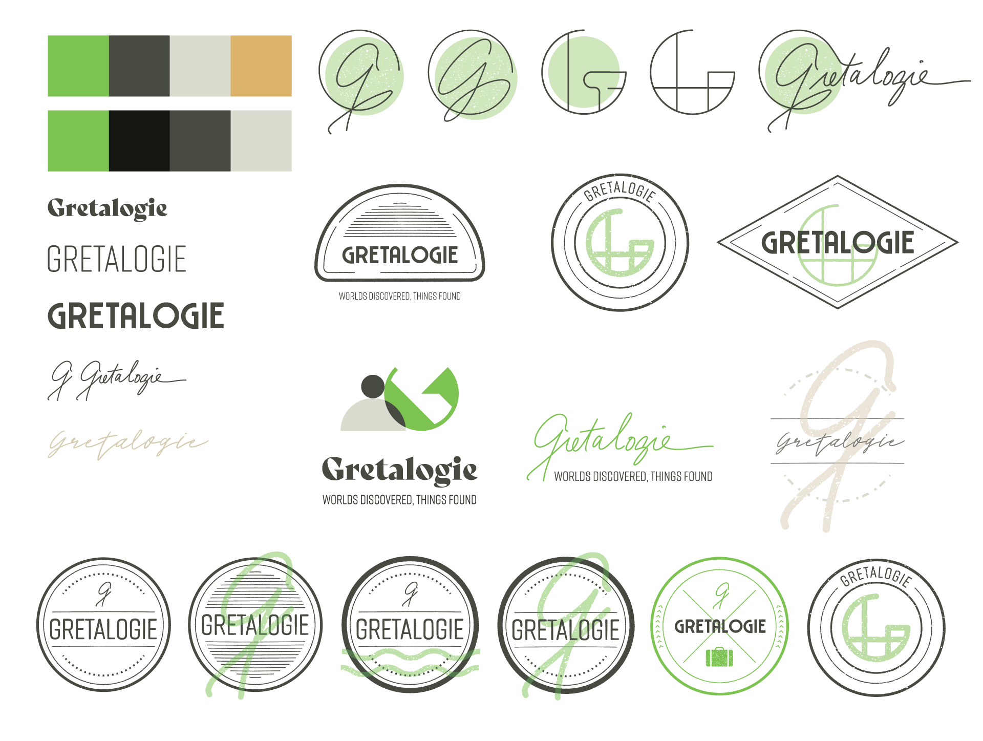
Initial Concepts
We used the initial brand traits vintage, exclusive, welcoming, adventurous, and intuitive, as well as conversation notes with her about her business. We came up with a wide range of ideas, travel stamps from a passport, a signature “G,” fingerprints, organic and geometric textures and patterns from her products, and stacked shapes representing items.
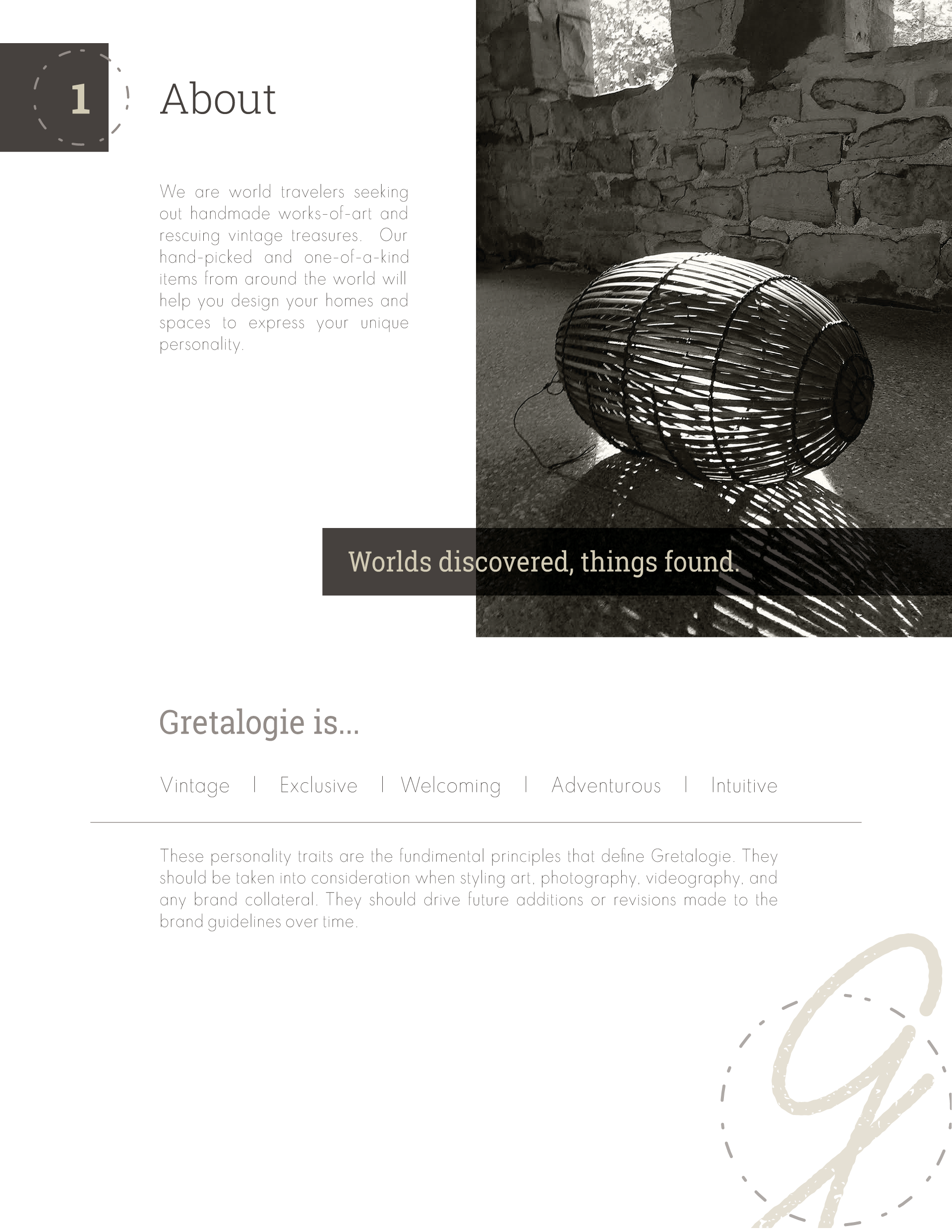
About the Brand
“We are world travelers seeking out handmade works-of-art and rescuing vintage treasures. Our hand-picked and one-of-a-kind items from around the world will help you design your homes and spaces to express your unique personality.” The client had a lot of really nice product and location photos that we were able to incorporate into the website and brand guide.
Brand Traits
Vintage | Exclusive | Welcoming | Adventurous | Intuitive
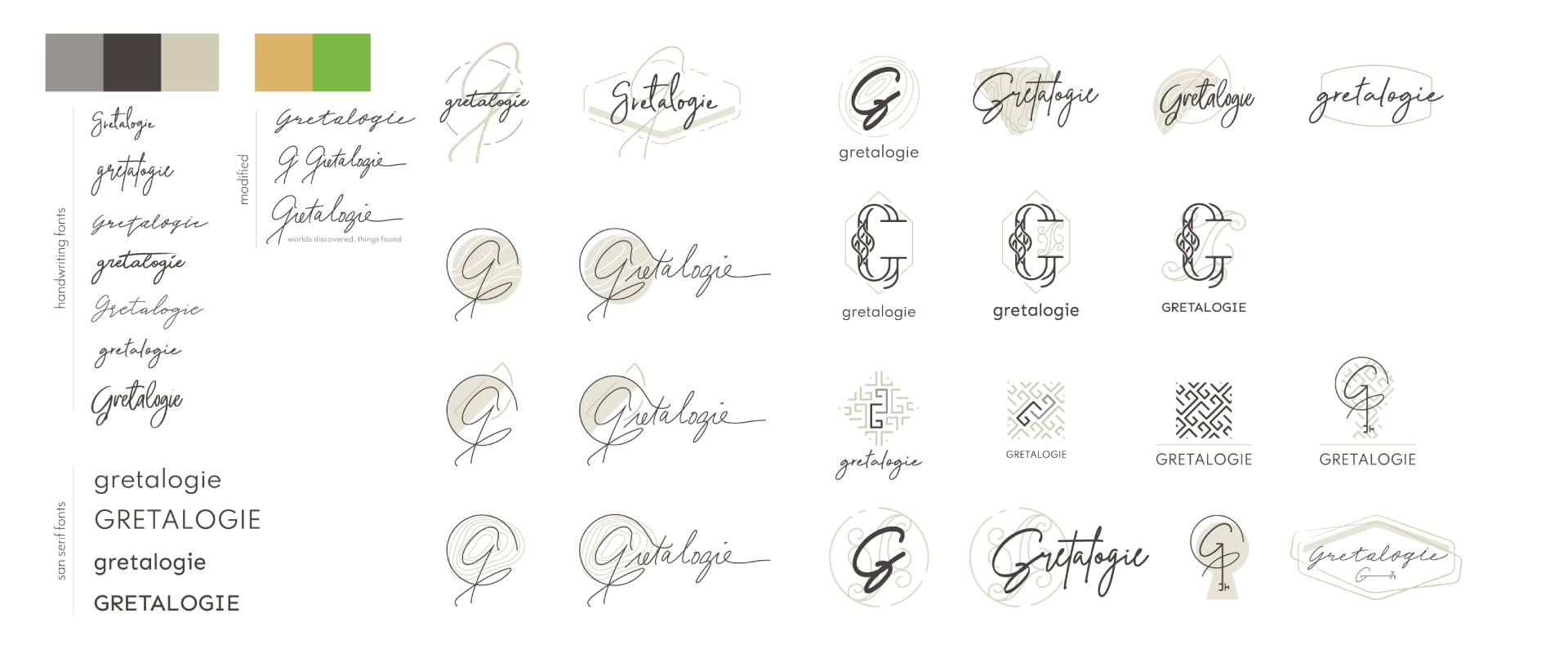
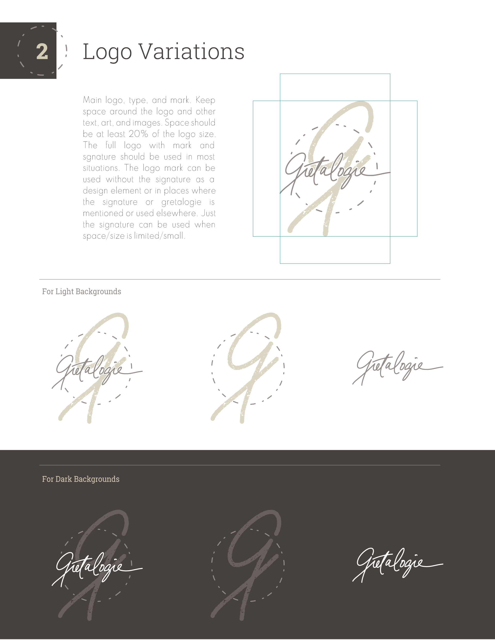
Final Logo
The final logo combines elements of the handwritten type the client liked, with the travel stamp concept. It feels very personal, I imagine her using it as a literal stamp for product tags in her shop.
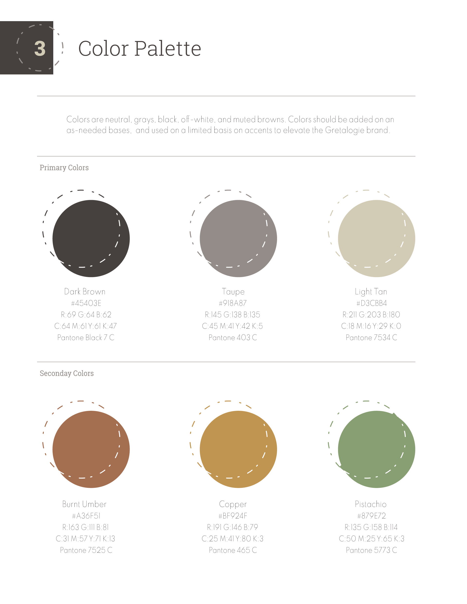
Color Palette
I would describe the color palette as muted earth tones. At one point she wanted to go fully grayscale only for the brand. I think having some accent colors to play with helps keep the brand fresh and adds some contrast.
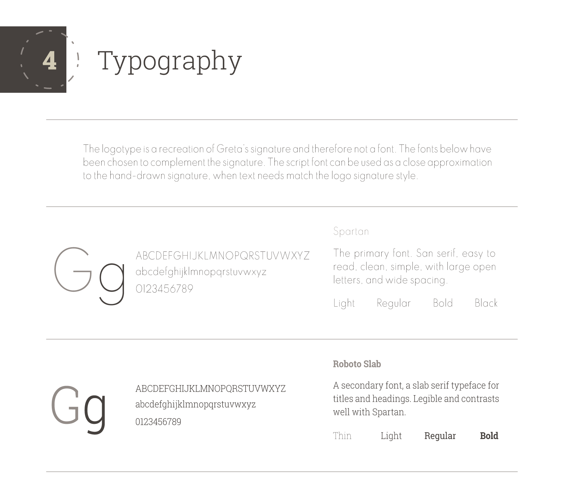
Type
The fonts are really thin and almost ethereal which I think works for the client’s vision. I do think adding the slab serif in as a secondary font adds some weight, especially for the website headers and product titles.
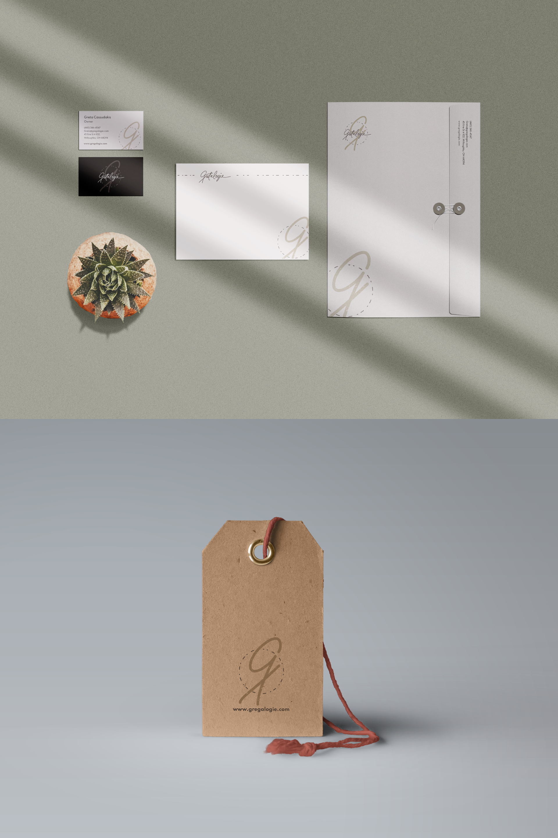
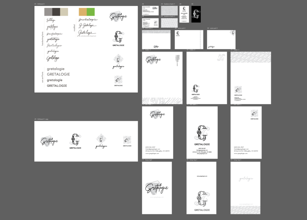
Mock-ups
Mock-ups were really helpful for this client to help visualize the brand in context. This was the final set created with the final logo for approval. She did end up using these designs for postcards, business cards, and product tags.