David Wilkinson, a Cleveland Jeweler, reached out to Cory Hughart and I about creating a new website for him in 2021. Cory worked on the custom development of the site, while I handled design and illustration. David had a less than stellar experience in the past with his website, and wanted something that was going to be easy for him to manage and update, help him meet his custom jewelry business goals, as well as reflect his unique personality and style. He already had an established brand, so it was a matter of utilizing and elevating that brand in the new site design.
Moodboard
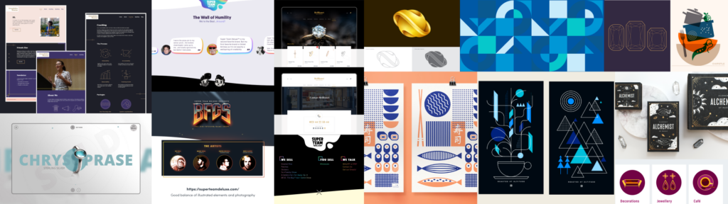
We started the project out by sending along a questionnaire prior to meeting with him to prep him for the information we’d be discussing. In our meeting we discussed David’s goals for the site, the types of content he envisioned needing now and in the future for his target audience, and his timeline and budget. We put together a moodboard and site map based on this meeting, to try and capture the style direction, overall content needs, and user navigation on the site.
Colors & Fonts
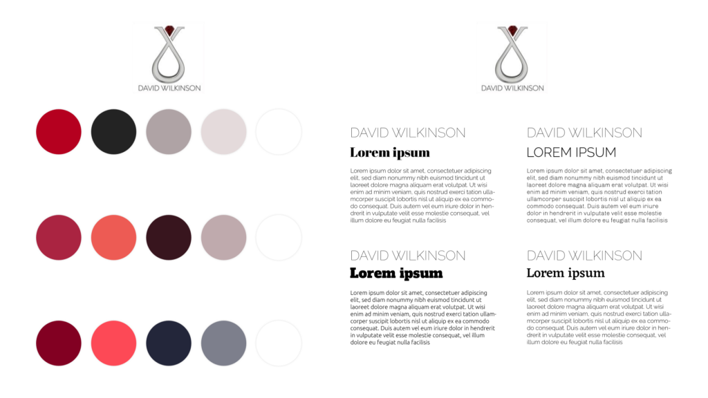
David had a logo but did not have a brand, so in order to move forward with the website, we had to come up with colors, fonts, and an overall style based on the logo he did have. Hopefully this helps bring some consistency to his future branding needs as a bonus.
Flow Chart
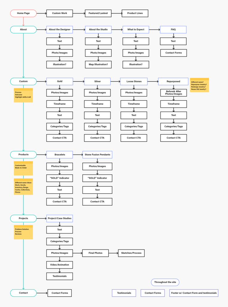
David primarily focuses on custom jewelry so much of the work on the site needed to showcase work that was done bespoke for clients with testimonials. One thing that was important to him, however, was having a new product line section on the site. These would be items with a list price that could be customized if a customer was interested by contacting David. From a technical standpoint, Cory created a form that would tell David which item the user was looking at when they decided to contact him, that way he would have context, and start a conversation with a better idea of what the customer may have in mind.
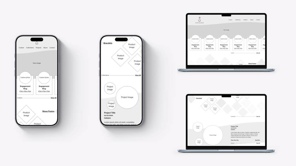
Wireframes
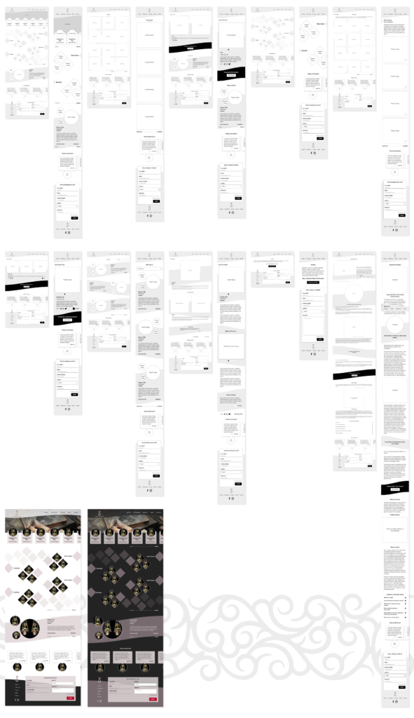
Even in wireframes, we knew David wanted something a bit different, so during wireframes we blocked in some of the design elements such as the waves, the diamond pattern, and circle crop on the images to help Cory start to plan for how those would be developed on the final site. David also has specific image size requirements which presented an interesting challenge. We designed a way to display images on the site that would accommodate this image size and elevate the images he already had using frames. Along with the wireframes we presented two different color options to David, something lighter and something darker, keeping in line with his brand colors.
Art & Style
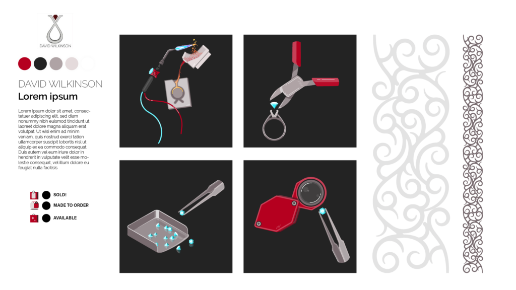
It became apparent we would need custom artwork to help illustrate David’s process in the about section. We matched the style of these illustrations to David’s existing branding, and incorporated an ornate pattern as well which paired well with the style of his work as a design element. Custom icons were also needed to showcase the availability of his product line and custom pieces.
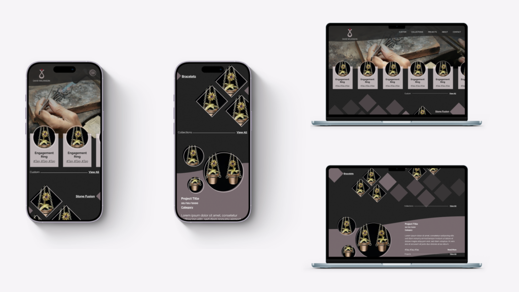
Website Design
David chose to go the darker direction, and so while applying the design to the wireframes, we used slightly lighter and darker shades of his brand colors to visually separate the sections on the site, and retain good color contrast throughout.
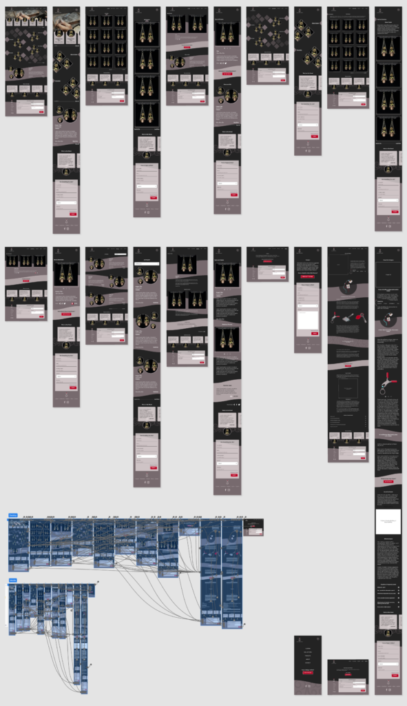
We also put together a prototype in Adobe XD so David could interact with the design and navigate through the different pages to get a sense for how the website would look and feel on desktop and mobile, before Cory created it.
Prototype
Watch the live stream replays: Part 1 | Part 2 | Part 3 | Part 4
Client Testimonial
“I am just absolutely floored. I will have a couple questions, but for now I just want to keep looking at what you have done. It literally gives me goosebumps! There are so many details I love, like the fine line circle that is offset on the circle pics…that’s a fabulous little detail. This site screams everything I hoped for…professional, slick, creative, and sooooo different from so many other jeweler’s websites. Thank you, thank you, thank you!”
David Wilkinson