While at Blackbird I worked on a number of government projects, one of which was a website redesign for the Willoughby-Eastlake library. This was a complex website with a lot of scattered information, in some cases duplicate information, as well as pdf content that wasn’t accessible. There were also a lot of individuals from each department who had specific needs for their portion of the site, and a lot of third party services like Libby, Hoopla, Overdrive, and their research database to name a few. They also had a complex calendar system and needed to be able to display different events for different audiences both on the homepage, and on different areas of the website.
Research
They came to us with an idea of how they’d like the content restructured on the website, particularly for kids and teens, and educators to streamline those experiences, so we worked with them to audit their old website, worked through a card sort to consolidate the various stakeholders and department thoughts and opinions on organization, and put together a new site map and user flow that reflected their needs.
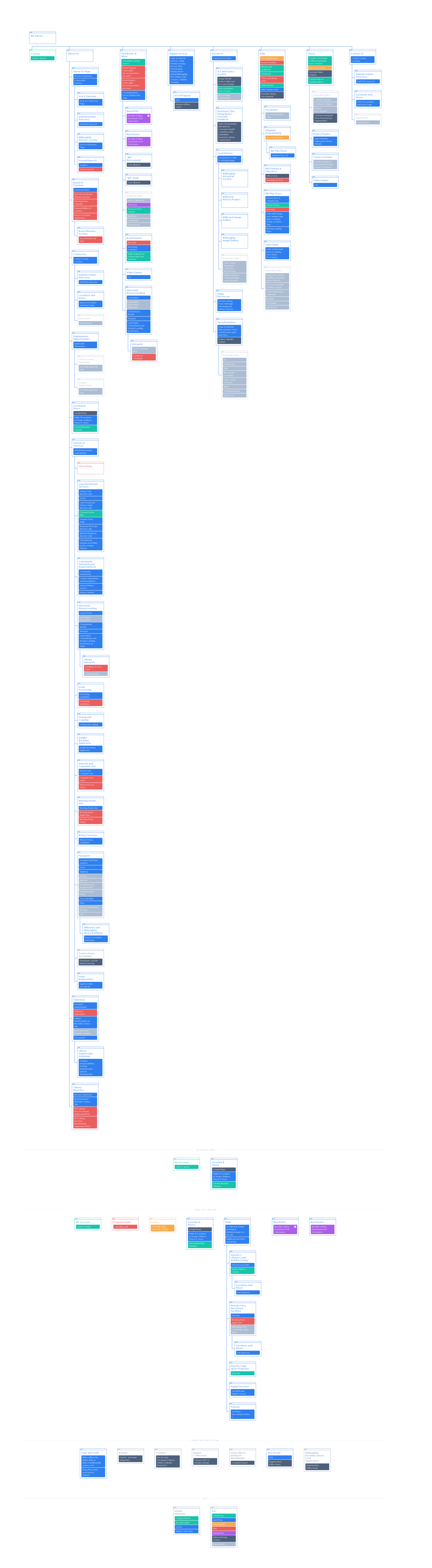
Original Site Map
The original site map had a lot of the content, especially library services, hidden under About Us. A repeat complaint they’d received is how difficult the information on the website was to find. The website felt very inaccessible, there were broken links, duplicate content, and even the staff wasn’t fully aware where all of their content lived.
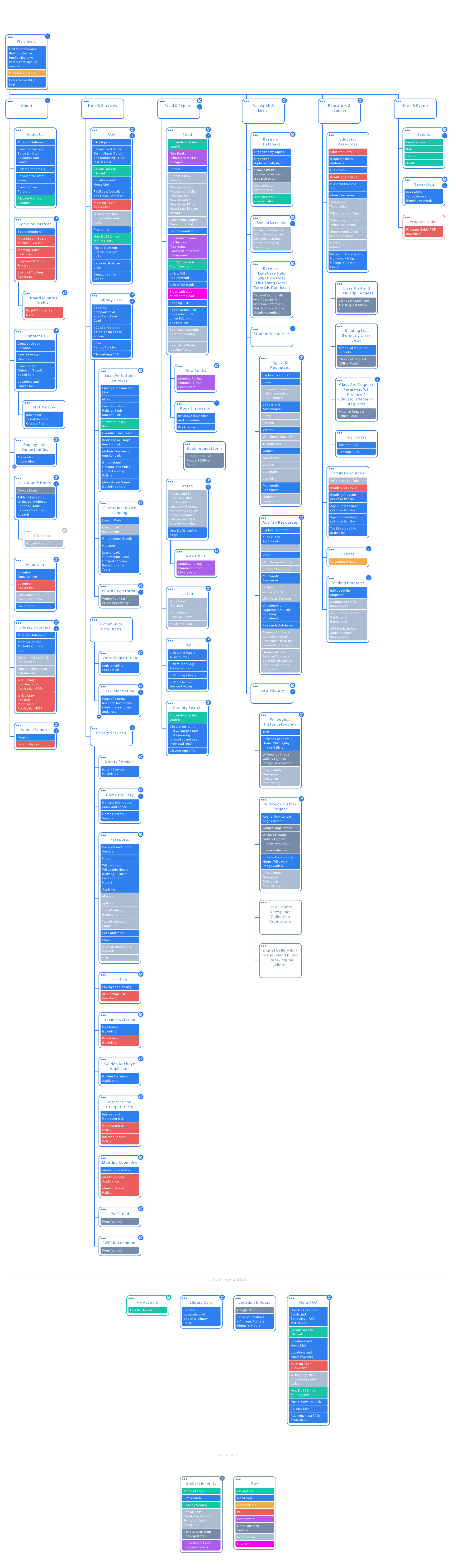
Updated Site Map
The updated site map is consolidated into different actions users are looking to do at the library. We also identified several areas of duplicate and redundant information that could be consolidated.
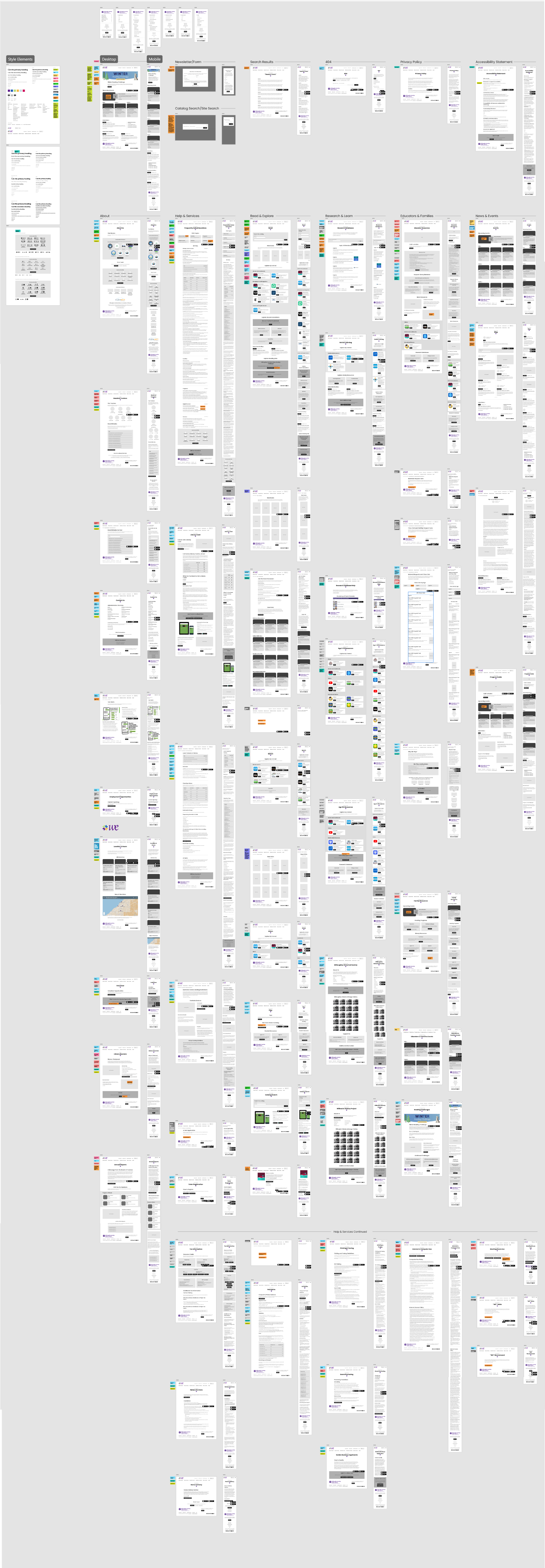
Wireframes
The wireframes were pretty elaborate, and did include live content in some areas to ensure we could account for the information that needed to be displayed, as well as notes for their team, design, and dev. color coded to make sure no information was lost while everyone was working simultaneously on their respective areas.
From the beginning I worked with the developer closely to ensure whatever design choices were made could support the third party services. We also worked with them to identify any pieces of content that were currently pdf format but needed to be forms, or content on the website. The content lift was probably one of the more daunting tasks of the project but they were very helpful in moving that over.
Style Guide
They had recently gone through a rebrand so we had to incorporate the new logo, colors, and fonts into the design. I created some icons to supplement the brand and add visual interest to a very information heavy website. A design system of reusable components was created, and made use of color to visually differentiate sections of the site along with the icons. Again being a very information heavy website, the design had to be clever to make navigating the dense content feel easy.

Final Design
The biggest challenge on this website was the number of people involved with their own needs, the content reorganization, and the new branding which was being tested for the first time on the new site. In the end we were able to deliver something that met their needs and improved the user experience as well as the accessibility of the website.