In 2022, I had a really unique opportunity to redesign the website for the Roxie Theater in San Francisco. They reached out to Blackbird looking for help creating a website that was easier for their staff to maintain, with some technical requirements to manage their schedule and film database on the backend. Accessibility was also an important concern for them as their current website was difficult to use on mobile in particular with really small text for film details.
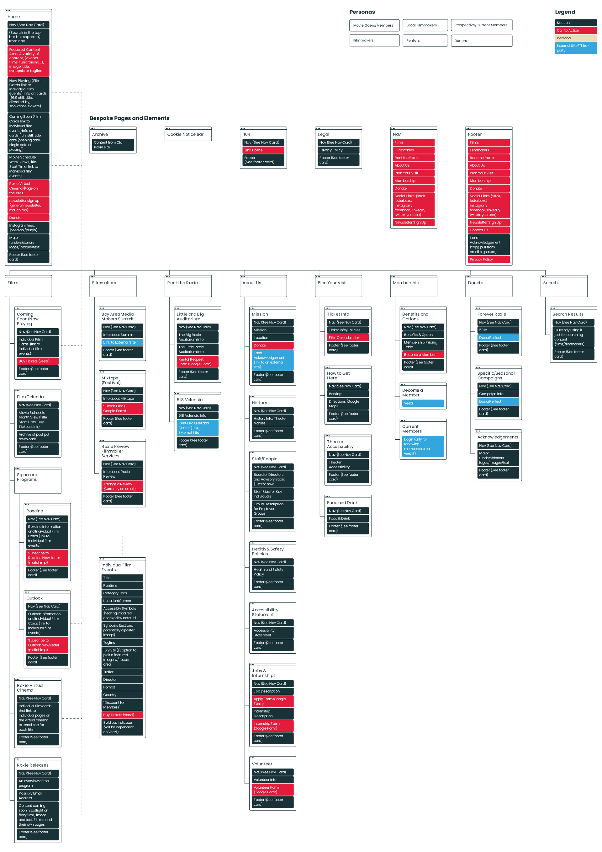
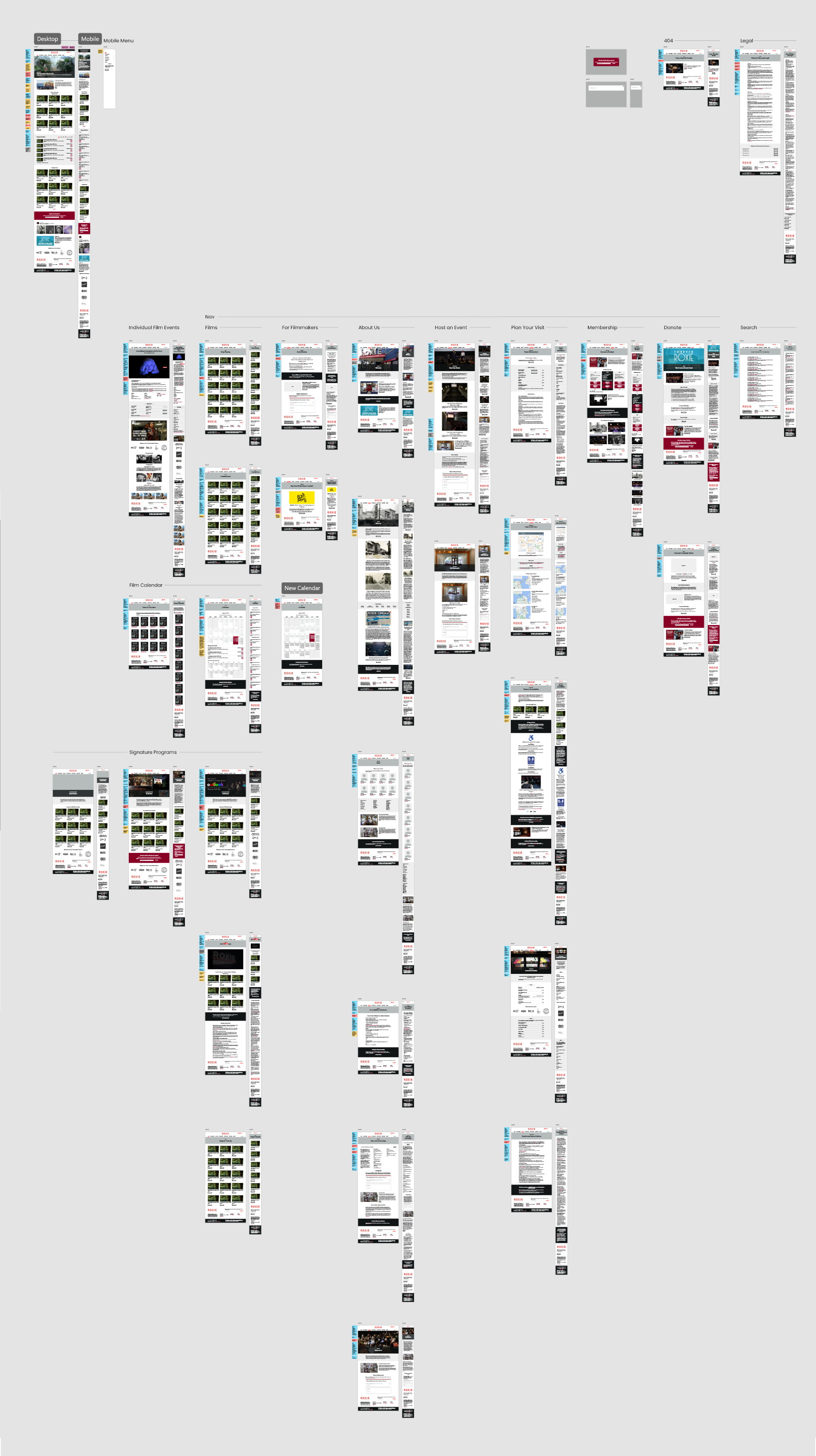
Site Map
We took stock of their current website, and created a flow chart to help them visualize the content they currently had, and help us determine any new content or restructuring needs. We were able to through multiple meetings come up with a new site map that would better help their different audiences find what they might be looking for.
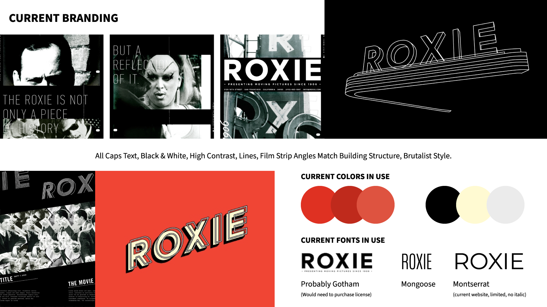
Updated Branding
Roxie already had an established brand, but they didn’t have a brand guide that could be used for the website, they weren’t even sure what typeface had been used for the latest iteration of the brand. We made very minimal changes to their branding specifically for the website, presenting them in conjunction with their existing brand to ensure a seamless integration.
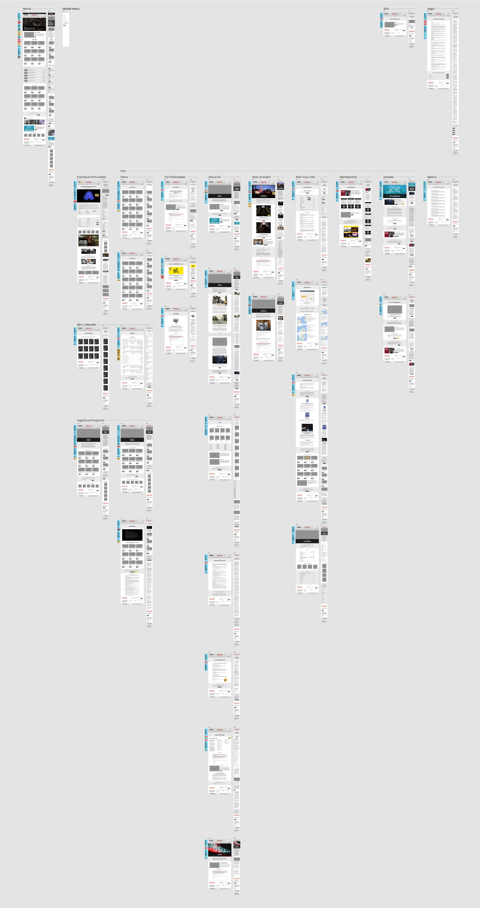
Wireframes
A big goal of this project was to make data entry for the films, calendars, and general site maintenance easier for the staff. From the beginning, even before wireframes, I worked closely with the developer to figure out what our limitations would be, and what type of experience we could provide them behind the scenes, and therefore visually have reflected to users on the site. How information got displayed was driven by technical capabilities, keeping in mind this was a nonprofit client with a tight budget. The wireframes reflect these discussions, we color coded our notes to clarify questions for design, dev., and client.
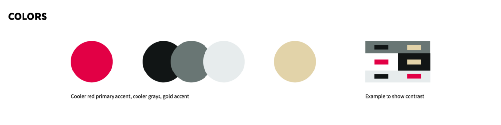
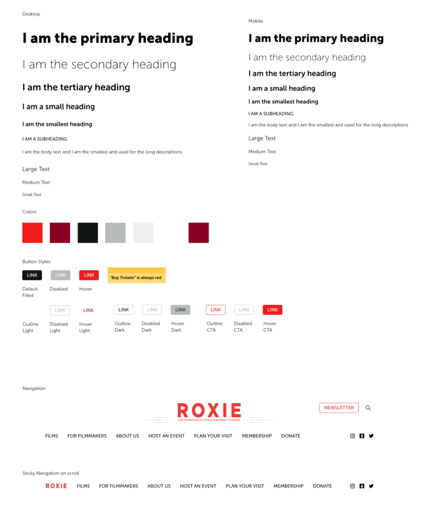
Style Guide
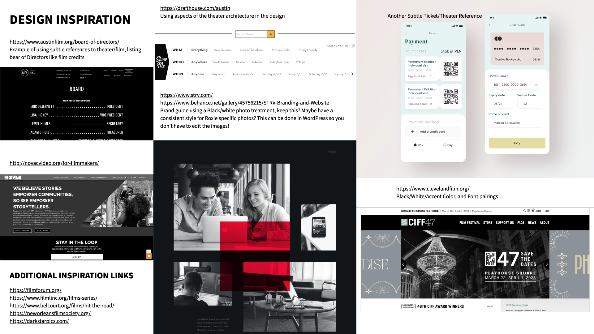
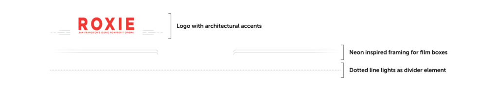
Even though the website had to be accessible, we were able to add some visual flair that reflected the theater’s history and architectural elements. They liked them so much they based some of their print materials off of the new website. In the end, we were able to fill some gaps in their branding through the website redesign.
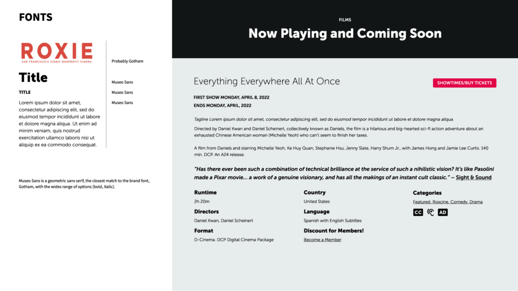
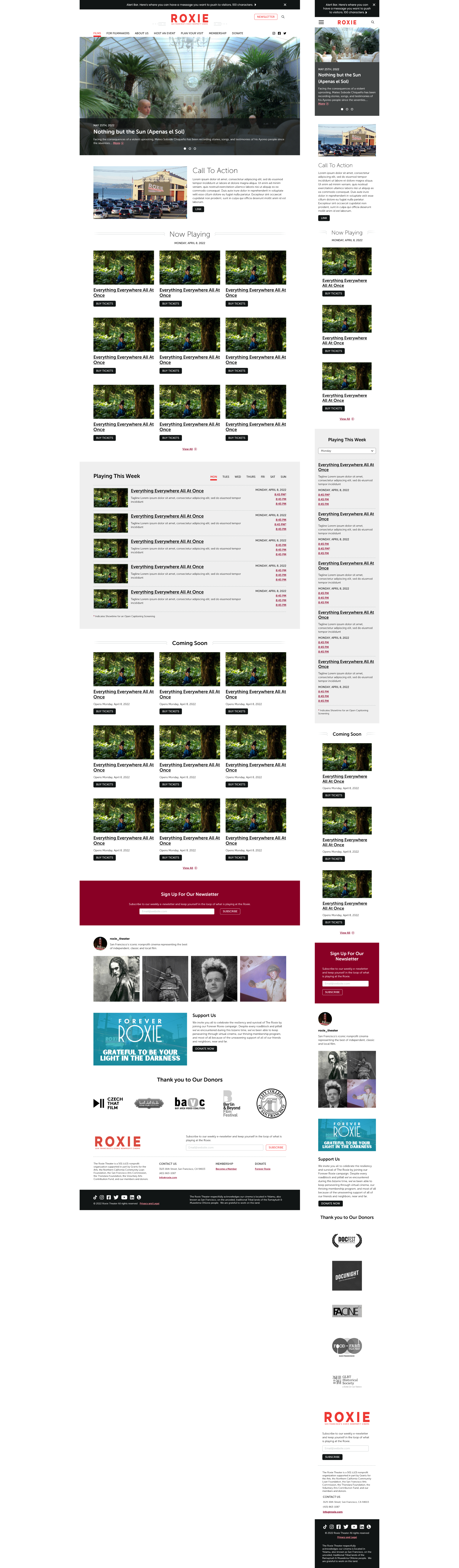
Final Design
The design system for the site was considered very early on. They had a lot of different types of calendars that needed to be displayed on the website, and information for each film including film series. We created a handful of reusable components, to try and cut down on the number of bespoke calendars that needed to be built, of course making sure they worked on both desktop and mobile. A very clean, and adaptable system allowing them to add pages and reuse components as needed for different events.
This was a really special project not only being in an adjacent creative industry, but also being a nonprofit created unique opportunities and challenges.